9/25/2024

High Valuations - September 25, 2024

Market Resilience, Naturally Occurring Shifts in Sentiment, and Valuation

We expect greater market volatility over the next few weeks, which may raise investor concerns that high stock valuations levels will fuel a major stock market decline. While I share those concerns on an emotional level, the data does not yet indicate that major declines are likely. The reasons are:

  1. The Macro Market Resilience Index is still in the upleg of their its cycle and the Exceptional Macro is present. These conditions are positive for the stock market.
  2. The naturally occurring shifts in investor optimism likely to cause the volatility are currently only short-term in nature. The long-term trend continues to be for naturally occurring optimism
  3. While widely used valuation metrics are high compared to the last few decades, a long-term perspective shows that valuation metrics have trended higher. This trend makes it difficult to determine when valuation metrics are excessively high.

Current MRI readings and our forecasts of naturally occurring sentiment shifts are shown on page 3 of the weekly pdf.  The upper panel shows that the Macro MRI and Exceptional Macro both indicate strong market resilience. While the Micro MRI is in the downleg of its cycles, there are no indications of stress based on its recent price action, which is used to determine the MRI. 

Page 3 also shows in the lower panel that the periods of pessimism are likely to be temporary; the market will recover relatively quickly from declines that do take place. The Short-Term Driver shown in the lower panel of the graph indicates we will probably experience more ups and downs in the market over the next few weeks. The Long-term Driver, however, indicates that the longer-term shifts in sentiment will favor investors being optimistic.   

Thus, the markets may be more volatile over the next few weeks, but we should not get overly concerned that these will lead to deeper, more sustained losses. 

Valuation

Greater volatility will be unsettling to many investors who are already concerned about high valuations.  High valuations often precede market declines because investors come to believe that stock prices are too high compared to corporate earnings and company assets. With that widespread realization, there become more sellers of stocks than buyers. Recent business news headlines reflect this concern:

    - Fed's Rate Cut Sends Already-Stretched Valuations Even Higher https://www.bloomberg.com/news/articles/2024-09-20/risk-appetites-rage-as-powell-proves-hero-in-high-priced-markets

     - Valuation Angst Is Being Stoked by Fed’s Big Cut: Credit Weekly https://www.bloomberg.com/news/articles/2024-09-21/valuation-angst-is-being-stoked-by-fed-s-big-cut-credit-weekly


Metrics we have used in the past point to currently high valuation levels. Figure 1 below shows current valuations for the DJIA, S&P 500 and NASDAQ for the data available through Bloomberg. 


Figure 1

The table above presents a picture that reinforces the concerns reflected in the headlines. Focusing on Price/Book and Price/Sales, current levels are at or close to the upper end of their ranges, as indicated by their high percentile levels.

However, there is objective data that dampens concerns about current valuation levels.  First, while the above chart shows all the data available through Bloomberg, data is available for earlier periods through other sources. Figure 2 below shows our calculation of a statistic like Price/Book for US stocks beginning in 1926.  The data is from Kenneth French at Dartmouth.  It shows that this valuation metric has increased over time. 

Figure 2

CPM calculations using data from French, K. R. (n.d.). Data library. Dartmouth College, Tuck School of Business. Retrieved September 25, 2024, from https://mba.tuck.dartmouth.edu/pages/faculty/ken.french/data_library.html


The most recent date for his data is early 2024, so we cannot see the current reading, but we can see a clear trend of higher Price/Book valuation levels over time. A similar image is seen in a metric that approximates a Price/Earnings ratio, as shown in Figure 3 below for years beginning in 1951.  

Figure 3

CPM calculations using data from French, K. R. (n.d.). Data library. Dartmouth College, Tuck School of Business. Retrieved September 25, 2024, from https://mba.tuck.dartmouth.edu/pages/faculty/ken.french/data_library.html


While the extended timeframes shown above provide a broader context, our own research may be more compelling. It indicates that we are currently in a phase of the stock market during which most investors are unusually tolerant of high valuation metrics. More specifically, the Price/Earnings ratio for the S&P 500 is significantly higher during phases like the our current phase compared to all other phases of the market since 1940. Yet, the rate of economic growth during prior similar phases is not any higher than in other phases. This supports our view that these dynamics have a strong component of investor emotion as opposed to a view of economic forces. The difference in valuation ratios is a statistically significant finding.  We expect this period of tolerance for high valuation levels to last for several more quarters.  Please reach out if you would like more information about this research. 

Investors in general, are behaving as though one or both of the following are true:

  • There has been a long-term trend toward higher stock valuations, and this trend will continue. In this context, current valuations are not excessively high.
  • During this phase of the market, investors are simply more tolerant of high valuations. Since this phase is expected to last several more quarters, these high valuations are not worrisome.
They are also behaving as though the following is true:
  • The pandemic stimulus has elevated valuations, and once its effects have fully worked through the economy—potentially leading to an economic slowdown—valuations will decline.

The third is our primary concern. However, as time passes and we observe how the economy evolves, we will better understand the magnitude of this potential factor contributing to high valuations.


End


9/11/2024

New Content in Weekly Report - Sep 11 2024

Contents:

  1. New Chart on Page 3: A new chart illustrates DJIA price movements over the last 52 weeks and provides insight into naturally occurring periods of investor optimism and pessimism.
  2. Valuation – A Major Concern of Our Time: The stock market's high valuations, while historically significant, are currently tolerated.
  3. Change in Mutual Funds on Page 1 of the Report: We've switched to Schwab mutual funds for comparison, due to their performance and lower minimum investment.
Feel free to skip sections.

1. New Chart on Page 3

A new chart is on page 3 of the weekly report, and is shown as Figure 1 below. I will introduce it here and then give a step-by-step interpretation.  The chart has upper and lower panels.  The upper panel shows the price movements of the DJIA stock index over the last 52 weeks through the most recent Friday, which is indicated by the vertical line descending to the date on the horizontal axis. The upper panel also shows the Market Resilience Indexes up through the most recent date. 

Figure 1

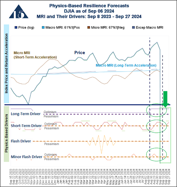
The lower panel shows four of our new physics-based drivers. These drivers indicate when there is likely to be naturally occurring periods of collective investor optimism and pessimism based on shifts in the degree of solar energy striking Earth. As implausible as this sounds, this phenomenon is supported by research done by the US Federal Reserve Bank of Atlanta. Our research over the last several years has revealed a way to quantify and use objective, independent, and exogenous physics-related data that correspond to shifts in collective investor sentiment, which can be seen in price changes of the stock index.

The physically-measurable shifts can be forecast with reasonable accuracy several months in the future. We have calibrated key drivers to our long-standing MRI over a multi-decade test period with reasonable statistical significance.  These forecasts give us an idea of upcoming periods of market vulnerability that we want to avoid. The forecasts (i.e., the next few weeks) are highlighted by the light green box at the lower right corner of the figure.

If you are already familiar with the MRI descriptions, skip section 1 in the web page linked below and review sections 2 through 4 for a description of the drivers and what they tell us. 

    The MRI and Drivers are described on this webpage.

I would be happy describe more about the drivers and how we developed them.  Please contact me for more information.

Step-by-Step Review of Page 3

The upper panel of the chart on Page 3 is in Figure 2 below. 

Figure 2


A few points are noteworthy:

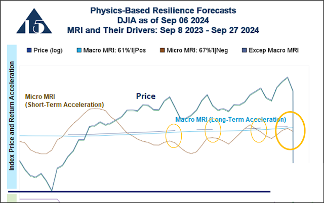
The short-term peaks and troughs of the DIA correspond to the peaks and troughs of the Micro MRI. This is the intended relationship between the two series.

  • The short-term peaks and troughs of the DIA correspond to the peaks and troughs of the Micro MRI. This is the intended relationship between the two series.
  • The Macro MRI (light blue line) had a negative trend early in the period shown and began to develop a more positive slope when the Exceptional Macro (dark blue line over the light blue Macro MRI) appeared.  This is the expected behavior of the two series.
  • Beginning about halfway through the period shown, the Exceptional Macro (dark blue line over the light blue Macro MRI) appeared off and on over many months. It has recently ended yet again. This on-and-off behavior is not common over the last several decades. 
  • An important (although difficult to see in the figure above) difference between the current and prior Exceptional Macro endings is that currently the slope of the Macro MRI (light blue line) has a higher positive slope than the at any time over the 52+ weeks shown.  This indicates that the current long-term trend of the stock market is positive.

An important dynamic is shown in Figure 3 below. The Macro MRI began to steepen at about when the Long-Term Driver shifted to a more optimistic stance.

Figure 3


In Figure 3 above, you can see that, for most of the period shown, the Long-Term Driver was just above the dashed purple line. This indicated that the long-term natural investor sentiment was only mildly optimistic. Looking back, this stance corresponds to the shallow slope of the Macro MRI during this period.  When the Long-Term Driver indicated greater optimism, not only did the Exceptional Macro re-appear, but also the slope of the Macro MRI became more positive.

In Figure 4 below, you can see that the DJIA price and the Micro MRI tended to track the periods of naturally occurring optimism and pessimism. This is shown by the vertical dashed lines.

Figure 4

The Short-Term Driver in Figure 4 above also indicates that there is likely a period of increased naturally occurring optimism later this month, during the week of Friday September 27, which is highlighted by the green ellipse in the lower right corner of the figure. Just above the Short-Term Driver line there are horizontal green lines that indicate when the driver signals are particularly strong.  One such green line is occurring later this month indicating additional strength.

Because our forecasts extend beyond the date shown (week of September 27) we can see a period of naturally occurring short-term pessimism occurring in October.  This may be when the MRI indicate that portfolios should take a more conservative stance. 

Figure 5, below, shows the addition of the Flash Driver. It occurs infrequently, but when it does occur the stock market tends to behave erratically.  This was the case in the most recent episode, as shown below between the two dashed lines. It is important to keep in mind that we know about changes in the drivers a couple of months they happen.   

Figure 5

Again, the Flash Driver has infrequent episodes and one is not expected for another several months. 

The fourth driver is the Minor Flash Driver, as shown in Figure 6 below. While its effect is not statistically significant over our multi-decade test period, these minor flashes often occur when the DJIA makes more dramatic moves, as has recently happened. 

Figure 6


In Figure 6 above, the Minor Flash Driver occurred the week of August 23. This was about the same time as other drivers indicated greater naturally occurring optimism so we cannot easily determine what effect each driver had.  This series of optimistic shifts are shown in Figure 7 below. 

Figure 7


The Short-Term and Long-Term drivers moved higher in mid-August, along with the Minor Flash Driver.

The market is not being affected only by these naturally occurring shifts. Real-world events indeed have an impact. A good way to think about the naturally occurring shifts is that optimistic shifts amplify good real-world news. The pessimistic shifts amplify the negative real-world news. 

In Figure 7 above, we see that the Short-term Driver has indicated pessimism last week and this week. Market behavior last week and this week is generally consistent with this shift. 

Yet, we see the Short-term Driver indicating greater optimism later this month. While the algorithms and our longstanding process do not consider these drivers, the algorithms are currently operating in a manner consistent with the drivers. Thus, I see no need to step in and override the established disciplines.

Beware of MRI and Drivers Synchronizing or Converging on a Negative Trend

In the notes on the website linked above and again here, we describe in sections 3 and 4 what we look for when the MRI and their drivers begin to be synchronized or to converge on a negative trend. When this happens, it is a warning sign that the markets may succumb to the period of naturally occurring vulnerability. As they converge and become more synchronized, I closely monitor the algorithms to ensure they are responding appropriately.  In the current situation, a potential convergence may occur later this year.

Comment

In a perfect world, investors would respond most to economic (e.g., corporate earnings growth) and market conditions (e.g., valuation). Yet, statistically speaking, collective investor sentiment and stock market behavior are heavily affected by the natural forces measured by the physics-based drivers. In our testing, the drivers explain over 70% of the stock market’s price momentum (how quickly prices change). Thus, these relationships are worth our attention.  

While I am concerned that high stock valuations will begin to limit the upside of the stock market, the MRI do not indicate the high stock valuations are impeding upward movement.  The strongest case for there being a drag on the stock market is the on-and-off nature of the Exceptional Macro, which is highly unusual by historical standards.  But that alone is not likely to lead to a sharp stock market decline.

Forward Visibility and Reduce Stress

While we do not yet incorporate the physics-based drivers into our algorithms (although we have used the status of the drivers to reduce trading by omitting those likely to be quickly reversed), this information is important. Many Focused 15 users traded their accounts through the COVID crash and recovery, which was an exceptionally challenging period for investors. Today, many users are concerned about the high stock valuations. The forward visibility provided by the physics-based drivers can help reduce the stress and risk of investing in the stock market by highlighting naturally occurring periods of vulnerability that might cause investors in general to panic about economic and market concerns. We can be more tolerant of short-term losses that are simply a naturally occurring aspect of stock market investing   

2. Valuation – The Concern of Our Time

A majority of Focused 15 users have a high level of concern about stock valuations.  Indeed, valuations for the US stock market are high by historical standards.  The Figure 8 below shows three valuation metrics for the major US stock indexes.

Figure 8

Focusing on Price/Book and Price/Sales ratios, all are close to, or above, the 90th percentiles of the levels since the inception of the data series on Bloomberg.[1]  The Price/Earnings ratios are all above the 80th percentile. We consider Price/Book and Price/Sales to be more reliable indicators of stock market valuation compared to the Price/Earnings ratio.

As mentioned in earlier posts, our research indicates that the long-term phase of the market we are now in is remarkably tolerant of high valuations. We believe the most realistic way to interpret this condition is that high stock valuations will not be a catalyst for a major stock market decline. The catalyst will need to be some yet-to-emerge economic weakness or calamity. Tolerance for high valuation has been present for several years and we expect it to remain true for at least the next several quarters.

I will continue to mention valuation because of its long-term importance.  Valuation is more important in every other long-term phase of the market. The next time we will experience a phase tolerant of high valuations like the one we are in now in is over a decade away. Thus, it is not appropriate to conclude that valuation is not an important characteristic.

3. Change in Mutual Funds Listed on Page 1 of Weekly Report


We have changed the mutual funds listed for comparison. We will now be listing Schwab mutual funds on the weekly report. The reasons for the change are:

  • The short- and long-term performance of the Schwab funds are more consistent with expectations. Over a reasonable period, we expect the more aggressive funds (i.e., those with higher stock allocations) to perform better than those with low stock allocations. However, the Vanguard funds do not have this expected relationship.
    • Over the short period listed in the table below, the moderate (60|40) and aggressive (80|20) Vanguard funds have similar performance. See column B in Figure 1 below.
    • Over the long period, the aggressive (80|20) fund actually had worse performance than the middle fund (60|40), as shown in column C. The pattern displayed is contrary to expectations.
    • The Schwab funds have a performance pattern consistent with expectations, as shown in column E and F.
  • The minimum investment in the Schwab funds is $1, which makes them more convenient for smaller accounts.

Figure 9


The Focused 15 portfolios returned -2.3% over the short period (12/31/2021 – 9/6/2024) listed in Figure 9 above and would be generally comparable to the numbers in columns A and D. While our portfolios have underperformed, they have lower risk (as shown on the weekly report). Also, they have the potential to return a much higher return than any of the funds listed over the long period shown.

Potential Future Strategy

Not now, but In the future, we may use the Schwab funds in a strategy portfolio. The strategy would be to make infrequent shifts among these three funds (SWCGX, SWBGX, SWHGX) based on the long-term trend of the market, as indicated by the Macro MRI. There would be less trading but lower returns than we can expect from trading the ETFs as we now do. However, some may find this strategy attractive because of the lower trading required.

End


[1] Data for the DJIA begins in November 1997, for the S&P 500 in February 1991, for the NASDAQ 100 in October 2002.