2/24/2021

Weekly Note - February 24, 2021

I discuss in this post the MRI conditions of the sleeves used in the various model portfolios. I believe that the current target weights adequately reflect the MRI conditions described.


The algorithms for the DJIA and also the MRI conditions for a number of markets in general indicate it is time to reduce Box #2 Cash for the model portfolios. Please note the new suggested amount on the detail page for each model portfolio in the attached pdf.

See this link for a reminder of the language we use to discuss MRI conditions: https://focused15investing.com/language

The Onyx Sleeve

The Onyx sleeve is a major component of many portfolios. It consists of four low-variability ETFs (consumer staples stocks, utility stocks, US 7-10-year bonds, and US 1-3-year bonds). Each of these ETFs is at the lower end of its Micro MRI cycle and continued to move lower as of last Friday. The Micro MRI levels of these ETFs range from the 15th to the 28th percentiles. These ETFs could easily reach the troughs in their Micro MRI cycles in the next week or so. They will then move to the upleg of their Micro MRI cycles and experience higher resilience and support higher prices.

The DJIA-Focused Loss-Avoiding Sleeve

The DJIA-focused loss-avoiding sleeves are important sleeves in many model portfolios. Model portfolios using these sleeves are listed first in the weekly publications.

As of last Friday, the Micro MRI for the DJIA was at the 40th percentile and still moving lower. At the moment, it looks like it may reach its low point over the next few weeks. After reaching its low point, the Micro MRI will enter its upleg, and thus we can expect the DJIA to be more resilient over the short term, which will support higher prices.

Accordingly, the algorithms have set higher target weights for the DJIA for this Friday. Thus, despite stock prices being at all-time highs and stock valuations being high as well, support for higher prices is likely to increase.

I would feel better about the stock markets globally if there had been large price declines during the current downleg in the Micro MRI cycle. Yet the current economic stimulus intended to overcome the negative effects of the pandemic are massive by historical standards, and a significant price drop has not yet materialized. The time for significant declines rooted in a lack of short-term resilience is passing.

The Exceptional Macro is again present for the DJIA. My guidance for holding extra Box #2 Cash for people sensitive to losses has been driven by the off-and-on nature of the Exceptional Macro over the last several weeks. This pattern is highly unusual by historical standards—but it is understandable, considering high stock valuations and the market’s dependence on the government’s life-support measures.

An important condition to keep in mind is that the Macro MRI for the DJIA is moving higher (i.e., it is in the upleg of its cycle), indicating that the current longer-term trend for DJIA prices is positive. The Macro has declined from an extremely high level at the beginning of 2018 to a low point in late-2020. It is now at the 43rd percentile of levels since 1918 and moving higher, which suggests there is ample room to accommodate further price increases. The returns of the stock market since 2018 have been remarkably good considering the headwind introduced by the negative Macro trend. This condition has been psychologically challenging – at least for me – because we were investing in a stock market that lacks a key component of resilience, its long-term or “Macro” resilience. Because the Macro MRI is now in its upleg (which it has been since December 2020), we are no longer in that situation.

As additional background, while stocks moving higher in a negative Macro MRI environment seems counterintuitive, it has happened before. In the late 1990s, the Macro MRI peaked in early 1997 and declined in an almost uninterrupted fashion until late 1999. However, DJIA prices continued to move higher despite the negative Macro trend and peaked two-and-a-half years later, at the beginning of 2000.

The late 1990s had similar features to what has occurred since 2018. In the late 1990s and now, government stimulus has been an important factor. In the late 1990s, governments made rescue efforts to support the markets and economy related to the Asian and Russian debt crises and the Long-Term Capital Management implosion. The rescue efforts created a benevolent environment for stocks, especially high-tech stocks. The pandemic and residual issues from the 2008 Global Financial Crisis and trade tensions are currently driving even larger rescue efforts.

If we continue with the same pattern of the late 1990s and early 2000s, the NASDAQ might experience losses (after its large gains in both periods) while the DJIA continues to make gains. This potential decline in the NASDAQ (based on this historical precedent) is a key reason that the NASDAQ is not a permanent part of the main model portfolios at this time.

2020 Recovery and Emerald Sleeves

The important ETFs in these sleeves have been moving lower in their Micro MRI cycles for several weeks and are nearing the lower ends of their normal ranges. Specifically, as of last Friday:

      PBD Green Energy was at the 11th percentile in the downleg of its Micro MRI cycle
      ARKK: was at the 30th percentile in the downleg of its Micro MRI cycle.

The Micro MRIs for both are close to their troughs and can be expected to move to the upleg of their cycles over the coming weeks, a move which will provide greater resilience and support for higher prices.

Focusing on the longer price trend for these two ETFs, the Macro MRI (indicating the long-term trends for prices) continues to be in the upleg of its cycle. Thus, it appears that these ETFs will experience support for higher prices for the time being.

In contrast, the NASDAQ’s Micro MRI is at a higher level in its Micro (shorter-term) cycle. Its Micro MRI is at the 64th percentile and continues to move lower. While currently positive and providing resilience, the Macro MRI and Exceptional Macro are historically less reliable for the NASDAQ than they are for the DJIA. The algorithms currently call for a less-than-maximum weight for the NASDAQ ETFs in the sleeves.

Final Comment

There are two potentially related aspects of current market conditions that cause me to be cautious over the mid-term horizon (beginning in roughly May). First, stock valuations are still high by historical standards. I expect that investor concerns about valuations will be first indicated by a deterioration in the Macro MRI, which has not taken place yet. I infer from the current status that government stimulus and a low interest rate environment currently overwhelm investor concerns about valuation. Second, is the on-and-off behavior of the Exceptional Macro. This behavior over the last few months is not typical and may reflect concerns about valuations or other factors. I believe the upcoming period of resilience from the Micro MRI will temporarily reduce these concerns.

Despite these concerns, I believe the major market indexes like the DJIA are performing as expected given their MRI conditions. I also believe that the algorithms are adjusting the target weights in an appropriate manner.

2/10/2021

Weekly Note - February 10, 2021

Micro MRI Projections

Our portfolios have been defensive for several weeks and I’d like to show support for why we have that position.  This is important to understand because the fear of missing out on a strong market often compels people to invest at the END of strong markets, only to experience the market declines. 

One can see factors that could lead to a stock price decline, including currently high valuations of stocks in the context of rising interest rates, and any pandemic-related surprises.  Factors that could lead to continued price increases include unprecedented government stimulus, historically low interest rates, and pent-up demand from the pandemic period. 

 Forecasting how these factors will play out in the future is a challenging effort. Few people can make successful forecasts of these types of forces over time.  With Focused 15 Investing we make investment decisions based on the comparatively predictable force of the inherent resilience of the market.  As I show below, some elements of resilience display reliable cycles that we can take advantage of.  We don’t want to put our money back in a market lacking resilience only to have the sentiment of the market change and experience abrupt losses.  Thus, it is best to make decisions based on resilience.    

For a reminder of the language I use, please see this webpage: 

      https://focused15investing.com/language


Projections for the Micro MRI

Figure 1 shows a projection of the Micro MRI (indicating short-term resilience) through this coming June.

Figure 1.  Project and Actual Micro MRI Levels, Plus recent Price Change for DJIA


This chart shows the period from July 2020 through July 2021.  The brown line shows the actual price level of the DJIA from July 2020 to last Friday (February 5, 2021), where the line stops.  The green line shows the actual Micro MRI used in the investment approach. All my communications in the past relate to the green line.  The orange line is the projected Micro MRI. 

Note that the projections align particularly well with the actual MRI during the recent period, lending credence to the projection analysis.  The clear similarity supports the near-term validity of the projection for the future.  There are deviations, but they are small.  These deviations were caused by current events, which I describe in the Review of 2020 Performance:

         https://marketresilience.blogspot.com/2021/02/review-of-2020-performance.html

This Micro MRI projection (orange line) is based on data from 1940 to 2011.  From other work, I have found that pricing dynamics of the market since the financial crisis in 2007-9 do not contribute a great deal to making forecasts.  I therefore often exclude recent data from analyses.  The 2011 end date is arbitrary; it is 10 years ago.    

If we look at the projection for the next several weeks, we can see that the Micro MRI is likely to continue to move lower, meaning a period of low resilience.[1]  Based on this projection, the Micro MRI will move lower into March.  After it reaches a low point, it will begin the upleg of its cycle and the market will be more resilient.  Since we rotate ETFs based on resilience as indicated by the movement of the MRI, it is not yet time to get back in the market in a major way.  If the market does make a big drop, it will likely do so before the end of March.  Thus, I am not making any change in the level of Box #2 Cash being held. 

As you know the algorithms consider all MRI (Macro, Exceptional Macro, and Micro), plus other factors.  The Macro MRI remain positive and seems to be supporting the market.  The algorithms may respond sooner than the trough in the Micro MRI because of the other factors considered.    


Prices Currently Hugging a Trend Line

Current price action of the DJIA is hugging what I consider to be an important trend line.  The line is formed using Fibonacci analysis.  This condition reinforces being patient right now as a reasonable course of action.  The details of this analysis are not important to cover here, but the main points are:

  • Prices move between and along trend lines that follow consistent rates of return (associated with Fibonacci numbers) over long periods of time. 
  • When prices move closely along (hug) a trend line for several weeks, they are challenging or “testing” that trend line, and may move above or below the line in the next few weeks.
  • When prices break through one of the trend lines (either up or down), they can often make dramatic moves over the next few weeks. 

Please keep in mind that these trend lines are not considered in the algorithms.  Nonetheless, it is relevant to our investment approach. I have found that the prices break through these important trend lines when MRI-related resilience changes.  Figure 2 below adds the trend line to Figure 1. 


Figure 2. Projected Current Resilience and Fibonacci Fan Trend Line


The trend line is blue.  Note how it relates to the DJIA price line (brown).  In late 2020, prices shifted above the trend line after the announcement of an effective vaccine in early November.  Point 1 corresponds to the recent GameStop decline, and prices dropped to the trend line.  While prices (brown line) have rebounded over the last week, bouncing up from the trendline, we still have a few weeks to before getting to higher Micro resilience.  Until then, there is a higher possibility of breaking through the trend line and dropping, say, 10 to 15 %.  

The GameStop drop produced a sharp decline that precipitated, or at least, corresponded to, the end of a period of Exceptional Macro resilience – which I describe in last week’s post:

             https://marketresilience.blogspot.com/2021/02/weekly-note-february-3-2021.html

Historically, once the Exceptional Macro has ceased, it has been better to wait for the trough of the next Micro MRI cycle (the beginning of its upleg) before getting back into the market – EVEN if it reappears a few weeks later.  The Exceptional Macro has returned for the DJIA, but it has ceased for several indexes, which makes me cautious.  At the moment, I believe it is best to keep Box #2 Cash levels where they are right now, and wait for the upcoming trough of the Macro MRI. 

Thus, while the market seems strong right now, it is too soon to become fully invested in the stock market.  I don’t want my subscribers to get in the market just as it decides to be concerned about other factors, such as valuation.  Below is a link to the December research note on valuation.  Valuations are still high by historical standards. 

           https://marketresilience.blogspot.com/2020/12/research-note-stock-market-valuations.html

We may look back and see that being conservative and holding cash caused us to miss out on returns.  But when resilience is higher, we will be much more aggressive.  You do not need to know the information I have presented in last week’s post and this week’s.  But know that I am doing these types of analyses to monitor and assess the reasonableness of the MRI conditions and the actions of the algorithms.   


[1] The picture is consistent with the percentile level I often use to describe the current level of the MRI.  As of last week, the actual Micro MRI was at the 49th percentile of actual levels since 1918, which is visually similar to where it is compared to the upcoming trough of the projected Micro MRI. 


2/08/2021

Review of 2020 Performance

Review of 2020 Performance 

I. Model Portfolios Performance

o   Main Model Portfolios in Diamond Publication

§  Diamond 70-30 (sg131)

§  Diamond-Onyx 35-65 Mix (sg218)

o   Select Model Portfolios in Sapphire Publication

II. Performance of the Building Blocks (Sleeves) of the Model Portfolios

o   DJIA Loss Avoiding Sleeve

o   Onyx Sleeve

III. Analysis of 2020 Performance for the DJIA Loss Avoiding Sleeve

o   A Period of High Resilience Began in Late 2019

o   The 2020 DJIA Price Decline Was Rapid, So Was the Recovery

o   The Micro MRI Oscillated Quickly in 2020

Please see this webpage for a discussion of the terminology used in this report.

                https://focused15investing.com/language


I. Model Portfolio Performance

The table below (Figure 1) shows the performance of the two main model portfolios in the Diamond publications:

  1. Diamond “sg131” – Designed to have a level of variability similar to the DJIA
  2. Diamond-Onyx 35-65 Mix “sg218” – Designed to have variability similar to a mix of 60% stocks and 40% bonds

The performance figures do not incorporate any cash held in accounts associated with the “Box #2 Cash” level that users can determine on their own or using my guidance.[1]  The other model portfolios on the weekly publications have structures similar to these but are either more aggressive or less aggressive.  

Both model portfolios are designed to have a high return-to-variability ratio (RoR/Var).  An attractive return-to-variability ratio is 1.0 or higher over multi-year periods.  Over a period of under a year or so, it is sometimes useful to look at the maximum loss (drawdown) over the period as an alternate measure of variability. 

Figure 1. Performance of the Two Main Model Portfolios in the Diamond Publication


DIAMOND 70-30 (sg131)

The Diamond 70-30 “sg131” model portfolio, listed in row 1 of Figure 1, is designed to have a level of variability about the same as the DJIA.[2]  We can see in column D that the variability of sg131 is 17.20% over the six-plus years since the Focused 15 Investing publication began.  The variability of the DJIA over this six-plus year period is 18.30%, which is reasonably close.  Recall that for variability, lower is better. 

The model portfolio sg131 had a return of -5% for 2020 (column A).  The DJIA (row 3) returned 9% for the same period.  This is an undesirable result for the model portfolio. 

The table also shows that sg131’s maximum loss for 2020 (B) was -34% for the model portfolio.  For the DJIA it was -35%.  From this perspective, the model portfolio met one of its objectives, which is to have a level of variability similar to the DJIA. 

Over the last six-plus years of the Focused 15 Investing publication, the model portfolio returned (C) 13.8% (annualized) compared with 12.2% for the DJIA. It did so with a lower level of variability (D) of 17.2% compared to 18.3% for the DJIA.  The return-to-variability ratio (F) of 0.80 is higher (a good attribute) than that for the DJIA of 0.67.  Long-term, I aim to have a return-to-variability ratio for the model portfolio exceed the reasonable alternative by 0.30.  From this perspective, the poor 2020 return-to-variability for sg131 has caused this ratio to fall below that aim for the six-year period. 

Over a longer term, however, sg131 has strong return-to-variability ratio compared to the DJIA.  Column I shows statistics from January 2000 through the end of 2020.  These return-to-variability statistics are more consistent with the objectives for the model portfolios.  Since 2000, the DJIA experienced declines from 2000 through 2003 and 2007 to early 2009 – both of which occurred at a pace similar to other major declines over the last 100 years – the approach navigated these effectively. In a later section, I show the pace of declines in the major declines of the last 100 years, which underscores the rapid pace of declines in 2020.   


DIAMOND-ONYX 35-65 MIX (sg218)

Diamond-Onyx 35-65 Mix “sg218” model portfolio is designed to have variability close to an alternative that mixes stocks and bonds at the ratio of 60/40.[3]  The Vanguard fund VBINX is a well-known 60/40 fund. 

In 2020, sg218 had a maximum loss of -20%, compared to VBINX’s loss of -22%.  Which is a positive result for sg218. 

However, sg218 performed worse than VBINX in 2020, with a gain of 10% compared to VBINX’s gain of 16%. 

Over the six-plus years through the end of 2020, sg218 had much better returns (C) than VBINX. It returned 13.85%, compared to VBINX’s 9.20%.  The return-to-variability ratio for sg218 is 1.21, compared to 0.86 for VBINX.  This higher ratio is consistent with the performance objective of the model portfolio. 

One might wonder if the Onyx mixes are simply better model portfolios than the DJIA-focused portfolios (e.g., Diamond sg131).  I designed the Onyx mixes in 2013 to have stable returns and to perform well in low and variable interest rate environments.  The Onyx mixes have performed well – with strong and consistent returns – since their inception. 

However, there will be times when the Onyx mix returns are lower than the returns of model portfolios emphasizing only a DJIA-focused sleeve, such as Diamond sg131.  This is evident in the better performance figures for the DJIA-focused portfolios after the 2007-2008 stock market declines associated with the global financial crisis.  In 2009, Diamond sg131 returned 39%, compared to 27% for the Diamond-Onyx Mix sg218.  For comparison, VBINX returned 18% and the DJIA returned 19%. 


SAPPHIRE PUBLICATION

The table below (Figure 2) shows similar information for two model portfolios in the Sapphire publication.  Both mix a DJIA segment (sleeve) and an Onyx sleeve.  These two model portfolios have a structure similar to the Diamond-Onyx Mix sg218, with the biggest difference being the use of the ETF “UDOW” for the DJIA instead of the ETF DDM. 

These model portfolios are designed for subscribers with long investment horizons and are more aggressive than the Diamond model portfolios.  The Sapphire portfolios have higher returns and variability measures.  The portfolios are designed to have an attractive return-to-variability ratio, which is a ratio greater than 1.0. 

Figure 2. Performance of Two Model Portfolios in the Sapphire Publication


The Sapphire-Onyx mix portfolios underperformed the DJIA in 2020, as shown in column A.  But the longer-term returns are quite a bit higher, as show in columns C and G.  The return-to-variability ratios are also more consistent with longer term return-to-variability objectives for Focused 15 Investing model portfolios (columns F and I). 


II. Performance of Important Building Blocks (Sleeves) of the Model Portfolios

DJIA Loss Avoiding Sleeve

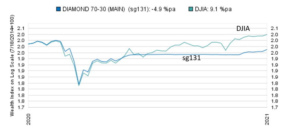
I will use the Diamond sg131 to represent the Diamond sleeve.  Figure 3 below shows the performance of sg131 and the DJIA throughout 2020.  The lines move in tandem from the first of the year to early June.  From June 19 through mid-November, the performance of the model portfolio was flat. 


Figure 3. Performance of DJIA and Diamond (sg131)

I discuss 2020 performance for this sleeve in greater detail below.  


Onyx Sleeve

The Onyx sleeve performed well in 2020. Figure 4 below shows the performance of the Onyx sleeve that is present in Onyx mixes in the Diamond publication.  It also shows the DJIA for comparison. 

 Figure 4. Onyx Sleeve and DJIA Performance


The Onyx sleeve had a return of about 13% for the year, which is very close to its long-term average of 12% (annualized return since January 2000).  Onyx avoided the major losses of the year and outperformed the DJIA. 

Although not shown in Figure 4, the benchmark (“neutral mix,” an equal-weighted mix of the four low-variability ETFs used in this sleeve) for the Onyx sleeve returned 9.9% for the year.  In addition, the sleeve had lower variability and a smaller maximum loss for the year, as shown in Figure 5 below. 

 Figure 5.  Onyx Sleeve Performance Statistics for 2020

The Focused 15 investment approach worked as expected for the Onyx sleeve. Model portfolios that contain the Onyx sleeve outperformed the portfolios that did not contain the Onyx sleeve. I do not offer the Onyx sleeve as a separate model portfolio.  It works best in combination with another sleeve because in strong stock markets, the returns of the Onyx sleeve alone are meager.  

For the balance of the report, I will focus on the DJIA loss-avoiding sleeves as represented by the Diamond sg131 model portfolio.


III. Analysis of 2020 Returns for the DJIA Loss-Avoiding Sleeve

This section discusses the reasons for the 2020 model portfolio performance based on the DJIA loss-avoiding sleeve.  I will use the Diamond sg131 model portfolio to represent this sleeve. 

The conclusions are:

  • The global pandemic produced both a rapid economic contraction and an almost simultaneous massive government-led program to stimulate economic expansion.
  • The two main elements in the DJIA Loss-Avoiding approach performed as expected.
    • The Market Resilience Indexes (MRI) were reasonably responsive in tracking the pricing dynamics of the stock market in 2019 and 2020.
    • While the algorithms that determine the target weights from the current MRI conditions performed as programmed, they missed two points at which the DJIA moved higher because of very positive news events. The approach does not respond to news events – instead, the news must influence stock prices, and the approach detects those influences. In 2020, however, the news events were especially consequential – the government stimulus (end of March) and the announcement of an effective vaccine (early November). These events quickly produced strong returns.

  • While performance of the DJIA loss avoiding sleeve was poor for 2020, I have confidence in the MRI and the algorithms. At this time, I believe the pandemic and responses will not be typical of future economic environments. Rather than considering 2020 as typical year to guide us in the future, I believe that it is better to instead consider the market dynamics of the last 100 years for insights about future dynamics.
  • A change that has been made in response to 2020 is that I am that am judgmentally adjusting Box #2 cash levels, as needed (even outside the regular Friday trading schedule), when a period of Exceptional Macro resilience ends.

A Period of High Resilience Began in late 2019

After declining since early 2018, the Macro MRI began to move higher on October 11, 2019.  This move higher in the Macro MRI coincided with a move higher in the DJIA.  Figure 6 below shows the DJIA price line from January 2019 through the end of January 2021. The large green arrow indicates the beginning of the upleg of the Macro MRI, and the small green arrow indicates the beginning of the period of Exceptional Macro resilience. 

Figure 6. DJIA Price (January 2019 through January 2021) and MRI Direction Changes

These shifts towards increased resilience could reasonably be expected to be the beginning of a strong bull market that could last many quarters.  The Macro MRI had been declining for almost two years and was at a relatively low level compared to its historical levels, which gave it ample upside potential.  The Focused 15 approach navigated the 2019 period reasonably well. 

Focusing just on the 2020 period, the Exceptional Macro ended at the end of January (small red arrow) for the DJIA and many other indexes. The end of the positive Macro MRI occurred in late February (large red arrow).  These shifts represented a rapid deterioration of resilience, which I believe was in response to growing awareness globally of the risk of a pandemic.  The algorithms responded by reducing the target weight for the DJIA-linked ETFs, which reduced subsequent losses.  However, the reduction was not large enough considering the subsequent decline.  I discuss the pace of the 2020 declines in the next section.

Going forward – and this is perhaps the biggest change to the investment process resulting from the 2020 experience – I will issue guidance to reduce allocation to stocks when the Exceptional Macro ends across several indexes.  I will do this by suggesting that subscribers (particularly those who are sensitive to losses) raise Box #2 Cash on the Shares-to-Trade worksheet outside of the regular Friday trading schedule.  I have discussed this in this blog post: 

https://marketresilience.blogspot.com/2021/02/weekly-note-february-3-2021.html


The 2020 DJIA Price Decline Was Rapid, So Was the Recovery

Figure 7 below shows major declines in the DJIA over the last 100 years.  Our investment approach navigated (in historical simulations) the five listed in the upper section quite well.  These declines took from 1.5 to 5.5 years to reach the bottom of the market from the most recent peak. 

Figure 7. Major Declines in the DJIA over the Last 100 Years

The sharp decline of 1987 lasted just three weeks.  Our loss-avoiding approach did not avoid this decline.  The last decline listed is the 2020 decline, which took place over five weeks.  The 2020 decline stands out from all of these declines in that the recovery has been rapid.  After the 2020 decline, it took just 24 weeks for the DJIA to recover to the prior peak.  This recovery is far faster than any of the other declines listed.  


The Micro MRI in 2020

The main purpose of the Micro MRI is to closely track the week-to-week movements of the market and accurately mark important inflection points in the market.  In 2020, the Micro did this reasonably well in the first half of the year as shown in Figure 8 below.  This figure shows the 2020 performance of the DJIA loss-avoiding sleeve (as represented by the Diamond sg131) as the heavy black line, and the DJIA as the dark brown line. Both are in the upper part of the figure and use the scale on the right. 

The figure also shows the Micro MRI (green line).  The Micro MRI is designed to move around a center line, shown as the yellow horizontal line, using the scale on the left.    The points labelled A through I indicate inflection points in the Micro MRI.

The Exceptional Macro is shown as the brown lines at the bottom of the figure.  When they spike up, the Exceptional Macro is present.  The figure does not show the Macro MRI. 

Figure 8. 2020 Performance of DJIA and Diamond (sg131), Plus Select MRI

The declining Micro MRI indicated weak short-term resilience from the beginning of the year (A).  Through the end of January, the presence of the Exceptional Macro (prior to J) and the positive Macro MRI (not shown) caused the algorithms to place a lower weight on the declining Micro MRI. 

Point B (March 20) indicates the bottom of the market, and the Micro MRI did a good job identifying the DJIA price move higher from that point.  The CARES relief act was passed March 27. From B to C, the Micro MRI effectively indicated the path of stock prices. 

The declining Micro from C to D was initially effective.  However, prices moved higher in early July (L) while the Micro continued to decline to D.  The inflection point at D was problematic in that it occurred very close to the center line.  Historically, when that has occurred, subsequent declines have often been abrupt and deep, and the algorithms are programmed not to respond aggressively to the Micro MRI moving higher from a point close to the center line.  That pattern does not always happen, but the declines are typically big enough that the long-term risk and return statistics are better if one does not try to capture the returns.  That is why we see the beginning of the horizontal line for the sg131 performance. 

From D through the end of the year, there were three more peaks in the Micro (E, G, and I).  E and G could have easily been the beginning of a steep price decline that would be more consistent with historical norms.   

Soon after peak G, the Micro declined, but the DJIA moved sharply higher in early November when Moderna announced an effective vaccine. 

There were five peaks in the Micro (A, C, E, G and I) in 2020.  This is a high number; two or three is more typical in a single year.  The MRI are designed to adapt to the market, but the forces in 2020 were too extreme and varied.   

The algorithms did not attempt to pursue these ups and downs in the Micro MRI.  Thus, there was a continuation of the flat performance line for sg131. Not chasing these moves probably helped performance. Had the algorithms attempted to respond to these rapid oscillations, they might have been too late or slow to exploit them, considering our weekly trading discipline.  Once can see that starting with E, the inflection points in the Micro MRI lag those in the DJIA, which makes the algorithms less effective.  Instead, they waited until after H when the rapid Micro MRI oscillations had ended.

The events and market dynamics of 2020 may not be repeated in the future.  I do know that the MRI-related market dynamics are remarkably consistent across the prior 100 years, and I believe it is safer to assume that future will be more like the consistent picture covering 100 years than like 2020.

 end


[1] I suggest a minimum of 3% cash in regular times, which is entered in Box #2 on the Shares-to-Trade worksheet.  In 2020, I provided optional guidance to hold extra cash by increasing the Box #2 Cash in times of heightened market uncertainty for those with short investment horizons.

[2] The Diamond model portfolios make prominent use of the leveraged stock ETF “DDM,” which magnifies the return of the DJIA two times (x2) each day.  In the name of the model portfolio, I indicate the maximum weight of this leveraged ETF using the loss-avoiding signals for the DJIA.  For example, the model portfolio DIAMOND 70-30 – 3 ETFs (sg131) has a maximum of 70% in DDM.  This means that when the DJIA is determined to be most resilient, the portfolio is intended to produce 140% the return of the DJIA each day (positive or negative), all else equal.  This model portfolio is designed to have variability similar to that of the DJIA.  Variability refers to how much the returns go up and down (and is often measured in the investment industry as the annualized standard deviation of weekly returns).  Lower variability is better. 

[3] The model portfolio DIAMOND-ONYX 35-65 MIX – 5 ETFs (sg218) has a maximum of 35% for the DJIA-focused sleeve using DDM and 65% allocated to the Onyx sleeve mentioned above.  This means that when the DJIA is determined to be most resilient, the sleeve will produce 70% the return of the DJIA.  This return is added to the return of the Onyx sleeve.  The DIAMOND-ONYX 35-65 MIX (sg218) is designed to have variability similar to a portfolio with a 60/40 mix of stock and bonds.   I use a Vanguard mutual fund “VBINX” to represent the return and variability of a 60/40 fund.  Since January 2000, VBINX has had a variability of 11%. 


2/03/2021

Weekly Note - February 3, 2021

The Long-term Trend in Prices May be Less Positive


The Exceptional Macro MRI, which is an indicator of longer-term resilience, ceased providing resilience as of last Friday (January 29). Historically, the cessation of Exceptional Macro MRI has meant that the long-term trend of stock price increases is likely to be less steep. The Exceptional Macro ceased for the DJIA but also for several other major indexes.

If you would like a reminder on the terms used – Macro MRI, Exceptional Macro MRI, Micro MRI, and their expected cycles – please see this webpage: https://focused15investing.com/language  

Background


The most important purpose of identifying the periods of exceptional resilience is to identify the beginning of a major upward trend in prices. The Exceptional Macro Market Resilience Index does this effectively. Therefore, the algorithms focus on the beginning of the period, not the end.

The research done for the Focused 15 Investing approach also showed that the end of a period of Exceptional Macro resilience is often followed by a dip in prices lasting a few weeks. Unfortunately, I have not found an effective way to respond to the end of the Exceptional Macro without sacrificing return at other times - while still adhering to the Friday trading schedule.

Beginning in late 2020, I have given the option to subscribers to increase Box #2 Cash (on the Shares-to-Trade worksheet) as soon as the period of Exceptional Macro resilience ends. Responding in this way can avoid some of the major declines identified in figure 1 below.

Figure 1 below shows the performance of the DJIA algorithms since 1990. For clarity, I have not included the DJIA or the upper risk mix for this model portfolio. The periods with the Exceptional Macro MRI are shown as red vertical lines. The key observations are:

  1. The periods of Exceptional Macro resilience are not common – most of the history shown does not have this extra source of resilience.
  2. Returns are indeed higher during the periods of Exceptional Macro resilience. This can be most easily seen in periods A, C, E, F, and G.
  3. Soon after the end of a period of Exceptional Macro resilience (after the red lines end) there is often a dip in returns. This can be most easily seen after periods A, B, D, F, I and J. Period J started and ended just before the March 2020 decline.

      Figure 1. Sample DJIA model portfolio (D5 signal), showing Exceptional Macro


This chart is on a log scale so we can see the declines in the early years. But a log scale also tends to understate the pain associated with declines. The declines after periods I (January 2018) and J (the March 2020) were painful.

Please note that increasing Box #2 Cash is optional. The return and risk of the model portfolios is strong without using this option. Also, while we might have avoided the declines of 2020 by raising cash, my reason for providing this option is because of the dips after periods D, F and I. These are most likely to be the types of losses we can avoid going forward. We may not experience a global event such as the COVID-19 pandemic for many years.

Similar Shifts Seen in Other Indexes

The Exceptional Macro ceased for the S&P500 and the Russell 1000 in addition to the DJIA. All three of are indexes for large US company stocks, so I expect them to move in similar ways in general. But their Exceptional Macros are not always synchronized to the extent that they were this last week.

The cessation of Exceptional Macro occurred for the ETFs “PBD” and “ARKK,” which we use in the add-in sleeves. While these ETFs don’t have long histories, their behavior to date suggests that their MRI are useful in anticipating resilience and performance. I believe the breadths of indexes making the shift decreases the likelihood that the shift is only because of events last week, namely GameStop trading.

In addition, I have been watching for several weeks the buildup of changes within the algorithms leading to this cessation of the Exceptional Macro. Although it seems likely that factors other than Gamestop led to the buildup, it is possible that Gamestop temporarily pushed the markets over a tipping point. I will review the results of this week’s returns to determine if the end of the Exceptional Macro was a one-week event.

A factor that could be important is the status of the Micro MRI, which measures the shortest cycle of resilience. I discuss below how this has influence my decision to suggest a 50% level for Box #2 Cash. We are likely to maintain high levels of Box #2 Cash until the Exceptional Macro re-emerges and/or we begin an upleg in the Micro MRI, which, as discussed in the section below, is still several weeks away.

Increasing Box #2 Cash to 50% Because of Near-term Vulnerability Related to Micro MRI

The reason I selected 50% as the amount for Box #2 Cash instead of a lower amount is that we are still early in the downleg of a Micro MRI cycle. Markets are likely to be more vulnerable to declines over the next several weeks regardless of the condition of the Exceptional Macro.

The Micro MRI has been making a slow peak over the last several weeks and are moving to the downleg of its cycle. For the DJIA, the Micro is at the 66th percentile of levels. All else equal, stock prices are likely to be vulnerable for several more weeks. If the Micro MRI were at lower levels in their cycles and closer to the beginning of their uplegs (e.g., at the 40th percentile or lower, for example), I would have suggested a smaller amount for Box #2 Cash.

In addition, many stock markets around the world have Micro MRIs in similar conditions. Since many of the stock indexes are beginning the downleg of their Micro MRI cycles at high levels, we can expect markets around the world to experience weakness. Also, markets being synchronized is sometimes a warning sign for major global stresses. The following stock market indexes are in the same general condition as the DJIA – their Micro MRI recently formed a peak and is still at a high level in its downleg (at the 60th percentile or higher):
  S&P500
  NASDAQ
  MSCI World Index
  Russell 2000 Small Company Index
  UK Stocks
  Europe Stocks
  Japan Stocks
  Emerging Market Stocks
  Shanghai Composite Stocks

Of course, we have a global pandemic, which is a source of great stress. Its global nature alone may account for the synchronizing economies and stock markets. However, from the perspective of our investment approach, when investors see many markets decline at the same time, the risk of panic selling increases, which tends to deepen the declines. Thus, my selection of 50% for Box #2 Cash.

Consistent with global stress and weak US stock prices, the MRI suggest that the USD will strengthen over the next several weeks. We may see heightened inflation concerns as well.
--