
Summary of My Near-term Suggestions
The scenario I outline for the recovery can help us make up for losses. In a way that is reliable and prudent. The immediate and pressing task is to determine the right course of action over he next week or two.
Jeff Hansen
Jeffrey.Hansen@me.com
Market Update - March 22, 2020
We are in a purposefully induced cardiac arrest in terms of the economy. While most investors are panicking, let’s keep our wits about us and look for attractive buying opportunities. We can navigate the market through this crisis and make sound investment decisions.
The first part of this note summarizes what I view as the most likely path the market will take from here. The second part has my comment about market context and additional background in the key points. I know some subscribers have adhered to the target weights and others have sold out of their stock ETFs during this decline.
PART ONE
The current MRI conditions suggest that a W-shaped market recovery is most likely. It is also the one that seems to fit the current economic situation and is the one that is most cautious. If we prepare for this pattern, we can easily accommodate other types of recovery pattern, which I discuss below, if they occur.
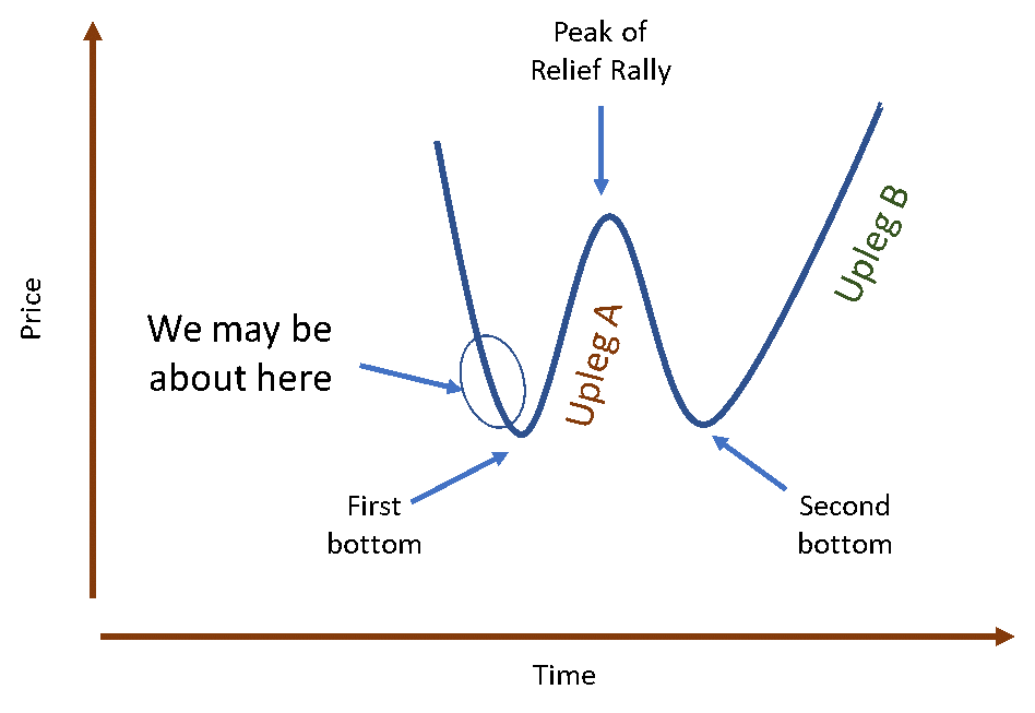
The diagram below represents the “W” pattern of stock price movements. We have had a dramatic drop in prices that is indicated by the first downleg of the W. We may soon be at the first bottom, which I discuss below in the section on valuation. From there, prices move higher when investors begin to see how some relief from the crisis and/or stocks simply become too cheap to not buy. The peak of the relief rally often coincides with a peak in the Micro MRI and the second decline is often precipitated by negative news that the recovery will be slower than hoped. Based on the current MRI conditions, I believe the second bottom will be easier to identify than the first. Also, I cannot determine right now if the second bottom will be higher or lower than the first.

The yellow box says: "Target weights of current model portfolio, or less aggressive." If at all tolerable, stay with the target weights of the model portfolio
The green box says: "Target weights of current model portfolio, or more aggressive"

Should we find that the W-shaped recovery is not relevant, I will describe what is taking place.
The historical simulation for the main signal set driving the model portfolios (D5) shows it has adapted to the various recovery patterns described in a section below. The graph below shows the simulated D5 performance in the green line. The DJIA as the brown line. The graph is on a log scale. You will note that our approach using a weekly trading discipline did not avoid the crash of 1987 (shown in the green box). But the recovery was reasonable. Over all the approach produced strong simulated returns and avoids many of the major losses over this time period.

Slightly Revised Model Portfolio Lineup on Diamond
The most widely used model portfolios have been Diamond (sg131) and Diamond-Onyx Mix (sg218). I have added model portfolios having the same signal sets and ETFs but are more or less aggressive. Whereas in the past, I discouraged switching model portfolios, the new lineup makes that less of an issue. They are similar enough - varying only by aggressiveness - that moving to an adjacent model portfolio is acceptable.
PART TWO
Market Context
The current situation may be analogous to an intentionally inducted cardiac arrest – shutting businesses to allow people to stay home in order to stop the spread of the virus and to prevent overwhelming the medical system. Leaders around the world have stopped the economy and are at the same time are adding stimulants (checks in the mail, extending unemployment insurance, etc.) to resuscitate the economy. There is often a lag between the time the stimulants are administered and when they take effect, so it is important to apply the stimulants as soon as possible. If we think of the stock markets as the heart rate monitor, we can see that the heart is indeed starting to flatline. We wait anxiously until we see that the economic heart restarts.
Of course, these market dynamics are not entirely explained by cycles of resilience, except to say that the spike in coronavirus cases in the US came when the Micro MRI was in the vulnerable part of its cycle.
I believe a case could be made that if we shut down the economy, we should also shut down the stock markets – the decline in the stock market is making many feel like our economic health is getting worse, when the decline is actually part of the cure that has been prescribed to address this non-economic issue (the virus). We rightfully have understood that the stock market generally reflects the value of the future economic returns of publicly traded companies. When the future appears bleak, stock prices decline. But that may not fit this intentional stoppage and investors hate uncertainty.
I believe the global economy will ultimately be resuscitated, but also anticipate that this episode will bring other underlying problems to the surface, such as too much consumer and business debt. Stock market declines and economic stress typically cause unemployment and push companies out of business, which push stock market prices down further. Some of these suspected non-virus problems could be true and might have produced a recession and market declines on their own over a more extended timeframe. But the virus and this intentionally induced economic arrest bring some of them to the forefront and demand solutions in order to resuscitate the economy.
While the current situation is alarming, I want to stress that what we are seeing is an intentionally induced economic arrest with the stimulus happening almost simultaneously. In past market economic and market declines, leaders have been slow to recognize that economic problems as they are occurring.
In addition to these problems, leaders during the Great Depression of the 1930s came forth with the wrong remedies. They selected a remedy that was a tough love approach. In the time I have today, Wikipedia is my source for this quote, (https://en.wikipedia.org/wiki/Great_Depression):
We fear reliving the Great Depression and the 80% decline in the stock market, and it is probably healthy to keep that experience in mind. But I believe this situation is different. We know that metrics commonly used to indicate recessions and depressions will soon spike. We can expect the unemployment rate to go much higher. Bankruptcies will also increase.
But the key driver of this downturn can end when the virus is contained and the resuscitation steps are already being applied. In recessions developing from within the economy, stimulus packages are typically delayed. Considering the delay and natural lag time required for the stimulus to have an impact, the economy suffers more.
The speed of resuscitation is crucial; the longer it takes, the more the economy deteriorates. Each week, thousands of people will be laid off and companies will slip into bankruptcy. While the coming recession could be deeper than usual because of the synchronized massive global shut down, it could be shorter than usual because of the extraordinary stimulus measures taking place around the world.
The DJIA May Be in the Bargain Basement as of Friday March 20, 2020
We can get an idea of how far prices might drop by looking at Friday’s (3/20/2020) valuation of the companies in the DJIA compared to the lowest levels of prior market declines. The most common valuation measure is the Price-to-Earnings ratio. This relates the current price of the companies to their earnings. However, in the current situation, we may not have a lot of confidence in the any assessment of earnings. The recent past may have little relationship to future earnings given the current economic arrest.
Instead, I’ll focus on the Price-to-Book ratio because it is more conservative. This ratio relates stock price to the hard assets of the company. For example, Apple Computer has buildings, machinery, computers, plants, land, etc. The Price-to-Book ratio looks at the current price relative to those hard assets. This is a conservative measure because it does not consider earnings, which can vary over time. In addition, this ratio does not include intangible assets, such as the brand name, that have real value. Because of the Apple brand and the talent of its people, it is probably worth more than a simple sum of its plants and equipment. Thus, the Apple, Nike, and IBM brands have value that is not considered in the Price-to-Book ratio. To get the average value for the DJIA, the individual company ratios are used to create one ratio for the index.
The two charts below show similar information. The first one provides more context for the points, but I include both because the second because it is easier to read and summarizes the main points. The first chart covers the 1995 to the present, and the DJIA is shown by the dark blue line (not on a log scale) and the Price-to-Book ratio in the thin light blue line. The ratio bounces around, but I’d like to focus on the values at the bottom of major declines. Lower values mean that the price for the stocks is low compared to their hard assets. These values have been similar over the last 25 years and range from a high of 3.5 to a low of 2.3. The current value (as of 3/21/2020) is 2.9. This is down from a ratio of 4.4 just a month ago.

By this measure, prices are closer to the bottom than to the top. So, stock prices are getting cheap. This level may be cheap enough that investors will start coming in simply because they are getting good hard assets at a low price. They may not care what earnings are this year or next year. They simply know that these quality companies are likely going to grow and make good use of these hard assets.
Thus, a week ago (what seems like an eternity), I thought prices could go lower. But now, just because these great companies are moving into the bargain basement, I believe that investors will soon come in and start buying.
The chart below is a simpler version that covers 2000 through the present. It plots the DJIA on a log scale and shows the Price-to-Book ratio for the major market price bottoms. Beginning with the major decline in 2009, the Price-to-Book ratios have been 2.3, 2.3, 2.8, and 3.5. After the market has achieve these levels there has been a strong rebound in prices. The average Price-to-Book ratio over the last four March values (2020, 2019, 2018, and 2017) has been 4.0. Thus, the recent price decline has produced valuation (Price-to-Book ratio) levels similar to recent market bottoms.

Don’t Just Do Something, Stand There
In my training videos, I mention a saying I heard at a conference: Don’t Just Do Something, Stand There. This means that in times of crisis or uncertainty, it is often better to NOT make a change. In general, things are not as bad as they seem. People overreact to their fears sending prices far lower than their true value. The valuation comment above is one reason why this saying is relevant. The MRI status is another reason. The Micro MRI and another important MRI (that I don’t often mention), are both at historic lows. Both suggest that there is more likelihood of prices moving higher than lower. If you can stand the short-term pain of additional big price swings due the crisis atmosphere, the current DJIA level may be a fabulous bargain.
As we have found out, trading one’s account requires that you look at your account balance each week, and the decline in that balance has been painful. With the idea that prices will bounce back, it sometimes helps to think of losses as paper losses – yes, the market has placed a low value on the DJIA at the moment, but the market is not making a sound judgment because of the panic. Investors overreact to both good news and bad news. What we are seeing now could easily be an overreaction that will be ultimately be corrected.
The Alphabet of Market Declines and Recoveries
Unless our economy fails to be resuscitated, there will be a recovery. The question becomes, “What will the recovery look like?” You may hear various descriptions of market recoveries using different letters of the alphabet. The description relates to the letters V, L U and W. At the moment, I believe the W pattern is most likely. This section describes this range of market declines and recoveries.
V-shaped Pattern
A few weeks ago (which seems like an eternity) I urged patience because many sharp declines are "V" shaped. When many investors see a negative event, they panic and sell. When the event passes, the markets recover quickly. Prices decline and make a complete recovery and then continue to move higher. The chart below shows 1974, during the oil shocks of that decade.

L-shaped Pattern
The L-shaped patterns pattern is unusual over the last 100 years. The main example is the 1987 crash and subsequent recovery. The DJIA declined abruptly and sharply over the course of a few weeks. I describe in my material on Focused 15 Investing that a decline of this type cannot be avoided using our weekly trading strategy, and that has proven to be the case in the current market decline. After the decline in 1987, price recovery was slow compared to the V-shaped recovery. It took the DJIA roughly two years to surpass the peak of the market before the crash.

U-shaped Pattern
A U-shaped recovery does not have a sharp rebound but ultimately does rebound. An example of this is the 1990 decline.

It may be most prudent to expect a W-shaped recovery. The decline we have already had is the first down-leg of the W. We should soon approach the bottom of the first decline. Then a rebound indicated by the first upleg of the W. I think it is most prudent to assume it is not going to be a completely recover to the price level of, say, a month ago. The peak in the middle of the W is the end of the relief rally. The second downleg typically comes quickly and the bottom can be higher or lower than the first bottom. The following graph shows the Russian Debt Crisis and Long-term Capital Management collapse in 1998.
 If we prepare for the W-shaped recovery, we can easily recognize a shift to a V-shaped one and move forward from there. The shift from W to V can be smooth.
We should soon find out if the recovery is U-shaped. In this case, declines stop but prices do not move up for a while. After some repair of the economy and greater visibility into the future, prices move higher again.
Please contact me with questions or comments.
The scenario I outline for the recovery can help us make up for losses. In a way that is reliable and prudent. The immediate and pressing task is to determine the right course of action over he next week or two.
- If you have a long-term investment horizon, stay with the target weights of the model portfolio you have selected.
- If you have stayed with the target weights of your model portfolio through the decline, try to stay with them. The valuation analysis I discuss below suggests we may be close to a near-term bottom.
- If the pain gets too much for you, reduce the aggressiveness, which I discuss below.
- If you sold some of your stock ETFs (DIA, DDM, UDOW, XLU, or XLP during the decline, I suggest not making any changes until we are at the near-term bottom of the market, which could occur this week or shortly thereafter. I will send out an alert when I think that is upon us.
- Now is not the time to try to be more aggressive than you have been in the past. There will be a better time for a more aggressive portfolio, which I describe below.
- It is most important to be aggressive later on beginning at the second bottom that appears likely at this time. I will alert subscribers and outline a reasonable course of action.
Jeff Hansen
Jeffrey.Hansen@me.com
Market Update - March 22, 2020
We are in a purposefully induced cardiac arrest in terms of the economy. While most investors are panicking, let’s keep our wits about us and look for attractive buying opportunities. We can navigate the market through this crisis and make sound investment decisions.
The first part of this note summarizes what I view as the most likely path the market will take from here. The second part has my comment about market context and additional background in the key points. I know some subscribers have adhered to the target weights and others have sold out of their stock ETFs during this decline.
PART ONE
The current MRI conditions suggest that a W-shaped market recovery is most likely. It is also the one that seems to fit the current economic situation and is the one that is most cautious. If we prepare for this pattern, we can easily accommodate other types of recovery pattern, which I discuss below, if they occur.
The diagram below represents the “W” pattern of stock price movements. We have had a dramatic drop in prices that is indicated by the first downleg of the W. We may soon be at the first bottom, which I discuss below in the section on valuation. From there, prices move higher when investors begin to see how some relief from the crisis and/or stocks simply become too cheap to not buy. The peak of the relief rally often coincides with a peak in the Micro MRI and the second decline is often precipitated by negative news that the recovery will be slower than hoped. Based on the current MRI conditions, I believe the second bottom will be easier to identify than the first. Also, I cannot determine right now if the second bottom will be higher or lower than the first.
As we get to the first bottom, it will be beneficial for you to have your portfolio match the target weights of the model portfolio you have been following thus far. I know some subscribers have sold stocks because the pain of the losses was great. If you can stomach the uncertainty of the coronavirus economic shutdown, I suggest that when I alert you that the first bottom (i.e., the near-term bottom) is upon us, you get back to the target weights of the model portfolio you have been using. If you are having trouble sleeping at night because of the markets and want to reduce the aggressiveness of your portfolio, you have two options.
You can easily change the aggressiveness of your portfolio by increasing the amount of cash you are holding. You do this on the Shares-to-Trade worksheet by increase the value in Box #2 (cash level). This is the percentage of your account that is not invested in the ETFs listed on the sheet.
Alternatively, you can select a less aggressive model portfolio from the weekly publication.
Please see this page for some additional detail on how to change the aggressiveness of your portfolio: LINK
Historically, the MRI framework has been good at identifying the end of relief rallies, such the end of Upleg A. I plan to give special alert outside of the regular weekly publication that the Micro MRI is beginning to indicate a peak.
At the second bottom, it will be very important to resume following the target weights the model portfolio you are comfortable with longer term, or one that is more aggressive. For example, if you followed Diamond (sg131) during the decline, follow Diamond (sg131) after the second bottom. Or, if you have followed Diamond-Onyx Mix 35-65 (sg218) during the recent decline, follow it after the second bottom.
If you want to be more aggressive after the Second Bottom, consider using Diamond-Onyx 50-50 Mix (sg118). The second bottom might be the most important point over the coming months – fully participating in the rebound of the Second Bottom is very important.
Regarding timeframe, based on the normal cycles of the MRI, I would expect the relief rally to end in May (roughly) and the second bottom to occur in May, June, or July. Of course, these are general estimates and we will get more visibility on the situation as we move forward.
Be ready for special alerts, which I describe in a section below. I anticipate being able to alert subscribers early in the week and you can decide how to respond. I believe we get many benefits from sticking to a weekly trading discipline over the long term. But the current unprecedented situation justifies some flexibility on this.
Anticipated Upcoming
Alerts
- Likely First Bottom - At the recent pace of declines, an alert may occur over the next few days. Certainly within a few weeks we will hit the first bottom. Adhere to the target weights of your selected portfolio. The value in Box #2 should be the same or slightly more than what it was on the recent decline. In other words, the aggressiveness of your investment in the stock market should not exceed the aggressiveness of you used during the decline.
- End of First Upleg of the W - If the MRI begin to indicate an inflection point, I will send out an informational alert. I will say in the alert to consider raising the cash level by, say, 20 percentage points. If you typically hold 3%, hold 23% or more. Of course, you may elect to hold more cash and reduce aggressiveness even more.
- Second Bottom – The MRI have successfully identified the situations like the Second Bottom – the Exceptional Macro is specifically designed to indicate this type of inflection point. At that time, make sure you are using the model portfolio you’d like to use over the long term. For those who want to be more aggressive, use the model portfolio to the right of the one you have been using thus far. I will say in the alert to consider reducing cash to your typical minimum, which should be 3-5%.
The yellow box says: "Target weights of current model portfolio, or less aggressive." If at all tolerable, stay with the target weights of the model portfolio
The green box says: "Target weights of current model portfolio, or more aggressive"

Should we find that the W-shaped recovery is not relevant, I will describe what is taking place.
The historical simulation for the main signal set driving the model portfolios (D5) shows it has adapted to the various recovery patterns described in a section below. The graph below shows the simulated D5 performance in the green line. The DJIA as the brown line. The graph is on a log scale. You will note that our approach using a weekly trading discipline did not avoid the crash of 1987 (shown in the green box). But the recovery was reasonable. Over all the approach produced strong simulated returns and avoids many of the major losses over this time period.

The most widely used model portfolios have been Diamond (sg131) and Diamond-Onyx Mix (sg218). I have added model portfolios having the same signal sets and ETFs but are more or less aggressive. Whereas in the past, I discouraged switching model portfolios, the new lineup makes that less of an issue. They are similar enough - varying only by aggressiveness - that moving to an adjacent model portfolio is acceptable.
PART TWO
Market Context
The current situation may be analogous to an intentionally inducted cardiac arrest – shutting businesses to allow people to stay home in order to stop the spread of the virus and to prevent overwhelming the medical system. Leaders around the world have stopped the economy and are at the same time are adding stimulants (checks in the mail, extending unemployment insurance, etc.) to resuscitate the economy. There is often a lag between the time the stimulants are administered and when they take effect, so it is important to apply the stimulants as soon as possible. If we think of the stock markets as the heart rate monitor, we can see that the heart is indeed starting to flatline. We wait anxiously until we see that the economic heart restarts.
Of course, these market dynamics are not entirely explained by cycles of resilience, except to say that the spike in coronavirus cases in the US came when the Micro MRI was in the vulnerable part of its cycle.
I believe a case could be made that if we shut down the economy, we should also shut down the stock markets – the decline in the stock market is making many feel like our economic health is getting worse, when the decline is actually part of the cure that has been prescribed to address this non-economic issue (the virus). We rightfully have understood that the stock market generally reflects the value of the future economic returns of publicly traded companies. When the future appears bleak, stock prices decline. But that may not fit this intentional stoppage and investors hate uncertainty.
I believe the global economy will ultimately be resuscitated, but also anticipate that this episode will bring other underlying problems to the surface, such as too much consumer and business debt. Stock market declines and economic stress typically cause unemployment and push companies out of business, which push stock market prices down further. Some of these suspected non-virus problems could be true and might have produced a recession and market declines on their own over a more extended timeframe. But the virus and this intentionally induced economic arrest bring some of them to the forefront and demand solutions in order to resuscitate the economy.
While the current situation is alarming, I want to stress that what we are seeing is an intentionally induced economic arrest with the stimulus happening almost simultaneously. In past market economic and market declines, leaders have been slow to recognize that economic problems as they are occurring.
In addition to these problems, leaders during the Great Depression of the 1930s came forth with the wrong remedies. They selected a remedy that was a tough love approach. In the time I have today, Wikipedia is my source for this quote, (https://en.wikipedia.org/wiki/Great_Depression):
At the beginning of the Great Depression, most economists
believed in Say's law and
the equilibrating powers of the market, and failed to explain the severity of
the Depression. Outright leave-it-alone liquidationism was
a position mainly held by the Austrian
School.[33] The
liquidationist position was that a depression is good medicine. The idea was
the benefit of a depression was to liquidate failed investments and businesses
that have been made obsolete by technological development to release factors of production (capital
and labor) from unproductive uses so that these could be redeployed in other
sectors of the technologically dynamic economy. They argued that even if
self-adjustment of the economy took mass bankruptcies, then so be it.[33]
Because of the disastrous effects of the tough love approach during the 1930s, today’s remedies that seek to enhance business and personal income continuity. Governments give money to individuals and are backstops for businesses large and small. Thus, indulgent love may sow the seeds of future problems – such as people developing the expectation that if they fail the government will rescue them - but at least the economy can rebound before deep damage is done to the economy as was the case in the 1930s. We fear reliving the Great Depression and the 80% decline in the stock market, and it is probably healthy to keep that experience in mind. But I believe this situation is different. We know that metrics commonly used to indicate recessions and depressions will soon spike. We can expect the unemployment rate to go much higher. Bankruptcies will also increase.
But the key driver of this downturn can end when the virus is contained and the resuscitation steps are already being applied. In recessions developing from within the economy, stimulus packages are typically delayed. Considering the delay and natural lag time required for the stimulus to have an impact, the economy suffers more.
The speed of resuscitation is crucial; the longer it takes, the more the economy deteriorates. Each week, thousands of people will be laid off and companies will slip into bankruptcy. While the coming recession could be deeper than usual because of the synchronized massive global shut down, it could be shorter than usual because of the extraordinary stimulus measures taking place around the world.
The DJIA May Be in the Bargain Basement as of Friday March 20, 2020
We can get an idea of how far prices might drop by looking at Friday’s (3/20/2020) valuation of the companies in the DJIA compared to the lowest levels of prior market declines. The most common valuation measure is the Price-to-Earnings ratio. This relates the current price of the companies to their earnings. However, in the current situation, we may not have a lot of confidence in the any assessment of earnings. The recent past may have little relationship to future earnings given the current economic arrest.
Instead, I’ll focus on the Price-to-Book ratio because it is more conservative. This ratio relates stock price to the hard assets of the company. For example, Apple Computer has buildings, machinery, computers, plants, land, etc. The Price-to-Book ratio looks at the current price relative to those hard assets. This is a conservative measure because it does not consider earnings, which can vary over time. In addition, this ratio does not include intangible assets, such as the brand name, that have real value. Because of the Apple brand and the talent of its people, it is probably worth more than a simple sum of its plants and equipment. Thus, the Apple, Nike, and IBM brands have value that is not considered in the Price-to-Book ratio. To get the average value for the DJIA, the individual company ratios are used to create one ratio for the index.
The two charts below show similar information. The first one provides more context for the points, but I include both because the second because it is easier to read and summarizes the main points. The first chart covers the 1995 to the present, and the DJIA is shown by the dark blue line (not on a log scale) and the Price-to-Book ratio in the thin light blue line. The ratio bounces around, but I’d like to focus on the values at the bottom of major declines. Lower values mean that the price for the stocks is low compared to their hard assets. These values have been similar over the last 25 years and range from a high of 3.5 to a low of 2.3. The current value (as of 3/21/2020) is 2.9. This is down from a ratio of 4.4 just a month ago.

By this measure, prices are closer to the bottom than to the top. So, stock prices are getting cheap. This level may be cheap enough that investors will start coming in simply because they are getting good hard assets at a low price. They may not care what earnings are this year or next year. They simply know that these quality companies are likely going to grow and make good use of these hard assets.
Thus, a week ago (what seems like an eternity), I thought prices could go lower. But now, just because these great companies are moving into the bargain basement, I believe that investors will soon come in and start buying.
The chart below is a simpler version that covers 2000 through the present. It plots the DJIA on a log scale and shows the Price-to-Book ratio for the major market price bottoms. Beginning with the major decline in 2009, the Price-to-Book ratios have been 2.3, 2.3, 2.8, and 3.5. After the market has achieve these levels there has been a strong rebound in prices. The average Price-to-Book ratio over the last four March values (2020, 2019, 2018, and 2017) has been 4.0. Thus, the recent price decline has produced valuation (Price-to-Book ratio) levels similar to recent market bottoms.

It could be that this time is different, but I believe we have declined to a level that might represent the bargain basement for these 30 high quality companies. It may not be wise to reduce aggressiveness dramatically at this time. A slight reduction can be okay if it helps you sleep at night. If you have an investment horizon longer than, say, 7 years, try to stay with the target weights (don’t increase the cash level).
See this link for the companies in the DJIA.
See this link for the companies in the DJIA.
In my training videos, I mention a saying I heard at a conference: Don’t Just Do Something, Stand There. This means that in times of crisis or uncertainty, it is often better to NOT make a change. In general, things are not as bad as they seem. People overreact to their fears sending prices far lower than their true value. The valuation comment above is one reason why this saying is relevant. The MRI status is another reason. The Micro MRI and another important MRI (that I don’t often mention), are both at historic lows. Both suggest that there is more likelihood of prices moving higher than lower. If you can stand the short-term pain of additional big price swings due the crisis atmosphere, the current DJIA level may be a fabulous bargain.
As we have found out, trading one’s account requires that you look at your account balance each week, and the decline in that balance has been painful. With the idea that prices will bounce back, it sometimes helps to think of losses as paper losses – yes, the market has placed a low value on the DJIA at the moment, but the market is not making a sound judgment because of the panic. Investors overreact to both good news and bad news. What we are seeing now could easily be an overreaction that will be ultimately be corrected.
The Alphabet of Market Declines and Recoveries
Unless our economy fails to be resuscitated, there will be a recovery. The question becomes, “What will the recovery look like?” You may hear various descriptions of market recoveries using different letters of the alphabet. The description relates to the letters V, L U and W. At the moment, I believe the W pattern is most likely. This section describes this range of market declines and recoveries.
V-shaped Pattern
A few weeks ago (which seems like an eternity) I urged patience because many sharp declines are "V" shaped. When many investors see a negative event, they panic and sell. When the event passes, the markets recover quickly. Prices decline and make a complete recovery and then continue to move higher. The chart below shows 1974, during the oil shocks of that decade.

The L-shaped patterns pattern is unusual over the last 100 years. The main example is the 1987 crash and subsequent recovery. The DJIA declined abruptly and sharply over the course of a few weeks. I describe in my material on Focused 15 Investing that a decline of this type cannot be avoided using our weekly trading strategy, and that has proven to be the case in the current market decline. After the decline in 1987, price recovery was slow compared to the V-shaped recovery. It took the DJIA roughly two years to surpass the peak of the market before the crash.

U-shaped Pattern
A U-shaped recovery does not have a sharp rebound but ultimately does rebound. An example of this is the 1990 decline.

It may be most prudent to expect a W-shaped recovery. The decline we have already had is the first down-leg of the W. We should soon approach the bottom of the first decline. Then a rebound indicated by the first upleg of the W. I think it is most prudent to assume it is not going to be a completely recover to the price level of, say, a month ago. The peak in the middle of the W is the end of the relief rally. The second downleg typically comes quickly and the bottom can be higher or lower than the first bottom. The following graph shows the Russian Debt Crisis and Long-term Capital Management collapse in 1998.

We should soon find out if the recovery is U-shaped. In this case, declines stop but prices do not move up for a while. After some repair of the economy and greater visibility into the future, prices move higher again.
Please contact me with questions or comments.