As mentioned in last week’s note, the market is primed for a return reversal in response to the declines of the prior several weeks. In this type of return reversal, stock prices stabilize or move higher for a few weeks. In addition, we may see the Micro MRI shift to the upleg of its cycle at the end of May or early June. The Micro MRI for the DJIA was last Friday at the 46th percentile of levels since 1919 and moving lower. Based on its level being close to the midpoint of its range, it may take a few weeks to reach the lower end of the downleg in the Micro MRI.
But these positive signs for the stock market themselves do not indicate the bottom of the stock market. Historically, the bottom of the stock market is best indicated by the Macro MRI shifting to the upleg of its cycle and/or Exceptional Macro MRI appearing.
Please see this link for a discussion of the language I use for the MRI: https://focused15investing.com/language.
You may remember from an earlier note my elaboration of an investment industry adage, “a bull market climbs a wall of worry.” I’d like to give a status report on the current condition of the US stock market that begins with a well-known industry saying, a bull market climbs a wall of worry.
A Bull Market Climbs a Wall of Worry
1. A bull market climbs a wall of worry - This means that during a bull market (when stock prices move higher for long periods), the path to higher stock prices is a slow climb and is never free from worry about company growth, stock valuations, the US dollar, trade wars, wars, politics, etc. If one were to wait until the market is worry-free, one would miss the bull market. The Macro MRI, which indicates the long-term trend, peaked in December 2021 at the 78th percentile of its levels since 1919. In the MRI framework, this peak marked the end of the bull market.
2. After climbing the wall of worry, the bear market jumps out the
window - This
means that once a bear market begins, the market moves down quickly and without
regard for the specifics of the situation. Historical data validate this; bull
markets (slowly climbing the wall of worry) tend to last much longer than bear
markets. For this reason, many say to
just stay invested in the markets for the long term because the markets go up
most of the time, even if the stock market drops 20, 40, 60% or more in a bear
market. Yet, by avoiding the steep
losses, we can achieve better mid- and long-term performance.
Since the beginning of January 2022, the DJIA has declined in price and the Macro MRI has continued in been in the downleg of its cycle. As of last Friday (May 6), the Macro MRI was at the 67th percentile. It would not be unusual for the downleg to end at a level at or below the 40th percentile. From this perspective, it currently appears that this period of low resilience will last a few more months.
I have mentioned in prior notes that I expect the short-term price swings to be muted because the forecasts of the Micro MRI have called for cycles of smaller than usual amplitude. This means that stock prices will not fall as abruptly as they do in typical bear markets. This observation is based on my recent research on the drivers of resilience. I identified when the drivers are biased toward abrupt daily price declines, and when they are biased toward gradual daily price declines.
Of the twenty largest daily price declines since 1900, three of them took place before the historical period I cover, which begins in 1919. Of the remaining seventeen, thirteen (76%) of the largest declines took place when one would objectively, using the finding of the recent research, expect abrupt declines. This includes all the major declines etched in our minds, 1987, 2020 (Covid), 1929 (beginning of Great Depression), 2008 (Global Financial Crisis), and 2000 (the end of the Dot.com) bubble.
Three of the remaining four occurred when the market conditions shifted to being biased to gradual declines but were follow-on declines from a bear market that began in a period biased toward abrupt declines. Two of these large daily declines occurred in 1932, which was a continuation of the abrupt declines that began in 1929. One was in 2001, which was a continuation of the abrupt declines that began in 2000.
Only one of the seventeen largest daily declines occurred during a period expected to have gradual price declines. This is loss in late 1997 related to the Asian debt crisis.
These patterns of the last 100 years have held true for the last four months; we have been in a period biased toward gradual price declines.
3. Valuation tells you what floor the market is on when it jumps into
a bear market - A
high stock valuation means the market is on a high floor and has farther to
fall. A good valuation measure for our
work is the price-to-sales for the DJIA, which is shown for the period 1997
through today. Price-to-sales is shown
by the blue line. The DJIA price is in
black.

The current price-to-sales ratio of 2.24 for the DJIA indicates that the current price of the DJIA is 2.2 times the reported sales of the roughly 30 companies in the DJIA. This is higher than the average level of 1.6 over the time period shown. In general, a high ratio can be justified if sales are widely expected to grow dramatically in the future. But if expectations for future sales growth begin to be viewed as unrealistic, prices decline. This type of euphoria about future sales growth took place in the late 1990s and we can see the ratio increase before 2000. But in roughly 2000, investors came to see these lofty expectations as unrealistic. The price of the DJIA did not move higher over the next few years while sales increased driving the price-to-sales ratio lower. The DJIA price did not move high until after the valuation measure declined to about 1.0 in 2003.
While the price-to-sales ratio has decreased since its peak in May of 2021, it is still at a very high level, and higher than any level prior to the Fall of 2020. For this ratio to go down, sales need to increase or stock prices need to fall. Increasing sales may be difficult at this time. Supply chain woes limit production, inflation eats away at consumer’s purchasing powers, and higher interest rates siphons money into debt financing and away from other expenditures.
It is important to note that low interest rates can allow valuation ratios to be higher than they would be otherwise, which makes comparing valuation ratios from different interest rate environments less reliable. Since we have had low interest rates for the last few years it may not be appropriate to compare them to ratios of the late 1990s when interest rates were higher.
But we can look at how much the ratios declined during the markets characterized by a steeply declining Macro MRI. The valuation levels of notable market tops and bottoms suggest that the current price for the DJIA (i.e., 2.2) is still high.
2000 top: 2.0 2003 bottom: 1.0 Decline of 50%
2007 top: 1.4 2009
bottom: 0.7 Decline of 50%
2018 top: 2.2 2020
bottom: 1.4 Decline of 36%
2021 top: 2.7 Current:
2.2 Decline
of 19%
In the earlier declines, the bottoms of the market had price-to-sales ratio declines of 36-50%. The current level represents a decline of 19%.
This valuation perspective suggests the DJIA has not reached the bottom. This is consistent with the status of the Macro MRI discussed above.
4. The cycles also tell us when the market is ready to become a bull
market and begin to climb the next wall of worry - Consistent with the image of
the wall of worry, we should expect the next bull market to begin while there
is still bad news in the marketplace. We
should not wait for all the bad news to go away before becoming more aggressive. However, we need to focus on the MRI (Macro, Exceptional Macro, and Micro) so we
can avoid being distracted by bad or good news or prices moving higher because
of a return reversal or a shift in to the upleg of the Micro MRI.
There are two ways the Macro MRI ends its downleg and moves higher in a way that signals the beginning of a bull market and that makes it prudent to be more aggressive. The most common over the last 100+ years is for the Exceptional Macro to appear, which signals exceptionally high resilience and foreshadows a later shift in the Macro MRI to the upleg of its cycle. The Exceptional Macro is not close to appearing at this time.
The less common way is for the Macro MRI to turn positive without the appearance of the Exceptional Macro, which happened in 1927 and 1993. The computer models watch for this type of shift each week and I also review the drivers of the Macro MRI to develop the near-term outlook. The drivers of the Macro MRI currently suggest that the greater resilience may develop in early July, as mentioned last week.
I mention
these details as a reminder that we should not be complacent about the lack of
major declines in the DJIA and conclude that the bottom of the market is just around
the corner. We could slip into a period
biased toward more abrupt price declines before the Macro MRI ends its downleg.
The market may start to move more dramatically over the next several weeks and we will probably trade more frequently to position our portfolios for the next phase of the markets.
Performance
The US stock market has declined from December 31, 2021 through last Friday. I have calculated the returns that one would get by following instructions since the beginning of the year for the “main” portfolios for each of the publications. Please see the endnote for a brief comment on the main portfolios. Contact me with questions.
The year-to-date returns as of 5/6/2022 are:
Diamond: -3.0%
Sapphire: -5.0%
These returns compare favorably to the following alternatives:
DJIA: -8.9%
S&P500: -13.1%
NASDAQ: -22.2%
IEF: -11.7% ETF for the US 7-10-year Treasury bond
index, with no leverage
VBINX: -12.9%
a Vanguard Fund that has 60% of its assets in stocks and 40% in bonds
VASGX: -13.5% a Vanguard Fund that has 80% of its assets
in stocks and 20% in bonds
_________________________________________________________
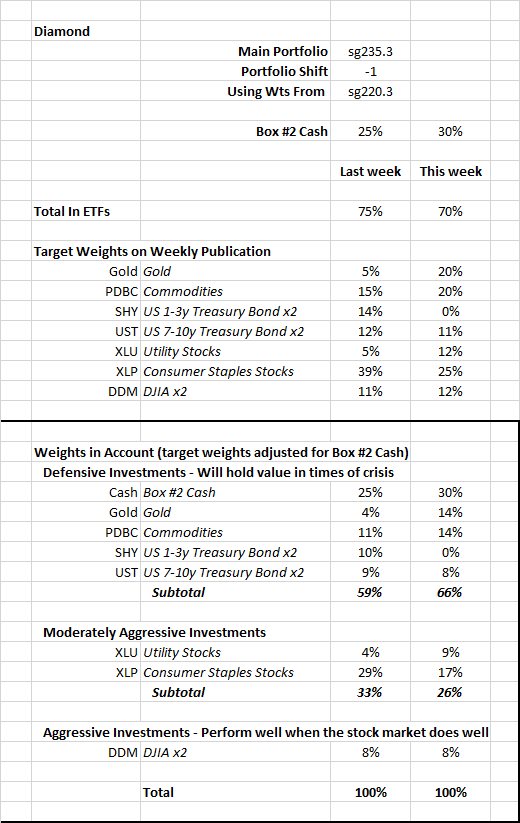
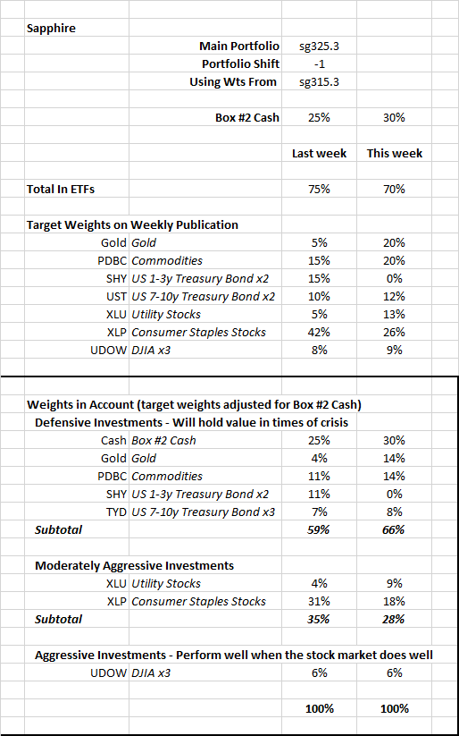
Note – Main Portfolios
The main portfolio in the Diamond publication is sg235. The main portfolio in the Sapphire publication is sg325.
If you use either of these as your long-term portfolio and have followed the instructions since the first of the year by switching to the target weights of a less aggressive portfolio (by adjusting Box #3) and holding Box #2 Cash as instructed, your account’s performance should be close to the figure above.
Some deviation between your account and the numbers above can be expected. The performance figures above assume trading is done at the close of trading on Fridays. Most people trade earlier in the day. In addition, we sometimes trade before Friday. If you use as your long-term portfolio one that is more or less aggressive than the main portfolio, your actual performance will be different.
The figures above are based on the actual ETFs in the model portfolio. The figures in the weekly publication are based on the index that the ETFs track.