6/22/2022

Weekly Note - June 22, 2022

 The MRI suggest the end of the current stock price decline is several weeks away.

This post describes the current level of the DJIA from two perspectives. First, I compare this decline to other major price declines over the last 100+ years. If these past declines are a relevant guide, the depth of the current decline is as severe as the others considered. 

Second, the DJIA’s current valuation measures (Price/Book and Price/Sales) compared to the period from 1993 to the present suggests that prices need to fall further to approach low valuation levels that have been attractive historically. From this perspective as well, the current decline appears to be several weeks away from the end. 

For the last 20+ years, the Fed has stepped in to support economic growth by lowering interest rates when the stock market weakens and the economy begins to falter. However, the Fed is far less likely to lower interest rates in this situation because doing so would, at this time, encourage inflation and fighting inflation is currently the Fed’s primary objective. The MRI don’t tell us if the economy will slip into recession. They indicate market resilience and vulnerability. At this time, the stock market looks very vulnerable to declines. 

The Current Stock Market Decline Compared with Others Over the Past 100+ Years

As of last Friday, we are at week 24 since prices peaked in early January of this year. Compared to major declines over the last 100+ years, the current decline is more severe than prior declines, many of which went on to experience even deeper declines before moving higher. 

Earlier this year, I wrote that 2022 may be similar to the DJIA decline that began in 2000. The collapse of the Dotcom bubble beginning in 2000 most directly affected the NASDAQ stock index, which is biased toward tech stocks. But the collapse also affected the DJIA. The DJIA made a long slow decline from 2000 to 2002 and then dropped again in 2003. During that period the Onyx sleeve consisting of the ETFs XLP (consumer staples stocks), XLU (utilities stocks), and UST (7-10-year Treasury Bonds), and SHY (1-3-year Treasury bonds) performed well.

However, over the last few months, we have seen stronger-than-expected declines in the Onyx sleeve ETFs. Thus, the decline that began in 2000 is not a useful guide for this decline. The broad nature of this decline suggests it could continue for several weeks more. 

Figure One below shows price performance of the DJIA for several declines since 1929, including those beginning after prices peaked on:

  • 1.       9/6/1929
  • 2.       5/3/1937
  • 3.       11/3/1939
  • 4.       1/5/1973
  • 5.       5/29/1981
  • 6.       1/21/2000
  • 7.       10/12/2007
  • 8.       2/14/2020
  • 9.       1/7/2022 - the current decline

The horizontal axis is the number of weeks after the DJIA peaked. The line descends to the lowest point in that decline and is then horizonal from that point until it reaches the scale on the right. All lines start with the value of 1.0. A decline ending at 0.60 on the scale, for example, means a 40% loss of the starting value. The thick green line is the current decline.

Figure One – Nine Major Price Declines Since Early 1929


The line shown by “A” is the decline beginning in 1929. The DJIA declined over a period of 148 weeks, to 7/1/1932, to a value of about 0.13, or 13% of its original value (scale on the right), which means that the DJIA lost about 87% of its value during that decline, definitely a startling loss. 

The line by “B” is the decline that began after the peak in prices on 2/14/2020 and relates to the COVID crash. This decline was even steeper than the early weeks of the 1929 decline. The DJIA took only five weeks to reach the bottom of the 2020 decline. It declined to 65% (scale on right) of the value it had on 2/14/2020, representing a loss of 35%. 

Figure One presents a reasonable comparison for the current decline (shown with the thick green line) showing the depth and duration of major declines since early 1929. Against this backdrop, the current decline has a relatively short duration, which is consistent with the MRI conditions indicating that the bottom of the market is several weeks away. When the bottom of the market does arrive, the DJIA will likely be at a lower level than it is now. 

Excluding the decline starting in 1929, all other declines ended at values between roughly 0.45 and 0.80, representing losses of about 20% to 55%. The current decline for the DJIA, shown by the heavy green line, is just approaching that range with a roughly 17% decline so far. 

For clarity, Figure Two below is the same as Figure One but without the declines beginning in 1929 and 2020. The depth and duration of the 1929 decline should be kept in the back of our minds but we are not likely to have a decline of its scale in the near-term. Policy makers made several mistakes during the 1929 decline, which I referenced in an earlier note. 

The 2020 decline is not applicable to the current decline because it was ended by extraordinary stimulus around the world. Stimulus of that scale seems less likely to occur for this decline because there is recognition that the stimulus implemented to address the 2020 decline may have magnified the inflation challenge we now face, and the Fed has indicated that it will aggressively fight inflation by increasing rates and reducing other measures supportive of the markets. See endnote #1.

Figure Two – Major Declines Excluding 1929 and 2020

The heavy green line in Figure Two (and Figure One) represents the current decline, after prices peaked 1/7/2022. As of last Friday (6/17/2022), we were at week 24 and the DJIA is at 0.83 of its beginning level, which means a 17% loss.  The other declines shown in Figure Two had an average loss of 9% by week 24.  Thus, the current decline is comparatively steep. 

The orange line by “C” is shows the path of the decline that began in 2000, after the Dotcom bubble. Especially over the last few weeks, the market has experienced sharper losses than the 2000 decline. It is no longer reasonable to compare the current decline to the 2000 decline. 

Of the declines shown, the average total decline was 39%, and this may be a reference point to consider for the magnitude of decline that may transpire for the current decline. This is not a forecast, but simply an observation to help frame expectations. 

Valuations Suggest that Prices are Not Yet Low

Figure Three below shows the price of the DJIA (brown, log scale, right) since 1993, along with the Price/Book (purple) and Price/Sales (blue) ratios. Valuation data for earlier dates is not available through my data sources. The current readings are at the far right of the figure. 

All else equal, lower valuation ratios are more attractive for purchasing stocks. After a period of price declines on investor concerns about the future, unusually low valuation ratios entice investors to buy even when the future is questionable. We can see from prior declines the valuation ratios that enticed investors to buy.

The ellipses show the levels of these ratios at the bottom of the major declines of the period from 1993 to the present. In all cases, the current ratios are higher than the levels at the ends of prior declines, suggesting that the current ratios may need to decline further to attract investors. The current level of the Price/Book ratio (purple, left scale) is 4.0. This means that the current price of all companies in the DJIA is four times the sales of all those companies. The average Price/Book value for this entire period is 3.3. The value of this ratio at the bottoms of the prior declines indicated is 3.0 or lower. Thus, the current value is still high by these historical standards. 

The Price/Sales ratio (blue, also on left scale) is currently 2.1, meaning that the price of the DJIA companies is just over twice the sales of those companies. The average Price/Sales value for this entire period is 1.4. For the end of the 2000 decline in 2022, the Price/Sales ratio was about 1.0.  In 2009, it was 0.6. In 2020, the lowest value was 1.4. Thus, the current value is still high by these historical standards. 

The high valuation ratios of the last few years have been more acceptable to investors because interest rates have been low. Low interest rates tend to boost economic growth, and high economic growth justifies high valuation ratios, all else equal. Low interest rates also give the long-term future growth of book value and sales a greater weight in determining the current fair value of a company. But when interest rates move rapidly higher, strong future economic growth is called into question and any growth that does occur in the distant future has less weight in determining current fair price of stocks.  Thus, a sharp move higher in interest rates has these two important effects. 

These forces can cause investors to care much more about the near-term prospects of a company.  Companies with weak near-term earnings but promises of high future growth can be shunned by investors because the rosy future may not materialize as expected. Therefore, indexes that are heavily weighted to companies promising high future growth, like the NASDAQ stock index, can become relatively more vulnerable to price declines. We are seeing this in the performance numbers reported below – the NASDAQ has had greater losses this year than the DJIA. 

While the above material describes the context of the current market, our portfolios are influenced more by the MRI. The MRI indicate that the stock market will continue to be vulnerable to declines for several more weeks. 

Performance

The US stock market has declined from December 31, 2021 through last Friday. I have calculated the returns that one would get by following instructions since the beginning of the year for the “main” portfolios for each of the publications. Please see endnote #2 for a brief comment on the main portfolios. Contact me with questions. 

The year-to-date returns as of 6/17/2022 are:

   Diamond:    -6.3%
   Sapphire:   -8.5%

These returns compare favorably to the following alternatives:
   DJIA:       -16.9%
   S&P500:     -22.3%
   NASDAQ:     -30.7%
   IEF:        -12.4%   ETF for the US 7-10-year Treasury bond index, with no leverage

   VBINX:      -18.9%   Vanguard Fund with 60% of assets in stocks and 40% in bonds
   VASGX:      -19.8%   Vanguard Fund with 80% of assets in stocks and 20% in bonds


end

_________________________________________________________

Endnotes

1 - Well before COVID, we had an extended period of exceptionally low interest rates.  During that period, policy makers around the world tried to get inflation to move higher. The Fed wanted to get inflation up to 2% and was struggling to induce inflation by keeping interest rates exceptionally low. During this period, the prices of many assets went higher. Stocks, bonds, real estate, cryptocurrencies, etc. rose in price. Then COVID came along, and the government added even more stimulus to keep the economy from falling further than it otherwise would. 

Inflation has gone higher – much higher - than policy makers expected.  In response, the government support is being retracted.  Most notably, the Fed is pushing interest rates higher. As rates go higher, all the assets that seemed reasonably priced two years ago are seeming more expensive. Stocks, bonds, real estate, cryptocurrencies, etc. are now moving lower. 

The MRI started to indicate greater market vulnerability in the middle of 2021. From this perspective, a good portion of what we are experiencing was already in motion at that time. The war in Ukraine and the resulting boost in energy prices has added to inflationary pressures but does not appear to be the sole cause of the inflation we are experiencing. The MRI indicate that forces over many years contribute to the current conditions. From this perspective, addressing the weaknesses in the stock market and probably the economy will be a long-term effort. This further supports the view emanating from the MRI that we have several weeks to go before the decline ends. 

2 - Main Portfolios

The main portfolio in the Diamond publication is sg235. The main portfolio in the Sapphire publication is sg325.

If you use either of these as your long-term portfolio and have followed the instructions since the first of the year by switching to the target weights of a less aggressive portfolio (by following the specification for Box #3, i.e., “-1”) and holding Box #2 Cash as instructed, your account’s performance should be close to the figure above. 

Some deviation between your account and the numbers above can be expected. The performance figures above assume trading is done at the close of trading on Fridays.  Most people trade earlier in the day. In addition, we sometimes trade before Friday. If you use as your long-term portfolio one that is more or less aggressive than the main portfolio, your actual performance will be different. 

The figures above are based on the actual ETFs in the model portfolio. The figures in the weekly publication are based on the index that the ETFs track. 

5/11/2022

Weekly Note - May 11, 2022

As mentioned in last week’s note, the market is primed for a return reversal in response to the declines of the prior several weeks.  In this type of return reversal, stock prices stabilize or move higher for a few weeks.  In addition, we may see the Micro MRI shift to the upleg of its cycle at the end of May or early June.  The Micro MRI for the DJIA was last Friday at the 46th percentile of levels since 1919 and moving lower.  Based on its level being close to the midpoint of its range, it may take a few weeks to reach the lower end of the downleg in the Micro MRI.

But these positive signs for the stock market themselves do not indicate the bottom of the stock market. Historically, the bottom of the stock market is best indicated by the Macro MRI shifting to the upleg of its cycle and/or Exceptional Macro MRI appearing. 

Please see this link for a discussion of the language I use for the MRI: https://focused15investing.com/language.   

You may remember from an earlier note my elaboration of an investment industry adage, “a bull market climbs a wall of worry.” I’d like to give a status report on the current condition of the US stock market that begins with a well-known industry saying, a bull market climbs a wall of worry

A Bull Market Climbs a Wall of Worry

1.      A bull market climbs a wall of worry - This means that during a bull market (when stock prices move higher for long periods), the path to higher stock prices is a slow climb and is never free from worry about company growth, stock valuations, the US dollar, trade wars, wars, politics, etc. If one were to wait until the market is worry-free, one would miss the bull market.  The Macro MRI, which indicates the long-term trend, peaked in December 2021 at the 78th percentile of its levels since 1919.  In the MRI framework, this peak marked the end of the bull market. 

2.       After climbing the wall of worry, the bear market jumps out the window - This means that once a bear market begins, the market moves down quickly and without regard for the specifics of the situation. Historical data validate this; bull markets (slowly climbing the wall of worry) tend to last much longer than bear markets.  For this reason, many say to just stay invested in the markets for the long term because the markets go up most of the time, even if the stock market drops 20, 40, 60% or more in a bear market.  Yet, by avoiding the steep losses, we can achieve better mid- and long-term performance. 

Since the beginning of January 2022, the DJIA has declined in price and the Macro MRI has continued in been in the downleg of its cycle.  As of last Friday (May 6), the Macro MRI was at the 67th percentile.  It would not be unusual for the downleg to end at a level at or below the 40th percentile.  From this perspective, it currently appears that this period of low resilience will last a few more months. 

I have mentioned in prior notes that I expect the short-term price swings to be muted because the forecasts of the Micro MRI have called for cycles of smaller than usual amplitude. This means that stock prices will not fall as abruptly as they do in typical bear markets. This observation is based on my recent research on the drivers of resilience. I identified when the drivers are biased toward abrupt daily price declines, and when they are biased toward gradual daily price declines. 

Of the twenty largest daily price declines since 1900, three of them took place before the historical period I cover, which begins in 1919.  Of the remaining seventeen, thirteen (76%) of the largest declines took place when one would objectively, using the finding of the recent research, expect abrupt declines.  This includes all the major declines etched in our minds, 1987, 2020 (Covid), 1929 (beginning of Great Depression), 2008 (Global Financial Crisis), and 2000 (the end of the Dot.com) bubble.   

Three of the remaining four occurred when the market conditions shifted to being biased to gradual declines but were follow-on declines from a bear market that began in a period biased toward abrupt declines.  Two of these large daily declines occurred in 1932, which was a continuation of the abrupt declines that began in 1929.  One was in 2001, which was a continuation of the abrupt declines that began in 2000.

Only one of the seventeen largest daily declines occurred during a period expected to have gradual price declines.  This is loss in late 1997 related to the Asian debt crisis.  

These patterns of the last 100 years have held true for the last four months; we have been in a period biased toward gradual price declines. 

3.     Valuation tells you what floor the market is on when it jumps into a bear market - A high stock valuation means the market is on a high floor and has farther to fall.  A good valuation measure for our work is the price-to-sales for the DJIA, which is shown for the period 1997 through today.  Price-to-sales is shown by the blue line.  The DJIA price is in black. 


The current price-to-sales ratio of 2.24 for the DJIA indicates that the current price of the DJIA is 2.2 times the reported sales of the roughly 30 companies in the DJIA.  This is higher than the average level of 1.6 over the time period shown.  In general, a high ratio can be justified if sales are widely expected to grow dramatically in the future.  But if expectations for future sales growth begin to be viewed as unrealistic, prices decline.  This type of euphoria about future sales growth took place in the late 1990s and we can see the ratio increase before 2000.  But in roughly 2000, investors came to see these lofty expectations as unrealistic. The price of the DJIA did not move higher over the next few years while sales increased driving the price-to-sales ratio lower.  The DJIA price did not move high until after the valuation measure declined to about 1.0 in 2003.    

While the price-to-sales ratio has decreased since its peak in May of 2021, it is still at a very high level, and higher than any level prior to the Fall of 2020.  For this ratio to go down, sales need to increase or stock prices need to fall.  Increasing sales may be difficult at this time.  Supply chain woes limit production, inflation eats away at consumer’s purchasing powers, and higher interest rates siphons money into debt financing and away from other expenditures. 

It is important to note that low interest rates can allow valuation ratios to be higher than they would be otherwise, which makes comparing valuation ratios from different interest rate environments less reliable.  Since we have had low interest rates for the last few years it may not be appropriate to compare them to ratios of the late 1990s when interest rates were higher.

But we can look at how much the ratios declined during the markets characterized by a steeply declining Macro MRI.  The valuation levels of notable market tops and bottoms suggest that the current price for the DJIA (i.e., 2.2) is still high.  

2000 top: 2.0                      2003 bottom: 1.0              Decline of 50%

2007 top: 1.4                      2009 bottom: 0.7              Decline of 50%

2018 top: 2.2                      2020 bottom: 1.4              Decline of 36%

2021 top: 2.7                      Current: 2.2                      Decline of 19%

In the earlier declines, the bottoms of the market had price-to-sales ratio declines of 36-50%.  The current level represents a decline of 19%. 

This valuation perspective suggests the DJIA has not reached the bottom.  This is consistent with the status of the Macro MRI discussed above.  

4.     The cycles also tell us when the market is ready to become a bull market and begin to climb the next wall of worry - Consistent with the image of the wall of worry, we should expect the next bull market to begin while there is still bad news in the marketplace.  We should not wait for all the bad news to go away before becoming more aggressive.  However, we need to focus on the MRI (Macro, Exceptional Macro, and Micro) so we can avoid being distracted by bad or good news or prices moving higher because of a return reversal or a shift in to the upleg of the Micro MRI.    

There are two ways the Macro MRI ends its downleg and moves higher in a way that signals the beginning of a bull market and that makes it prudent to be more aggressive.  The most common over the last 100+ years is for the Exceptional Macro to appear, which signals exceptionally high resilience and foreshadows a later shift in the Macro MRI to the upleg of its cycle. The Exceptional Macro is not close to appearing at this time.   

The less common way is for the Macro MRI to turn positive without the appearance of the Exceptional Macro, which happened in 1927 and 1993. The computer models watch for this type of shift each week and I also review the drivers of the Macro MRI to develop the near-term outlook.  The drivers of the Macro MRI currently suggest that the greater resilience may develop in early July, as mentioned last week.

I mention these details as a reminder that we should not be complacent about the lack of major declines in the DJIA and conclude that the bottom of the market is just around the corner.  We could slip into a period biased toward more abrupt price declines before the Macro MRI ends its downleg.

The market may start to move more dramatically over the next several weeks and we will probably trade more frequently to position our portfolios for the next phase of the markets. 

Performance

The US stock market has declined from December 31, 2021 through last Friday.  I have calculated the returns that one would get by following instructions since the beginning of the year for the “main” portfolios for each of the publications. Please see the endnote for a brief comment on the main portfolios.  Contact me with questions. 

The year-to-date returns as of 5/6/2022 are:

  Diamond:           -3.0%

  Sapphire:           -5.0%

These returns compare favorably to the following alternatives:

  DJIA:                     -8.9%

  S&P500:             -13.1%

  NASDAQ:           -22.2%

  IEF:                     -11.7%   ETF for the US 7-10-year Treasury bond index, with no leverage


  VBINX:               -12.9%   a Vanguard Fund that has 60% of its assets in stocks and 40% in bonds

  VASGX:              -13.5%   a Vanguard Fund that has 80% of its assets in stocks and 20% in bonds


_________________________________________________________


Note – Main Portfolios

The main portfolio in the Diamond publication is sg235. The main portfolio in the Sapphire publication is sg325.

If you use either of these as your long-term portfolio and have followed the instructions since the first of the year by switching to the target weights of a less aggressive portfolio (by adjusting Box #3) and holding Box #2 Cash as instructed, your account’s performance should be close to the figure above. 

Some deviation between your account and the numbers above can be expected.  The performance figures above assume trading is done at the close of trading on Fridays.  Most people trade earlier in the day. In addition, we sometimes trade before Friday.  If you use as your long-term portfolio one that is more or less aggressive than the main portfolio, your actual performance will be different. 

The figures above are based on the actual ETFs in the model portfolio. The figures in the weekly publication are based on the index that the ETFs track. 

4/06/2022

Weekly Note - April 6, 2022

Market Comment

The algorithms call for different weights for the ETFs. The portfolios are positioned for further declines in both the stock and the bond markets.

The upleg in the Micro MRI for the stock market has stalled. Since late December 2021, it has not been making the large swings up and down that we often see; the amplitude of its cycles is muted. I expect this to occur from time to time, and the implication is that declines and gains in the stock market are less extreme. Since 2007, the major stock market declines have occurred during periods when the Micro MRI cycle is NOT muted, which I’ll describe in a future note.

In the section below, I update my comment of last week about, “Higher interest rates may precipitate the end of the counter-trend rally we have seen in stocks over the last few weeks.” In order to get inflation under control, the Fed may have to try extra hard to precipitate meaningful declines in the stock and bond markets.

Update: Higher Interest Rates May Help Precipitate the End of The Counter-Trend Rally

We know that the Fed is concerned about inflation and plans to increase interest rates and to be less supportive of the markets in general. Earlier today, Bill Dudley (president of Federal Reserve Bank of New York from 2009 to 2018 and former vice-chairman of the Federal Open Market Committee) wrote an opinion piece for Bloomberg News with the title: “If Stocks Don’t Fall, the Fed Needs to Force Them.”

Posted below is the opinion piece and a YouTube Bloomberg News interview with Dudley. His main point is that rates will need to go higher in order to reduce inflation. He believes that byproducts of this effort are likely to be more slack in the labor market (a move toward higher unemployment), reduced demand, and tipping the economy into recession.

The MRI have signaled for some time that an economic slowdown is likely. Our portfolios have therefore been defensive for several months. The performance figures show that our portfolios are down a few percentage points since the beginning of the year.

The alternatives listed below (e.g., DJIA, S&P500, VBINX, VASGX) have had larger losses. We are much more defensive than the alternatives listed, which cannot hold cash, so their losses may end up being larger compared to what is possible if the Fed becomes more aggressive in raising rates and reducing the accommodative policies of the last few years.

Performance

The US stock market has declined from December 31, 2021 through last Friday, April, 2022. I have calculated the returns that one would get by following instructions since the beginning of the year for the “main” portfolios for each of the publications. Please see the endnote for a brief comment on the main portfolios.

The year-to-date returns as of 4/1/2022 are:
   Diamond: -2.0%
   Sapphire: -3.2%

These returns compare favorably to these alternatives:
   DJIA: -3.7%
   S&P500: -4.3%
   NASDAQ: -8.7%
   IEF: -7.0% IEF is the ETF for the US 7-10-year Treasury bond index, with no leverage

   VBINX: -5.5% VBINX is a Vanguard Fund that has 60% of its assets in stocks and 40% in bonds
   VASGX: -5.3% VASGX is a Vanguard Fund that has 80% of its assets in stocks and 20% in bonds


If Stocks Don’t Fall, the Fed Needs to Force Them: Bill Dudley
2022-04-06 10:00:09.17 GMT
   By Bill Dudley

(Bloomberg Opinion) -- It’s hard to know how much the U.S.
Federal Reserve will need to do to get inflation under control.
But one thing is certain: To be effective, it’ll have to inflict
more losses on stock and bond investors than it has so far.
Market participants’ heads are already spinning from the
rapid change in the outlook for the Fed’s interest-rate policy.
As recently as a year ago, they expected no rate increases in
2022. Now, they foresee the federal funds rate reaching about
2.5% by the end of this year and peaking at more than 3% in
2023.

Whether that proves right will depend on a number of hard-
to-predict developments. How quickly will inflation come down?
Where will it bottom out as the economy reopens, demand shifts
from services to goods and supply-chain disruptions ease? What
will happen in the labor market, where annual wage inflation is
running at more than 5% and the unemployment rate is on track to
reach its lowest level since the early 1950s within a few
months? Will more people come off the sidelines, boosting the
labor supply? Together with moderating inflation, this could
allow the Fed to stop raising rates at a neutral level of about
2.5%. Or a tightening labor market and stubborn inflation could
force the Fed to be a lot more aggressive.

Among the biggest uncertainties: How will the Fed’s
tightening affect financial conditions, and how will those
conditions affect economic activity? This is central to Fed
Chair Jerome Powell’s thinking about the transmission of
monetary policy. As he put it in his March press conference:
“Policy works through financial conditions. That’s how it
reaches the real economy.”

He’s right. In contrast to many other countries, the U.S.
economy doesn’t respond directly to the level of short-term
interest rates. Most home borrowers aren’t affected, because
they have long-term, fixed-rate mortgages. And, again in
contrast to many other countries, many U.S. households do hold a
significant amount of their wealth in equities. As a result,
they’re sensitive to financial conditions: Equity prices
influence how wealthy they feel, and how willing they are to
spend rather than save.

So far, the Fed’s removal of stimulus hasn’t had much
effect on financial conditions. The S&P 500 index is down only
about 4% from its peak in early January, and still up a lot from
its pre-pandemic level. Similarly, the yield on the 10-year
Treasury note stands at 2.5%, up just 0.75 percentage point from
a year ago and still way below the inflation rate. This is
happening because market participants expect higher short-term
rates to undermine economic growth and force the Fed to reverse
course in 2024 and 2025 — but these very expectations are
preventing the tightening of financial conditions that would
make such an outcome more likely.

Investors should pay closer attention to what Powell has
said: Financial conditions need to tighten. If this doesn’t
happen on its own (which seems unlikely), the Fed will have to
shock markets to achieve the desired response. This would mean
hiking the federal funds rate considerably higher than currently
anticipated. One way or another, to get inflation under control,
the Fed will need to push bond yields higher and stock prices
lower.

   To contact the editor responsible for this story:
   Mark Whitehouse at mwhitehouse1@bloomberg.net

YouTube Dudley Interview

The Bloomberg interview with Dudley in which he provides additional explanation.
   Fed might need to force stocks to fall https://youtu.be/Fiiib9oqTB0


--------------------------

Note – Main Portfolios

The main portfolio in the Diamond publication is sg235. The main portfolio in the Sapphire publication is sg325.

If you use either of these as your long-term portfolio and have followed the instructions since the first of the year by switching to the target weights of a less aggressive portfolio (by adjusting Box #3) and holding Box #2 Cash as instructed, your account’s performance should be close to the figure above.

Some deviation between your account and the numbers above can be expected. The performance figures above assume trading is done at the close of trading on Fridays. Most people trade earlier in the day. In addition, we sometimes trade before Friday. If you use as your long-term portfolio one that is more or less aggressive than the main portfolio, your actual performance will be different.

The figures above are based on the actual ETFs in the model portfolio. The figures in the weekly publication are based on the index that the ETFs track.

3/30/2022

Weekly Note - March 30, 2022

Market Comment

The algorithms call for reducing weight to the DJIA-linked ETFs. This change is consistent with the DJIA’s recent move higher in a counter-trend rally. A counter trend rally means that, while the longer trend of the market is still down, the index price moves higher against that trend. The expectation is that the counter trend rally is temporary, and the market will be more vulnerable to declines over the next few weeks.

The long-term trend of the market became negative (as measured by the Macro MRI beginning the downleg of its cycle) in late November of last year. The timing of that inflection point coincides with when it was expected based on the dynamics of the market from 1940 to 2010. The downleg of the Macro MRI became more pronounced in January. At that time, there were only faint concerns about a war in Ukraine.

Once the Macro MRI is in a downleg, there are typically one or more counter trend rallies before the market reaches the low point of the downleg in the Macro MRI. I expected a counter-trend rally to begin in late January and one did occur at that time, and I designated a Plant season for just one week.

In mid-February, the Exceptional Macro MRIs for commodities and gold indicated strong “buy” signals. There were heightened concerns about inflation at that time, and we moved into the commodity ETF PDBC and the gold ETF GLD.

In late February, Russia invaded Ukraine, and this action resulted in concerns about reduced supply of commodities. This concern added further upward pressure on the prices of PDBC.

Recent Allocations to Commodity ETF PDBC

I mention this background because the investment rationale for holding commodity ETF PDBC shifted over the course of a few weeks. It went from a concern about inflation to a concern about both inflation and supply of key commodities, both of which are likely to cause PDBC to increase in price. With the supply of commodities, especially oil, affected by the war, the returns of PDBC will be more heavily influenced by the status of the war, OPEC, and potential government action to affect oil supply and price, such as releasing oil from the strategic reserves. Our process does not provide any insight into these variables and I thought it best to reduce our exposure to PDBC. I reduced the allocation to PDBC and increased the Box #2 Cash level. 

Because of these concerns, I reduced the allocations to PDBC, and hold more GLD than PDBC. In a prior note, I mentioned that I may use a different ETF for commodities – I am not considering a switch at this time.

Higher Interest Rates May Help Precipitate the End of The Counter-Trend Rally

The stock market has moved sharply higher over the last two weeks. One might wonder if the market will move higher from here.

The Macro MRI for the DJIA is clearly in the downleg of its cycle and is likely to remain that way for several weeks or longer. From this perspective, the period of vulnerability is still present and I believe that we should consider the recent price appreciation as simply a temporary counter-trend rally.

Over the last eighteen months we have seen that government support for the economy has overwhelmed the natural cycles of resilience; the stock market did not decline during periods of vulnerability. However, I believe that there will be less government support going forward if the war stays contained.

Since the beginning of the pandemic, government support has come through stimulus payments and low interest rates. Both forms of stimulus have indeed produced economic growth. Along with that growth we also have a tight labor market and inflation. It is important to remember that the effects of government stimulus continue after the active stimulus has ended. Thus, we will see the positive aspect of stimulus, economic growth, and the negative, inflation, for some time.

The Fed is now speaking as though it will be very aggressive in increasing interest rates. Rate hikes can slow both the economy and inflation. It also means that the stock market is not likely to be buoyed by the low interest rates of the recent past.

When interest rates move higher, bonds decline in price. In the performance section below, you will see the year-to-date performance of two bond ETFs. UST is the ETF used in many of the model portfolios. It has lost about 14% of its value this year. The ETF IEF tracks the same set of bonds as UST (and TYD in Sapphire) but does not use leverage. IEF has lost about 7% this year. Many retirement portfolios have stable allocations to bonds and would have had losses in their bond segments this year. This is reflected in the relatively poor performance of the Vanguard funds VBINX and VASGX, shown below.

From the mid-1980s to the recent period, when the stock market did poorly, bonds tended to do well. Currently however, increasing interest rates that has a negative impact on the performance of both stocks and bonds. The Macro MRIs for both the DJIA and the US 10-year bond index are both clearly in the downlegs of their cycles. Thus, we are holding cash. This has helped our performance.

If the war in Ukraine continues and/or expands, the Fed may reconsider its harsh stance; it may not be as aggressive about raising rates. But at the moment, a more lenient Fed seems unlikely considering the very high inflation readings. Thus, both the DJIA and bonds are likely to follow their cycles of resilience, which means that both are vulnerable to declines.

The Utility stock ETF XLU and the Consumer Staples stock XLP are likely to follow a different path. Their MRI are decidedly more positive. Thus, this week we are shifting assets into those ETFs by reducing Box #2 Cash levels.

This picture – vulnerability for the DJIA and moderate resilience for the Utility- and Consumer Staples-linked ETFs – is most like early 2018 when the market had moderate declines that we want to avoid, but not major declines. I’ll describe this more in a future note.

Performance

The US stock market has declined from December 31, 2021 through last Friday, March 25, 2022. I have calculated the returns that one would get by following instructions since the beginning of the year for the “main” portfolios for each of the publications. Please see the endnote for a brief comment on the main portfolios.

The year-to-date returns as of 3/25/2022 are:

Diamond:       -2.8%
Sapphire:        -3.9%

These returns compare favorably to these alternatives:

DJIA:             -3.6%
S&P500:        -4.4%
NASDAQ:     -9.3%

UST:            -14.5%   UST is the ETF for the US 7-10-year Treasury bond index, with 2x leverage
IEF:               -7.6%   IEF is the ETF for the US 7-10-year Treasury bond index, with no leverage

VBINX:       -5.9%    VBINX is a Vanguard Fund that has 60% of its assets in stocks and 40% in bonds
VASGX:       -5.8%   VASGX is a Vanguard Fund that has 80% of its assets in stocks and 20% in bonds


--------------------------

Note – Main Portfolios

The main portfolio in the Diamond publication is sg235. The main portfolio in the Sapphire publication is sg325.

If you use either of these as your long-term portfolio and have followed the instructions since the first of the year by switching to the target weights of a less aggressive portfolio (by adjusting Box #3) and holding Box #2 Cash as instructed, your account’s performance should be close to the figure above.

Some deviation between your account and the numbers above can be expected. The performance figures above assume trading is done at the close of trading on Fridays. Most people trade earlier in the day. In addition, we sometimes trade before Friday. If you use as your long-term portfolio one that is more or less aggressive than the main portfolio, your actual performance will be different.

The figures above are based on the actual ETFs in the model portfolio. The figures in the weekly publication are based on the index that the ETFs track.

3/10/2022

Weekly Note - March 9, 2022

This note covers:
  1. The performance of accounts that follow the weekly instructions for the main Diamond and Sapphire portfolios since the beginning of the year
  2. Three themes affecting the markets
  3. Outlook and Possible Changes in Theme ETFs

1. Performance – Year-to-Date

The US stock market has declined from December 31, 2021 through last Friday, March 4, 2022.  I have calculated the returns that one would get by following instructions since the beginning of the year. Specifically, if you followed the “main” portfolio in Diamond (sg235) and switched to alternative target weights and held Box #2 Cash as instructed.  

Similarly, if you followed the “main” portfolio in Sapphire (sg325) and switched to alternative weights, etc. as instructed.  These figures are based on the actual ETFs in the model portfolios (in contrast, the figures in the weekly publication are based on the indexes that the ETFs track). 

The returns are:

  Diamond:          -2.6%

  Sapphire:           -3.2%

If you use as your long-term portfolio one that is more or less aggressive than the "main" listed in each publication, your actual performance will be different.  These returns compare favorably with these alternatives:

  DJIA:                    -7.2%

  S&P500:               -8.9%

  NASDAQ:           -14.8%

  VBINX:                -7.1%    VBINX (Vanguard Fund that has 60% of its assets in stocks, 40% in bonds)

  VASGX:               -8.5%    VASGX (Vanguard Fund that has 80% of its assets in stocks, 20% in bonds)

The Vanguard funds appear on the Return-to-Variability charts on the first two pages of the weekly pdf.  You can see that our portfolios have better return and variability characteristics than the Vanguard funds over the time periods shown. 

2. Current Market Themes

Three major themes appear to be affecting the market.

   Theme One – Lower Resilience 

From fall 2021 through to the present, the MRI have indicated decreasing market resilience (greater vulnerability).  In the fall of 2021, the computer models and algorithms reduced aggressiveness of our portfolios, which meant that we moved out of the stock market.  Many of these were false alarms and the stock market moved higher.

As you may remember, the investment process tends to underperform in the late stage of an ascending market and there are numerous false alarms just before a major market decline.  This is an apt description of the last months of 2021. The Macro MRI finally made a clear move to the downleg of its cycle in mid-December and prices subsequently peaked at the end of December.  However, the false alarms suggested that we were in the late stage of the strong ascending market that would be followed by a meaningful decline.

The research I’ve done on developing longer-term forecasts of market resilience has pointed to lower resilience in the coming weeks as well. The longer-term forecast done in December for the first four months of 2022, called for the Micro MRI for the DJIA to make a double dip, which is for the Micro to form one low point (which occurred at the end of January), move higher, and then return to form another low point before moving toward its normal high level.  This happens from time to time and it is happening now, as forecasted in December. The Micro MRI is now in the downleg of a cycle. Unfortunately, this downleg is occurring when there is high inflation, a war in Europe, supplies of commodities are being reduced because of the war, the Fed is poised in raise interest rates, and the Macro MRI is clearly in the downleg of its cycle.   

Since mid-December, the market has moved generally in accordance with the forecasted resilience levels.  If that continues to be true, we can expect additional stock price vulnerability and possibly price declines over the next few weeks.   

In addition, some valuation measures (price-to-sales, price-to-book ratios) suggested that late 2021 might be a period of peak company earnings; the market may have been anticipating a decline in earnings. Thus, both the MRI and the valuation measures suggested future economic weakness. 

The forces in this theme are not part of the computer models or algorithms but they do affect my decisions about Plant/Wait/Harvest designations, the inclusion of theme-related ETFs (such as the current commodity and gold ETFs we currently hold), and Box #2 cash levels.      

    Theme Two – High Inflation

The prevailing narrative during late 2021 was that inflation would be high going forward and the Fed would be forced to increase interest rates. Inflation was moving higher because of Covid recovery spending and very low interest rates.  Commodity prices were indeed moving higher.  The major commodity index (S&P Goldman Sachs Commodity Index) peaked in price in October of 2021 and was somewhat lower at the end of the year, which was consistent with slower economic growth discussed in theme one. 

There was much discussion of when and by how much the Fed would increase rates.  Increasing interest rates would tend to make investors more concerned about the high stock valuation measures that had developed during the Covid stimulus spending and abnormally low rates. The NASDAQ index, which is biased toward growth stocks with high valuations, peaked at the end of November and has had the biggest year-to-date decline mentioned above.   

While stocks can well during periods of high inflation and interest rates over the long term, over the short term, prices often drop in order to achieve valuation levels better suited to higher interest rates.     

   Theme Three – Economic Upheaval Related to Russian Invasion

This theme is new.  The Russian invasion of Ukraine has resulted in higher oil and grain prices.  The commodity ETF “PDBC” has increased by a startling 10.7% in the two weeks since its inclusion (February 18) through today.  That figure includes today’s (March 9, 2022) sharp decline.  While the price of oil is volatile and we can expect sharp moves (both positive and negative), the 10.7% figure is a very sharp move up in only two weeks.  

From Barrons: “Russia is the third-largest producer of petroleum after the U.S. and Saudi Arabia, exporting almost 5 million barrels a day of crude oil in 2020, according to the U.S. Energy Information Administration. Almost half of those exports went to European countries, while 42% went to Asia and Oceania.

    (https://www.barrons.com/articles/russia-oil-imports-ban-crude-prices-51646667317)

In addition, Russia and Ukraine supply 30% of the world’s major grains.

From Time magazine: “Russia and Ukraine together supply nearly a third of the world's wheat and barley exports, which have soared in price since the invasion. The products they send are made into bread, noodles and animal feed around the world.

    (https://time.com/6156160/ukraine-bans-wheat-exports/#:~:text=Russia%20and%20Ukraine%20together%20supply,places%20like%20Egypt%20and%20Lebanon.)

All else equal, higher commodity prices can reduce demand.  This is especially true when energy prices move higher.  People drive less, turn down their thermostats, and companies find alternatives to oil.  In addition, higher commodity prices in general increase inflation readings and therefore encourage the Fed to increase rates.  But, considering that we have open battles in Europe, the Fed is, I believe, less likely to raise rates aggressively out of concerns for helping to tip the country into recession during a time of war. 

One scenario is that the Fed raises rates only slightly and allows economic growth and inflation to be higher than they otherwise would be.  Others include increasing rates and helping to tip the economy into recession. 

3. Outlook and Possible Changes

My current concern in this quickly evolving situation is that theme one – the inherently low resilience of the coming weeks - is not widely recognized.  Low resilience means that when there is bad news the market goes down and stays down; it doesn’t recover quickly or completely.  We may have tipped into a mild recession anyway without theme three (Ukraine).  The price movements of the major stock indexes so far this year generally support the validity of this concern.  In addition, themes two and three seem able to provide several opportunities for bad news to occur. In many past crises, the main event (in this case war in Ukraine) produces follow-on events over the subsequent weeks and months that are themselves bad news for stocks.   

I am therefore increasing the Box #2 Cash to 35%. As mentioned last week, we may see a counter-trend rally over the next week or so, but I believe that it will be fleeting if it does occur. 

Also, the level of Box #2 Cash has remained high since the beginning of the year.  The Plant designation lasted just one week (the beginning of February), but an expected countertrend rally failed to materialize. I anticipate reducing this cash level during the next Plant season.    

I can envision scenarios that would result in us selling the commodity and gold ETFs.  Should we need sell out of them outside the regular Friday trading schedule (most likely on a Tuesday), then I will alert you by email.  

In addition, I am considering:

  • A different ETF for the commodity exposure – one that has less weight in energy and more in agricultural commodities
  • Including the clean energy ETF that we used in the Emerald portfolio, which is starting to move higher after being down for several months. Low carbon energy companies may get a boost in the current situation. 
  • Including an ETF for aerospace and defense companies. Regardless of what happens in Ukraine, there will be more spending on defense in the US, Europe, and Asia.

End

3/01/2022

Weekly Note - March 1, 2022

Portfolios have higher allocations to the gold ETF “GLD” and the commodities ETF “PDBC.”  These ETFs already have or will soon have positive Exceptional Macro MRIs, which means their prices are very resilient.  This MRI condition is consistent with current market dynamics.  Gold tends to do well in times of global stress and/or inflation.  Commodity prices are likely to increase because of sanctions against Russia, a major commodity exporter. 

These are temporary holdings.  The commodity ETF invests primarily in energy (crude oil, gas) and high commodity prices can inhibit growth and further demand for commodities leading to price declines.  As mentioned in prior notes, the algorithms driving our investment in commodities were developed in 2008 and 9.  They have been successful over the years in identifying buy and sell points.  But energy prices are volatile and we can expect the price of the commodity ETF to move up and down.  

From the narrow perspective of the stock markets around the world, the war in Ukraine is coming at an unfortunate time because the natural cycles of resilience are shifting to a more vulnerable phase.  This means that even if there are positive news events related to the conflict, any jump in prices is likely to be temporary.  If there is negative news, prices are likely to fall. 

In more normal times, we would have seen a counter-trend rally over the last four or five weeks and extending for a few more weeks.  A counter-trend rally is a temporary rally in stock prices that would fades as the market resumes a downward trend. In this case, the downward trend began at the end of December 2021 and it likely to continue for a several weeks more. 

The war, inflation concerns, and high stock valuations have weighed on the market and likely subdued the counter-trend rally.  Because of this, we are running out of time for that temporary rally to occur. While a counter-trend rally may still happen, it will be short and difficult to capture without experiencing the subsequent price declines.  

I believe it is unlikely that the markets will shift to a strong positive trend from here.  Investors globally will need time to adjust expectations for growth, interest rates, inflation, and fair stock prices considering geopolitical events.  The upcoming period of vulnerability may induce some panic, which could cause stock prices to drop more than the figure above.  I believe there will be a better time in the future to be aggressive in our portfolios. 

Considering these dynamics, I have reduced portfolio aggressiveness over the last few weeks.  This period of vulnerability is likely to last several weeks. 

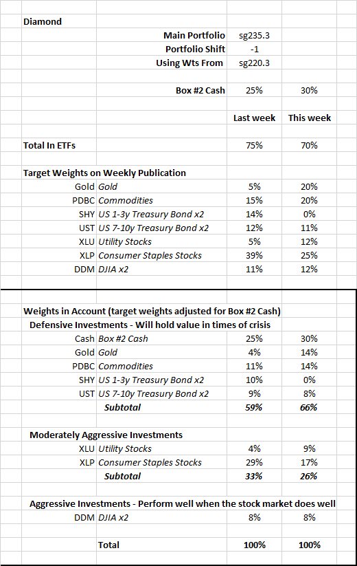
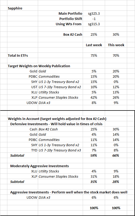
Because of the recent changes in the portfolios and the weekly reports, it may be difficult to get a sense of how defensive the portfolios are.  The tables below show the target weights from last week and new target weights for the ETF; the ETFs are grouped by how they are likely to perform during this crisis and a vulnerable stock market.  There is one table for the Diamond and one for the Sapphire main portfolios.   Don’t be concerned if you don’t follow all the details of the table. The key points of this table are in the highlighted boxes:

  • Our portfolios have been conservative (or Defensive) for the last few weeks
  • This week’s target weights call for:
    • Two-thirds of our accounts are in Defensive ETFs that may move higher in times of crisis, including large weights in gold and commodities.
    • Less than 10% is in Aggressive ETFs
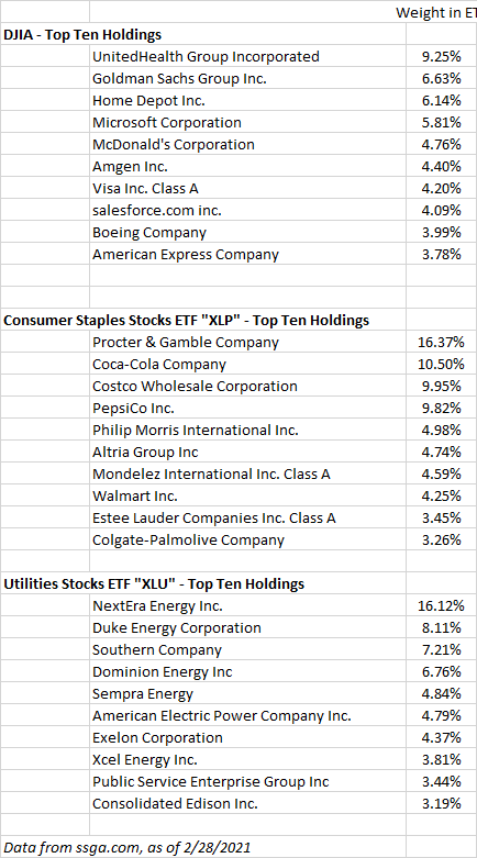
Portfolios have high target weights for the consumer staples ETF XLP. The companies in this ETF tend to be resilient when economic growth slows or inflation is high because they sell everyday needs. A list of the top 10 holdings of this ETF is at the end of this note, along with the holdings of the DJIA-linked and utility stock ETFs. The categories for the ETFs are:

Defensive” ETFs are likely to hold and perhaps increase in value a stock market decline or a crisis such as the current one.

Moderately Aggressive” ETFs may experience losses but will move higher should the stock market declines be small and the Ukraine-related crisis be less severe than it currently appears.

Aggressive” ETFs will move higher on renewed optimism in the stock market.


2/16/2022

Weekly Note - February 16, 2022

Please see this page for the terminology I use to discuss the MRI conditions:  https://focused15investing.com/language

Key observations as of last Friday (2/11/2022):

  • The stock market is likely to be less resilient in the weeks ahead. The DJIA Loss-Avoiding algorithms are signaling greater vulnerability. Less resilience is likely despite the Micro MRI for the DJIA being in the upleg of it cycle and at a low level and poised to move higher.
  • Bond prices are likely to decline further. The Macro MRI indicating the long-term trend for the US 10year bond index shifted to a negative trend, which indicates another drop in bond prices. Because bond prices move down when their yield moves up, declining bond price is consistent with the current condition of the US 10-year yield – its Macro MRI is currently in the upleg of its cycle (at the 61st percentile since 1962). Also, importantly, the Exceptional Macro for the 10-year yield appeared three weeks ago. With the Macro MRI for yields to be at the 61st percentile, it would not be unprecedented for yields to move higher for a few months.
  • Commodities are likely to move higher. As of last Friday, the Exceptional Macro for the SPGS commodities index is now present. This shift was unexpected because the Exceptional Macro had ceased being present at the end of last November and the its end often foreshadows a shift to the downleg of a Macro cycle. However, the Macro is still in its upleg at the 74th percentile since 1974, suggesting that commodity prices could move higher for a few months. With the Macro and Exceptional Macro MRI still providing resilience, commodity prices could be resilient for a few months, regardless of the condition (upleg or downleg) of the Micro MRI.
  • A measure of inflation expectations indicates higher inflation expectations over the next several weeks. I use a ratio of the Global Inflation-Linked Bond Index to the World Government Bond Index as the indicator of inflation expectations, which is a common industry practice. The Micro MRI for this series shifted to the upleg of its cycle as of last Friday and was at the 5th percentile since 1997, which suggests inflation expectations have been relatively low recently and will be higher over the next several weeks. Unfortunately, this index does not go back to the high inflation period of the 1970s and 1980s to capture expectations during that time. But the condition of this series is consistent with bond prices moving lower as the Fed tries to reduce inflation expectations by increasing interest rates.
  • Gold is likely to move higher. The Macro MRI is in the upleg of its cycle and the Micro turned to the upleg of its cycle last Friday (at the 38th percentile of levels since 1976).

The observations mentioned above are consistent with further concerns about inflation and the Federal Reserve increasing interest rates.  Higher inflation expectations can push commodity prices higher.  Fed action to reduce inflation expectations by increasing interest rates could erode support for stock prices. 

Market jitters about how all this plays out can result in gold prices moving higher. In Part III of the pdf, you can see on the Sleeve Profile for gold that its Macro MRI appears to be coming to the end of its recent downleg. Although not shown on the Sleeve Profile, the Exceptional Macro may be present in the next few weeks. If these shifts occur, gold prices will be more resilient.   

Because of these shifts, I have added two ETFs to the portfolios.  PDBC is for a broad basket of commodities. GLD is for gold.  You can see additional information about these ETFs in Part III of this week’s pdf.  I have also imposed limits on the weight of the US 10-year bond ETFs to reduce interest rate sensitivity.

I have allocated 10% of each portfolio to the PDBC sleeve and 15% to the GLD sleeve.  I may change these allocations over time depending on how jittery the markets become. 

As an additional note about commodity prices, in addition to inflation concerns a possible cause of their resurging resilience might be geopolitical tensions. Russia is a major oil exporter and tensions related to Ukraine may be a factor in greater energy price resilience. If this is the case and tensions subside, energy prices may be somewhat less resilient.  Also, if a military conflict takes place, I believe the Fed will be less aggressive about raising interest rates.  

Note about PDBC: Some online information providers (those used by smartphone apps) show incorrect price history for this ETF.  The chart below shows the price history from Bloomberg, which I believe to be correct.