12/08/2021

After Near-Term Recalibration, Stock Market is Likely to Do Well

The markets are likely to go through a process of recalibrating stock and bond prices to accommodate higher inflation, higher interest rates, and a Fed that is less willing to step in with support when the economy or capital markets feel distress. Stock prices may experience downward pressure when faced with higher interest rates but upward pressure with stimulus-induced economic growth. All else equal, downward pressures will result in sharper market declines during a period of unusually low resilience that I expect to begin in December. 

We may find that stimulus-induced strong economic growth more than compensates for the lack of resilience - and we may miss some positive returns if this happens. But our philosophy is to reduce our exposure to stocks when the market is vulnerable. Moving in and out of stocks is cheap and easy to do. We need to be looking ahead to the period after the next Plant season when it is appropriate to be aggressive.

This post discusses the current situation and a possible future condition that will be more economically rational and, I believe, better for the economy, for stocks, and for our portfolios. I believe we need to adjust our thinking to this emerging new reality because parts of it have not been experienced for decades. 

Sharp Minds Expect a Deep Decline in Stock Prices

Jeremy Grantham is a well-respected investor thinks it will be big. Here is a Q and A he had with Reuters in July 2021 (https://www.reuters.com/business/bubbles-bubbles-everywhere-jeremy-grantham-bust-ahead-2021-07-20/):

·  Q: What is your take on equity valuations now?

·  A: Looking at most measures, the market is more expensive than in 2000, which was more expensive than anything that preceded it.

·  My favorite metric is price-to-sales: What you find is that even the cheapest parts of the market are way more expensive than in 2000.

·  Q: What might bring an end to this bubble?

·  A: Markets peak when you are as happy as you can get, and a near-perfect economy is extrapolated into the indefinite future. But around the corner are lurking serious issues like interest rates, inflation, labor and commodity prices. All of those are beginning to look less optimistic than they did just a week or two ago.

·  Q: How long until a bust?

·  A: A bust might take a few more months, and, in fact, I hope it does, because it will give us the opportunity to warn more people. The probabilities are that this will go into the fall: The stimulus, the economic recovery, and vaccinations have all allowed this thing to go on a few months longer than I would have initially guessed.

·  What pricks the bubble could be a virus problem, it could be an inflation problem, or it could be the most important category of all, which is everything else that is unexpected. One of 20 different things that you haven't even thought of will come out of the woodwork, and you had no idea it was even there.

·  Q: What might a bust look like?

·  A: There will be an enormous negative wealth effect, broader than it has ever been, compared to any other previous bubble breaking. It's the first time we have bubbled in so many different areas – interest rates, stocks, housing, non-energy commodities. On the way up, it gave us all a positive wealth effect, and on the way down it will retract, painfully.


I have met Jeremy a few times for one-on-one conversations and have a great deal of respect for him.  He has a strong interest in valuations and has often been early in prior calls for markets to decline.  

I believe it will be a shift in resilience that starts the bubbles to pop. Based on the MRI research, the timing of that period of low resilience is likely upon us now. My theory of what pops the bubble is different than his, and I will discuss it in a future post.

Inflation Is Now Increasing

Inflation has been in the news recently. This month’s inflation reading is expected to indicate that prices have moved up over 6% since last year, the highest rate since 1991.  (https://finance.yahoo.com/news/consumer-price-index-what-to-know-this-week-190934215.html)

I believe there will be higher inflation and that a good case can be made that there should be higher inflation for an extended period, and Powell would probably agree with me on this.

Powell as an Inflation Fighter

Many articles on Powell’s recent reappointment focused on the need to battle inflation, as indicated by headline: “Biden Picks Jerome Powell to Lead the Fed for a Second Term as the US Battles Covid and Inflation.”

(https://www.cnbc.com/2021/11/22/biden-picks-jerome-powell-to-lead-the-fed-for-a-second-term-as-the-us-battles-covid-and-inflation.html)

I believe that the Fed’s efforts to fight excessive inflation are important. They should strive to keep inflation from getting out control as it did in the 1970s. But I also believe the ultimate goal of the Fed and the policy makers around the world will not be extremely low inflation, such as the low levels of the 2008 to 2018 period - but instead a moderate level of inflation. A level of 2 to 4 percent might be more realistic for a protracted period.   

Global Economies Have Recently Confronted Something Worse than Inflation: Deflation

After the global financial crisis in 2008/9, inflation declined so much that the major concern among central banks around the world was not inflation but deflation – where prices decline over time. While this sounds good, it tends to harm economic growth. When consumers get a sense that prices will be lower in the future, they put off purchase to wait for better prices. When they do that, production declines and economic growth slows. Here is an article about deflation and I have included (below) the key passage (https://www.thebalance.com/what-is-deflation-definition-causes-and-why-it-s-bad-3306169):

·  Deflation slows economic growth. As prices fall, people put off purchases. They hope they can get a better deal later. You've probably experienced this yourself when thinking about getting a new cell phone, iPad, or TV. You might wait until next year to get this year's model for less.

·  This puts pressure on manufacturers to constantly lower prices and develop new products. That's good for consumers like you. But constant cost-cutting means lower wages and less investment spending.

For much of the 10-plus years after the global financial crisis, central banks sought to induce inflation and the US Federal Reserve set an inflation target of 2%, annually, which it struggled to achieve. Here is a quote from one of many articles on the topic from 2015 (https://www.cnbc.com/2015/10/13/the-us-is-closer-to-deflation-than-you-think.html.):

·  Nonvoting member James Bullard, who heads the St. Louis Fed, is among those pushing for a rate increase, as he believes policy has helped make “cumulative progress toward committee goals,” as he said in a speech Tuesday.

·  Fed Gov. Lael Brainard, who does have a vote on the FOMC, countered that deflationary pressures argue against an increase.

·  Our economy has made good progress toward full employment, but sluggish wage growth suggests there is some room to go, and inflation has remained persistently below our target,” Brainard said in a speech Monday. “With equilibrium real interest rates likely to remain low for some time and policy options that are more limited if conditions deteriorate than if they accelerate, risk management considerations counsel a stance of waiting to see if the risks to the outlook diminish.

How Inflation Might Be Used to Address Our High Levels of Debt

Inflation is likely to be higher over the coming years not only because of Covid stimulus,  infrastructure, and climate spending, but also because higher inflation addresses a more fundamental problem the US and other countries have. The article below requires a subscription, but I have included key sections below (https://www.bloomberg.com/opinion/articles/2021-11-16/greenspan-s-bond-yield-conundrum-has-returned-to-haunt-markets):

The writer, John Authers, does a good job of laying out a few key points:

  • This chart is from Deutsche Bank’s indefatigable financial historian Jim Reid and goes back to 1800. It compares debt/GDP ratio with real yields defined as the prevailing 10-year rate subtracting the five-year rolling average of inflation:


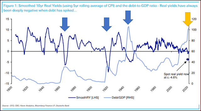
[Note from JHansen: The above chart focuses on just the US. I have added three big blue arrows to indicate the three earlier periods of low real yields (dark blue line labelled “SmoothRY”) and high Debt-to-GDP ratios (light blue line), plus, in yellow, the current period. The key thing to note is the high debt-to-GDP levels under the four arrows. Generally speaking, high levels are bad.]

·  On this view, real yields have been as low as this three times before in the last 200 years: during the U.S. Civil War, the Great Depression, and finally in the aftermath of the Second World War. In all cases, for obvious reasons, debt spiked. That has happened again [yellow arrow, JHansen], although not for reasons as horrific as a war or a depression.

·  The low real yields associated with the Second World War came during a period of explicit “financial repression” when the government held them [real bond yields] low to make it easier to pay off the debts incurred to finance the conflict, and the Fed had to surrender its independence for a matter of years. The Reid hypothesis is that with another epic debt pile to pay off, another episode of financial repression lies in our future. He also suggests that a combination of inflation (to reduce the value of the debt) and repressed yields (to make it cheaper to service) mean that real yields will stay negative for the rest of his career, and that this unenticing option is superior to the alternatives:

·  Financial repression has always won out. The previous debt spikes occurred around the Civil War, WWI and WWII. This latest climb had been steadier (but substantial) until Covid, which may explain why real yields have steadily but consistently declined. However, the economic response to Covid has been more akin to a war time response, with debt and spot real yields both spiking in opposite directions just like that seen around and after the wars discussed above.

·  [W]ithout financial repression, real yields would likely be consistently positive at the moment given the weight of global debt. But given this global debt pile, that would strongly increase the probability of financial crises across the world. So the risk to my “rest of my career” view is that something happens in the years ahead that prevents the authorities using financial repression. If this occurs then the global financial crisis may look like a dress rehearsal for a much bigger event. So the incentives for the authorities are there.

·  Beyond that, a world of financial repression would continue to be a world of TINA, where we are left grudgingly to buy stocks because There Is No Alternative [TINA = There is no alternative. Low yields mean that bonds deliver lower returns to investors. - JHansen]. It’s not appealing, and arguably it’s not really capitalism, but it might be the best way forward. It’s also a worryingly good explanation for the continued low long yields.

Low “real yields” means that the yield on bonds is low compared to the inflation rate, and “long yields” are yields on long term bonds.

"Financial repression" is known to those at the Fed.  Here is quote from a Fed paper on the topic (https://www.richmondfed.org/publications/research/econ_focus/2021/q1/economic_history):

A Tool of Debt Liquidation: In many countries during 1945-1980, financial repression effectively lowered the real returns to government debt holders and helped governments reduce their debt-to-GDP ratios, according to research by Reinhart and M. Belen Sbrancia of the IMF. Based on their calculations, real returns on government debt were negative in many countries over 1945-1980. The real returns to bond holders averaged -0.3 percent in the United States, and real returns were even lower on the bonds of those European governments that had been particularly ardent practitioners of financial repression, coming in at -6.6 percent in France and -4.6 percent in Italy. ... Ever since McKinnon and Shaw, financial repression has been associated with inflation...

Given this discussion, we might expect 1) bond yields and interest rates to increase enough to introduce greater sensitivity to stock valuations over the short term and improve only slightly the long-term return to some bond sectors, 2) interest rates  still low enough to encourage economic growth despite there being elevated inflation. 3) some upward pressure on stock prices because stocks have pricing power and can pass on any their higher costs to their customers, If this does turn out to be the case, investing in stocks will be most beneficial because of TINA – there is no alternative.

One Final Opinion: Expect to “Muddle Through” as Opposed to Expecting a “Crisis to be a Cleanser”

When I started in the investment business years ago, I thought of the economic and stock market cycles as periodic waves of getting rid of the old, inefficient aspects of the economy and allowing new ones to grow. While this rhythm does indeed take place, the periodic purges and sprouting new ways have never been as big as I thought they should have been. It is true that when the housing crisis started in 2007, it seemed that financial leverage and novel ways of packaging investments had become excesses before the crash of 2008, and these excesses were addressed.

When the dot-com bubble inflated in the late 1990s, there was much talk about the extreme valuations of companies with little or no revenue, and the subsequent bust of the bubble addressed those excesses. After the run-away inflation of the 1970s, it was clear that inflation had to be addresses, and Paul Volker increased interest rates and inflation was tamed by the early 1980s.

To be sure, these were major adjustments, but it surprised me at those times just how much of the economy continued and absorbed these changes. It surprised me how much stayed the same.

I think I had in mind the experience of the Great Depression when the stock market dropped about 80-plus percent, the economy in the 1930 was indeed a shambles, and it took years (and probably WWII) to get back on its feet. After that collapse, the economy and the country were completely different in many ways. I think I was expecting change of similar magnitude. But now, I realize that this expectation was unrealistic.

The economic collapse after the 1929 stock market crash was different. At the time the Fed and the government responded with a tough-love approach. There were government and business leaders who expected and maybe even welcomed a cleansing crisis that would abolish the excesses and provide fertile soil for new economic growth. This is a quote from a very interesting Federal Reserve history piece (https://www.federalreservehistory.org/essays/great-depression):

·  A few governors subscribed to an extreme version of the real-bills doctrine labeled “liquidationist.” This doctrine indicated that during financial panics, central banks should stand aside so that troubled financial institutions would fail. This pruning of weak institutions would accelerate the evolution of a healthier economic system. Herbert Hoover’s secretary of treasury, Andrew Mellon, who served on the Federal Reserve Board, advocated this approach.

However, as the article indicates, this view is now considered by the Fed to be a mistake. Instead, during a crisis the Fed should be very benevolent so the economy does not collapse and gets back to growth quickly – economic growth addresses many problems. One need only look at the response to the Covid crisis to see that this mindset still prevails at the Fed and in our broader government, which have been excruciatingly benevolent. But the Fed has concluded, rightly I believe, that addressing the subsequent excesses resulting from benevolence when the economy is stronger is much better than not being benevolent during a crisis.

This means that we will muddle through each crisis and muddle through the effects of the remedies used to prevent economic collapse during each crisis. At present, this means addressing inflation while promoting economic growth and allowing the debt level to shrink in proportion to the growing economy.

I expect the Fed to allow the economy to run “hot,” which means that it will encourage economic growth and allow a moderate level of inflation to take place. Stocks will be likely be the main investment that produces a strong return in these future conditions. Thus, after an initial period of recalibration and potential decline, I expect stocks and to be influenced by the natural cycles of resilience.  

I always pay attention to what Jeremy Grantham says. He may be right about a big decline that results in lower stock valuations.  But even during the collapse of the internet bubble in the early 2000s, the natural cycles of resilience still allowed the MRI-based process to generate good returns. The same was true in the 1970s with its high inflation and the 1980s when inflation was fought. The same was true before and after the stock market peak in 1929.  I expect our portfolios to do well in the environment described above and in other environments that are used to muddle through. The natural cycles persist.  

Again, the implication for us is to get out of the stock market when it is vulnerable and to be ready to participate later in the growing economy, to earn high returns in our portfolios, and to keep well ahead of inflation when markets are resilient.

----------

8/04/2021

Weekly Note - August 4, 2021 - Valuation of the DJIA - Part Two

Last week’s post discussed the current valuation of the DJIA compared to valuations over the last 20+ years (https://marketresilience.blogspot.com/2021/07/weekly-note-july-28-2021-perspective-on.html).

This week’s post discusses alternative interpretation [or interpretations] of today’s high PE valuation. It also points out how our focus on resilience cycles reduces the importance of which view of valuations proves to be most accurate.

Recap of Last Week’s Post

I mentioned last week that valuation ratios have declined since March of 2021, and this might give some investors hope for higher stock prices. The graph below shows the PE ratio for the DJIA in yellow (calculated by Bloomberg using recent 12 months earnings). Price is shown by the black line on a log scale. In general, we want to buy assets – in this case earnings – when price is low and sell when high. Note that the PE ratio has declined since the beginning of April 2021. As the DJIA PE ratio descends from its high level, prices can move higher, all else equal, to approach a PE valuation level that the market has already tolerated.


We are in a period of low interest rates and there is a reasonable expectation for high corporate earnings growth because of massive economic stimulus. These factors allow PE ratio levels to be higher than they otherwise would be. At the moment, investors globally are voting with their dollars and saying that current PE ratios are not a concern and stock prices can continue to move higher as corporate earnings increase. This is an optimistic case for stock prices.

An Alternative View of the Same Chart

A contrary view is that the market – reflecting the collective wisdom of investors globally – believes that earnings will not continue to grow in the future at the same high rate that they have in the recent past – that we are now seeing peak earnings. Therefore, stocks do not justify as high a PE Ratio even though interest rates are still at an extremely low level. Prices may decline as earnings fail to grow as expected and move the PE ratio to a more normal level compared to the last 20+ years. This is a pessimistic case for stock prices.

Thus, multiple conclusions can be drawn from a given PE valuation level or trend in levels. In the context of the Focused 15 Investing approach, we focus on the tug of war between optimistic and pessimistic investor perspectives through the Market Resilience Indexes. When optimism prevails, the MRI tend to be in the uplegs of their cycles, and we tend to be buying stocks. When pessimism prevails, the MRI tend to be in the downlegs of their cycles and we move out of stocks.

A Regular Pattern of Cycles

The cycles between collective optimism and pessimism are regular. The cycles, especially the shortest cycle we discuss, the Micro MRI, are regular like the tides. When the tide comes in it will lift all boats. When it goes out, all boats will drop. With tides, we know pretty accurately when the next tide will be and how high or low it will be. A severe storm can flood coastal areas and push tides higher or lower, but the tidal forces occur at regular intervals. Humans observed these patterns long before they knew what caused the tides.

The Micro and Macro MRI are both in the uplegs of their cycles as of when the Micro switched to its upleg at the end of July. The Macro has been in the upleg of its cycle since early December 2020. At the moment, tidal forces are lifting all boats. Thus, the optimistic view of stock valuations is currently prevailing.

Based on historical norms, the optimistic view should last into September. I project upleg of the short-term cycle (Micro MRI) to end in September. At that time, a more pessimistic view will likely prevail and perhaps high valuations will be the focus of that pessimism. I review what the MRI are saying about the tug-of-war between the optimists and the pessimists, approaching storms, and if the upleg of the Micro MRI cycle might occur earlier or later than expected. At this time, September appears to the next period of reduced resilience (and heightened vulnerability) for stock prices.

Bull Market Climb a Wall of Worry

Our current situation reminds me of a common investment industry adage, “a bull market climbs a wall of worry.” This means that during a bull market, the path to higher stock prices is a slow climb up and is never free from worry about company growth, stock valuations, the US dollar, trade wars, Washington, etc. If one were to wait until the market is worry-free, one would miss an entire bull market. This may describe the current environment. 

Some in the industry add on, “A bear market jumps out the window.” This means that once a bear market begins, the market moves down quickly and without regard for the specifics of the situation. Historical data validate this; bull markets tend to last much longer than bear markets.

Others in the industry add on, “Valuation tells you what floor the bear is on when it jumps.” A high stock valuation means the bear is on a high floor and has farther to fall. My concern is that we are currently on a high floor. If the bear jumps soon, the declines could be large.

I will add, “the cycles of resilience tell you when the bull and bear will start and end their journeys.” Timing is everything. At the moment, we do not have the conditions typical of when the bears jump.

This is way of saying that while I am concerned about high valuations, perhaps my concerns are simply part of the wall of worry. The best way to know where the market is going near term is to track the tug-of-war using the MRI. At the moment, it appears that the optimists will prevail into September.

The broader market dynamics suggest that the next decline will not be a sharp decline for stocks like March 2020, 2008, or 1987. Instead, they suggest a long decline like the that occurred from the beginning of 2000 to the end of 2002. This coincided with the deflating of the Dotcom bubble of the late 1990s, which also was a period of high valuations.

Disciplines are Important

An expected part of managing money – either for institutions, other individuals, oneself – is that one must contend with all the usual fear and greed, plus climbing bulls and jumping bears, and tides and storms. Making investment decisions is challenging at most times. But if one has a disciplined investment approach based on measurable and meaningful dynamics in the markets, one can do well longer term. I believe we have this in the MRI-based investment approach. Through the challenges, adhering to process and discipline will help us deliver attractive returns.

We don’t buy low and sell high on prices or valuations measures. Valuation measures are driven by stock prices, which are greatly influenced by the news of the day. Valuation ratios are also difficult interpret. We take what I believe is a more reliable path; we buy low and sell high on the naturally occurring cycles of resilience tracked by the MRI.

end

7/28/2021

Weekly Note - July 28, 2021 - Perspective on DJIA Valuation - Part One

With the stock market at all-time high price levels, it is a good time to review a common valuation measure to get perspective on the recent past and how the DJIA may move higher from this level. This note covers the average Price-to-Earnings (PE) ratio of the DJIA currently and compared to the 20+ years since the Dotcom boom of the late 1990s.

While still at historically high levels, the PE ratio of the DJIA has declined recently as company earnings have increased. This shift has made the stock market less expensive by this measure and may support the higher market resilience that the MRI are implying for the upcoming several weeks.

All else equal, one wants to buy assets at low prices and sell them at high prices. Consistent with this idea, one wants to buy stocks when the PE ratio is low and sell when it is high. A low PE ratio means that stocks are relatively inexpensive and you are paying less for the company’s earnings, all else equal. A high PE ratio means that stocks are expensive and you are paying more for the company’s earnings.

The diagram below shows the price level of the DJIA (black, on the right log scale) and the PE ratio (yellow, on the left scale, which is calculated by Bloomberg) for the period 8/29/2012 to 7/28/2021. One can see at the far right of the chart that the PE ratio has actually moved down recently as the price of the DJIA has moved higher. The current PE level is 22.19, which is lower than its peak of 26.9 at the end of March 2021 (red arrow). By this measure, the DJIA is getting less expensive and more attractive to buy because corporate earnings are growing more quickly compared to the price of the DJIA.


The recent peak of the PE ratio was very high compared to the last 20+ years. The last time the market had a PE valuation as high as it was in March 2021 was back in the late 1990s, on 8/20/1999. That date is shown in the figure below (yellow arrow) and was at the height of the Dotcom boom, just before the Dotcom bust of the early 2000s. Since the end of 1999, all PE readings for the DJIA have been lower – even through the peak of the DJIA just before the Global Financial Crisis of 2007 to 2009. The figure below shows the PE ratios and DJIA prices beginning in 1997.


Thus, compared to the PE ratio levels since 1999, the March 2021 reading was high. The recent reading of 22.19 is also high compared to the time period shown (Bloomberg does not have comparable PE ratios for earlier periods). That said, the decline of PE ratios since March (due to earnings growth) may help convince investors that current or even higher prices can be sustained.

Other factors influence PE ratios, including expected earnings growth and interest rates. We are experiencing very low interest rates now and there is also a high level of economic stimulus, both of which may accelerate the growth of corporate earnings. These factors are justifying higher valuation ratios for many investors. Although not shown in the figures, investment professionals tracked by Bloomberg expect high earnings growth to continue for companies in the DJIA, potentially leading to even cheaper valuation levels and or higher prices.

The PE ratio and other valuation measures do not directly affect our investment models or algorithms. Instead, investors globally consider PE, many other valuation measures, and expectations for future growth and interest rates in their decisions to buy or sell stocks. The price movements resulting from their decisions in turn affects our resilience measures. An expectation of an increase in interest rates or deceleration of corporate earnings growth would cause investors to be less tolerant of high valuations. Many investors globally are keenly focused on these issues and should they shift to a more pessimistic stance, we should see a shift in the market resilience measures. Based on historical norms for the cycles of resilience, I expect the market to be resilient for several weeks. A period of lower resilience is more likely to occur in the fall (late September).  

end

6/30/2021

Weekly Note - June 30, 2021 - Increasing Box #2 Cash

This post covers:
  • Why we increased Box #2 Cash this week
  • Why increasing cash was done outside of our regular Friday trading schedule
  • Why I selected 70%
  • The magnitude of the potential decline
  • Factors that might affect the magnitude of decline
  • How this event affects a longer-term market outlook
---------------------------------------------------------------

Why we increased Box #2 Cash this week…

I gave guidance this week to increase Box #2 Cash because of a shift in one of the Market Resilience Indexes for the DJIA. The event that caused this change is that the Exceptional Macro MRI ended and ceased to provide resilience last week. This and other market conditions fit the criteria I established for signaling that we should increase the amount of cash in our accounts outside the regular Friday trading schedule.

The Exceptional Macro provides resilience infrequently. Over most periods it is absent. It is designed to appear at the beginning of a strong market rally, which typically occurs just after a major market decline. The appearance of the Exceptional Macro MRI indicates that the Macro MRI is likely to shift to a more positive trend. In many cases, this marks the beginning of a strong and long-lasting period of high returns that last roughly a year for the DJIA. Our algorithms are designed to shift money into the stock market when the Exceptional Macro begins.

After about a year, however, the Exceptional Macro ends and the market often makes an abrupt but brief decline. It is this dip that we hope to avoid at this time.

Why done outside of regular Friday trading schedule…

The end of the Exceptional Macro has been a very good signal for near-term price declines over the last 100 years, but its key drawback is that we must respond to it quickly. Historically, if we wait to trade the following Friday, the losses are not avoided in many cases. Thus, we need to trade early in the week – earlier than Friday - to benefit from this signal.

The historical simulations that I show do not reflect acting on this signal. The performance of the algorithms is strong without responding to this signal. But for those with short time horizons (say, less than 7 years) responding to these circumstances can reduce losses and increase returns.

Another point that favors responding to the signal is that small declines can increase investor anxiety. Anxious investors tend to sell and selling pressure can lead to further declines. Thus, avoiding smaller losses can help us avoid potentially larger losses.

Why I selected 70%...

I suggested increasing Box #2 Cash by an additional 70 percentage points. The 70% is a large move and I decided to make a large move out of the stock market early and move gradually back in the market on our Friday trading schedule, as appropriate.

An alternative to this approach would be to reduce our allocation to stocks more gradually, say, increasing Box #2 Cash by 20% each week. This approach is suited to when there is ambiguity about the signal and the declines are not abrupt, neither of which is not the case in this situation. The signal is clear and the declines associated with these conditions are typically abrupt - taking place over a few weeks. After the decline, the stock market is likely to resume an upward trend, all else equal.

We could start moving back into the market on our regular Friday schedule as early as next week.

The magnitude of the potential decline…

The end of the Exceptional Macro MRI alone could precipitate a decline of about 15%. I mention below other factors that might lead to deeper and shallower declines.

From a purely resilience perspective, the situation as it stands today is not commonly associated with the biggest stock market declines (those down more than 20%). The stock market decline of 2011 is the most recent good example of how quickly the declines can occur.

In 2011, there was a decline of about 15% from July 1 through early August. The recovery began at the end of September. The time of year is similar to today but I see the situations as different and do not look to 2011 as an exact model for how the current situation will play out.

The key point of 2011 is that the decline was sharp – most of the decline took place in about a month – and was big enough to try to avoid. Based on dozens of similar situations over 100 years, my expectation is that the decline, if it occurs, will be abrupt.

Factors that may affect the magnitude of decline…

A factor that may result in a deep decline is currently high stock valuations in the context of rising interest rates. High current stock prices compared to corporate earnings and the book value of company assets may be justified by historically low interest rates. Yet, interest rates are likely to experience more upward pressure over the next few weeks (based on the MRI readings for the US 10-year Treasury bond index). As interest rates rise, the high valuations of stocks may be less justified.

Factors that may result in a shallow decline are, first, ample government stimulus underway contributing to strong post-pandemic economic growth. Since April of 2020 the stock markets have been supported by the expectation of stimulus and high post-pandemic growth. Strong economic growth could more than compensate for higher interest rates, which are likely to remain low by historical norms.

Second, the Micro MRI, indicating the shortest cycle of resilience I typically discuss, is toward the lower end of its normal cycle. As of last week, it was at the 24th percentile of levels since 1918. While it is still in the downleg of its cycle, it may move to the upleg of its cycle in a few weeks.

How this event affects a longer-term market outlook...

Over the last 100 years, the stock market often continues an upward trend after experiencing the abrupt decline associated with this signal. It a few cases, the market has begun a more negative trend. Both paths are reliably managed by the algorithms. Thus, by itself, this event has little bearing on a long-term outlook for the market.

3/17/2021

Weekly Note - March 17, 2021

All major stock markets around the world have strong Macro resilience, indicating that their longer-term price trends are positive.  I expect 2021 to be a year of good stock returns.  The following comments focus on where the different sleeves are in their Micro MRI cycles.  Recall that the Micro MRI indicates the short bursts of resilience lasting 5 to 15 weeks. For a reminder of how I describe the MRI conditions: https://focused15investing.com/language.

The different model portfolios have different positions in their Micro MRI cycles based on their dominant sleeves.  The positions are:

I provide more detailed notes about each below, but a key point is that while the Onyx mix portfolios have not performed as well as the DJIA-focused portfolios so far this year, the Onyx sleeve will soon get its burst of resilience and make up some of this deficit. In 2020, the reverse was true - the Onyx mixes did better than the DJIA-focused portfolios.  While one could switch to a DJIA-focused portfolio at this time (because it is a Plant season for these portfolios), I expect the Onyx mixes to move higher in the next few weeks.  I do not believe the Onyx mixes are broken – they are simply pausing after a strong 2020. 


Detailed Notes (Optional Reading)
  1. The DJIA-focused model portfolio’s such as Diamond 70-30 (MAIN) (sg131) and Sapphire (MAIN) 70-30 (sg188): These portfolios are primarily invested in DJIA-linked ETFs. The DJIA is mid-level and moving higher in its Micro MRI cycle. It is at the 46th percentile. I expect the Micro MRI for the DJIA to be providing resilience well into May. Since it is at the mid-level of its cycle, this week will be its last in the current “Plant” season.
  2. Portfolios incorporating the Onyx sleeve of four low volatility ETFs: This sleeve had a very good year in 2020, but has not produced strong returns this year through last Friday. Thus, the Onyx mix model portfolios look weak compared to the DJIA-focused portfolios. But the Onyx sleeve is just now at the lower end of its Micro MRI cycle. It is at the 12th percentile and started moving higher this last week. From this perspective, the Onyx sleeve should start to have better performance. If you are using one of the Onyx mixes (e.g. sg218, sg118) and are happy with the long-term performance profile of the portfolio, it is appropriate to stay with it. It is likely to produce higher returns over the next few weeks.
  3. 2020 Recovery (sg20.2). This add-in sleeve is at the 36th percentile of its Micro cycle. From this perspective, it is likely to produce good returns over the next several weeks, most likely into May. I will wait until this sleeve is higher in its Micro cycle to update it for 2021 (tentatively called “2021 Themes”).
  4. Emerald (sg30.2). This add-in sleeve is at the 13th percentile and moving lower. Given its low position, I expect it to turn and start moving higher over the next few weeks. The current target weights of this sleeve are defensive and we have avoided some of the recent losses. But I believe the target weights will be more aggressive over the coming weeks and that the returns will be higher.


3/01/2021

Comment of the Day - US 10-year Treasury Yield – Will be less resilient over the next 5 to 15 weeks

As of last Friday (2/26/2021), the Micro Market Resilience Index© for the US 10-year Treasury Yield was very high in its normal cycle.  Projections of the Micro MRI for the 10-year yield suggest that we are probably seeing the strongest resilience of this series at this time.  Thus, the strong move higher last week was not surprising. 

The projections also suggest that yields will have less resilience over the next several weeks.  The Micro MRI indicates a short cycle of resilience lasting 10 to 20 weeks. When the index is in the upleg of its cycle, the series - the 10-year yield in this case - is more resilient and is less likely to decline, all else equal.

The Micro MRI for the 10-year yield is just now completing its upleg.  Based on projections of the MRI from 1962 to 2010, the upleg will be completed March 12 (plus or minus a few weeks). 

When the upleg is completed, the Micro MRI will shift to its downleg.  After that inflection point, yields may decline, not move higher, or move higher much more slowly – based on current economic conditions.  But they are not likely to continue to move higher at the recent pace. 

$IEF $DIA  $UST

2/24/2021

Weekly Note - February 24, 2021

I discuss in this post the MRI conditions of the sleeves used in the various model portfolios. I believe that the current target weights adequately reflect the MRI conditions described.


The algorithms for the DJIA and also the MRI conditions for a number of markets in general indicate it is time to reduce Box #2 Cash for the model portfolios. Please note the new suggested amount on the detail page for each model portfolio in the attached pdf.

See this link for a reminder of the language we use to discuss MRI conditions: https://focused15investing.com/language

The Onyx Sleeve

The Onyx sleeve is a major component of many portfolios. It consists of four low-variability ETFs (consumer staples stocks, utility stocks, US 7-10-year bonds, and US 1-3-year bonds). Each of these ETFs is at the lower end of its Micro MRI cycle and continued to move lower as of last Friday. The Micro MRI levels of these ETFs range from the 15th to the 28th percentiles. These ETFs could easily reach the troughs in their Micro MRI cycles in the next week or so. They will then move to the upleg of their Micro MRI cycles and experience higher resilience and support higher prices.

The DJIA-Focused Loss-Avoiding Sleeve

The DJIA-focused loss-avoiding sleeves are important sleeves in many model portfolios. Model portfolios using these sleeves are listed first in the weekly publications.

As of last Friday, the Micro MRI for the DJIA was at the 40th percentile and still moving lower. At the moment, it looks like it may reach its low point over the next few weeks. After reaching its low point, the Micro MRI will enter its upleg, and thus we can expect the DJIA to be more resilient over the short term, which will support higher prices.

Accordingly, the algorithms have set higher target weights for the DJIA for this Friday. Thus, despite stock prices being at all-time highs and stock valuations being high as well, support for higher prices is likely to increase.

I would feel better about the stock markets globally if there had been large price declines during the current downleg in the Micro MRI cycle. Yet the current economic stimulus intended to overcome the negative effects of the pandemic are massive by historical standards, and a significant price drop has not yet materialized. The time for significant declines rooted in a lack of short-term resilience is passing.

The Exceptional Macro is again present for the DJIA. My guidance for holding extra Box #2 Cash for people sensitive to losses has been driven by the off-and-on nature of the Exceptional Macro over the last several weeks. This pattern is highly unusual by historical standards—but it is understandable, considering high stock valuations and the market’s dependence on the government’s life-support measures.

An important condition to keep in mind is that the Macro MRI for the DJIA is moving higher (i.e., it is in the upleg of its cycle), indicating that the current longer-term trend for DJIA prices is positive. The Macro has declined from an extremely high level at the beginning of 2018 to a low point in late-2020. It is now at the 43rd percentile of levels since 1918 and moving higher, which suggests there is ample room to accommodate further price increases. The returns of the stock market since 2018 have been remarkably good considering the headwind introduced by the negative Macro trend. This condition has been psychologically challenging – at least for me – because we were investing in a stock market that lacks a key component of resilience, its long-term or “Macro” resilience. Because the Macro MRI is now in its upleg (which it has been since December 2020), we are no longer in that situation.

As additional background, while stocks moving higher in a negative Macro MRI environment seems counterintuitive, it has happened before. In the late 1990s, the Macro MRI peaked in early 1997 and declined in an almost uninterrupted fashion until late 1999. However, DJIA prices continued to move higher despite the negative Macro trend and peaked two-and-a-half years later, at the beginning of 2000.

The late 1990s had similar features to what has occurred since 2018. In the late 1990s and now, government stimulus has been an important factor. In the late 1990s, governments made rescue efforts to support the markets and economy related to the Asian and Russian debt crises and the Long-Term Capital Management implosion. The rescue efforts created a benevolent environment for stocks, especially high-tech stocks. The pandemic and residual issues from the 2008 Global Financial Crisis and trade tensions are currently driving even larger rescue efforts.

If we continue with the same pattern of the late 1990s and early 2000s, the NASDAQ might experience losses (after its large gains in both periods) while the DJIA continues to make gains. This potential decline in the NASDAQ (based on this historical precedent) is a key reason that the NASDAQ is not a permanent part of the main model portfolios at this time.

2020 Recovery and Emerald Sleeves

The important ETFs in these sleeves have been moving lower in their Micro MRI cycles for several weeks and are nearing the lower ends of their normal ranges. Specifically, as of last Friday:

      PBD Green Energy was at the 11th percentile in the downleg of its Micro MRI cycle
      ARKK: was at the 30th percentile in the downleg of its Micro MRI cycle.

The Micro MRIs for both are close to their troughs and can be expected to move to the upleg of their cycles over the coming weeks, a move which will provide greater resilience and support for higher prices.

Focusing on the longer price trend for these two ETFs, the Macro MRI (indicating the long-term trends for prices) continues to be in the upleg of its cycle. Thus, it appears that these ETFs will experience support for higher prices for the time being.

In contrast, the NASDAQ’s Micro MRI is at a higher level in its Micro (shorter-term) cycle. Its Micro MRI is at the 64th percentile and continues to move lower. While currently positive and providing resilience, the Macro MRI and Exceptional Macro are historically less reliable for the NASDAQ than they are for the DJIA. The algorithms currently call for a less-than-maximum weight for the NASDAQ ETFs in the sleeves.

Final Comment

There are two potentially related aspects of current market conditions that cause me to be cautious over the mid-term horizon (beginning in roughly May). First, stock valuations are still high by historical standards. I expect that investor concerns about valuations will be first indicated by a deterioration in the Macro MRI, which has not taken place yet. I infer from the current status that government stimulus and a low interest rate environment currently overwhelm investor concerns about valuation. Second, is the on-and-off behavior of the Exceptional Macro. This behavior over the last few months is not typical and may reflect concerns about valuations or other factors. I believe the upcoming period of resilience from the Micro MRI will temporarily reduce these concerns.

Despite these concerns, I believe the major market indexes like the DJIA are performing as expected given their MRI conditions. I also believe that the algorithms are adjusting the target weights in an appropriate manner.

2/10/2021

Weekly Note - February 10, 2021

Micro MRI Projections

Our portfolios have been defensive for several weeks and I’d like to show support for why we have that position.  This is important to understand because the fear of missing out on a strong market often compels people to invest at the END of strong markets, only to experience the market declines. 

One can see factors that could lead to a stock price decline, including currently high valuations of stocks in the context of rising interest rates, and any pandemic-related surprises.  Factors that could lead to continued price increases include unprecedented government stimulus, historically low interest rates, and pent-up demand from the pandemic period. 

 Forecasting how these factors will play out in the future is a challenging effort. Few people can make successful forecasts of these types of forces over time.  With Focused 15 Investing we make investment decisions based on the comparatively predictable force of the inherent resilience of the market.  As I show below, some elements of resilience display reliable cycles that we can take advantage of.  We don’t want to put our money back in a market lacking resilience only to have the sentiment of the market change and experience abrupt losses.  Thus, it is best to make decisions based on resilience.    

For a reminder of the language I use, please see this webpage: 

      https://focused15investing.com/language


Projections for the Micro MRI

Figure 1 shows a projection of the Micro MRI (indicating short-term resilience) through this coming June.

Figure 1.  Project and Actual Micro MRI Levels, Plus recent Price Change for DJIA


This chart shows the period from July 2020 through July 2021.  The brown line shows the actual price level of the DJIA from July 2020 to last Friday (February 5, 2021), where the line stops.  The green line shows the actual Micro MRI used in the investment approach. All my communications in the past relate to the green line.  The orange line is the projected Micro MRI. 

Note that the projections align particularly well with the actual MRI during the recent period, lending credence to the projection analysis.  The clear similarity supports the near-term validity of the projection for the future.  There are deviations, but they are small.  These deviations were caused by current events, which I describe in the Review of 2020 Performance:

         https://marketresilience.blogspot.com/2021/02/review-of-2020-performance.html

This Micro MRI projection (orange line) is based on data from 1940 to 2011.  From other work, I have found that pricing dynamics of the market since the financial crisis in 2007-9 do not contribute a great deal to making forecasts.  I therefore often exclude recent data from analyses.  The 2011 end date is arbitrary; it is 10 years ago.    

If we look at the projection for the next several weeks, we can see that the Micro MRI is likely to continue to move lower, meaning a period of low resilience.[1]  Based on this projection, the Micro MRI will move lower into March.  After it reaches a low point, it will begin the upleg of its cycle and the market will be more resilient.  Since we rotate ETFs based on resilience as indicated by the movement of the MRI, it is not yet time to get back in the market in a major way.  If the market does make a big drop, it will likely do so before the end of March.  Thus, I am not making any change in the level of Box #2 Cash being held. 

As you know the algorithms consider all MRI (Macro, Exceptional Macro, and Micro), plus other factors.  The Macro MRI remain positive and seems to be supporting the market.  The algorithms may respond sooner than the trough in the Micro MRI because of the other factors considered.    


Prices Currently Hugging a Trend Line

Current price action of the DJIA is hugging what I consider to be an important trend line.  The line is formed using Fibonacci analysis.  This condition reinforces being patient right now as a reasonable course of action.  The details of this analysis are not important to cover here, but the main points are:

  • Prices move between and along trend lines that follow consistent rates of return (associated with Fibonacci numbers) over long periods of time. 
  • When prices move closely along (hug) a trend line for several weeks, they are challenging or “testing” that trend line, and may move above or below the line in the next few weeks.
  • When prices break through one of the trend lines (either up or down), they can often make dramatic moves over the next few weeks. 

Please keep in mind that these trend lines are not considered in the algorithms.  Nonetheless, it is relevant to our investment approach. I have found that the prices break through these important trend lines when MRI-related resilience changes.  Figure 2 below adds the trend line to Figure 1. 


Figure 2. Projected Current Resilience and Fibonacci Fan Trend Line


The trend line is blue.  Note how it relates to the DJIA price line (brown).  In late 2020, prices shifted above the trend line after the announcement of an effective vaccine in early November.  Point 1 corresponds to the recent GameStop decline, and prices dropped to the trend line.  While prices (brown line) have rebounded over the last week, bouncing up from the trendline, we still have a few weeks to before getting to higher Micro resilience.  Until then, there is a higher possibility of breaking through the trend line and dropping, say, 10 to 15 %.  

The GameStop drop produced a sharp decline that precipitated, or at least, corresponded to, the end of a period of Exceptional Macro resilience – which I describe in last week’s post:

             https://marketresilience.blogspot.com/2021/02/weekly-note-february-3-2021.html

Historically, once the Exceptional Macro has ceased, it has been better to wait for the trough of the next Micro MRI cycle (the beginning of its upleg) before getting back into the market – EVEN if it reappears a few weeks later.  The Exceptional Macro has returned for the DJIA, but it has ceased for several indexes, which makes me cautious.  At the moment, I believe it is best to keep Box #2 Cash levels where they are right now, and wait for the upcoming trough of the Macro MRI. 

Thus, while the market seems strong right now, it is too soon to become fully invested in the stock market.  I don’t want my subscribers to get in the market just as it decides to be concerned about other factors, such as valuation.  Below is a link to the December research note on valuation.  Valuations are still high by historical standards. 

           https://marketresilience.blogspot.com/2020/12/research-note-stock-market-valuations.html

We may look back and see that being conservative and holding cash caused us to miss out on returns.  But when resilience is higher, we will be much more aggressive.  You do not need to know the information I have presented in last week’s post and this week’s.  But know that I am doing these types of analyses to monitor and assess the reasonableness of the MRI conditions and the actions of the algorithms.   


[1] The picture is consistent with the percentile level I often use to describe the current level of the MRI.  As of last week, the actual Micro MRI was at the 49th percentile of actual levels since 1918, which is visually similar to where it is compared to the upcoming trough of the projected Micro MRI. 


2/08/2021

Review of 2020 Performance

Review of 2020 Performance 

I. Model Portfolios Performance

o   Main Model Portfolios in Diamond Publication

§  Diamond 70-30 (sg131)

§  Diamond-Onyx 35-65 Mix (sg218)

o   Select Model Portfolios in Sapphire Publication

II. Performance of the Building Blocks (Sleeves) of the Model Portfolios

o   DJIA Loss Avoiding Sleeve

o   Onyx Sleeve

III. Analysis of 2020 Performance for the DJIA Loss Avoiding Sleeve

o   A Period of High Resilience Began in Late 2019

o   The 2020 DJIA Price Decline Was Rapid, So Was the Recovery

o   The Micro MRI Oscillated Quickly in 2020

Please see this webpage for a discussion of the terminology used in this report.

                https://focused15investing.com/language


I. Model Portfolio Performance

The table below (Figure 1) shows the performance of the two main model portfolios in the Diamond publications:

  1. Diamond “sg131” – Designed to have a level of variability similar to the DJIA
  2. Diamond-Onyx 35-65 Mix “sg218” – Designed to have variability similar to a mix of 60% stocks and 40% bonds

The performance figures do not incorporate any cash held in accounts associated with the “Box #2 Cash” level that users can determine on their own or using my guidance.[1]  The other model portfolios on the weekly publications have structures similar to these but are either more aggressive or less aggressive.  

Both model portfolios are designed to have a high return-to-variability ratio (RoR/Var).  An attractive return-to-variability ratio is 1.0 or higher over multi-year periods.  Over a period of under a year or so, it is sometimes useful to look at the maximum loss (drawdown) over the period as an alternate measure of variability. 

Figure 1. Performance of the Two Main Model Portfolios in the Diamond Publication


DIAMOND 70-30 (sg131)

The Diamond 70-30 “sg131” model portfolio, listed in row 1 of Figure 1, is designed to have a level of variability about the same as the DJIA.[2]  We can see in column D that the variability of sg131 is 17.20% over the six-plus years since the Focused 15 Investing publication began.  The variability of the DJIA over this six-plus year period is 18.30%, which is reasonably close.  Recall that for variability, lower is better. 

The model portfolio sg131 had a return of -5% for 2020 (column A).  The DJIA (row 3) returned 9% for the same period.  This is an undesirable result for the model portfolio. 

The table also shows that sg131’s maximum loss for 2020 (B) was -34% for the model portfolio.  For the DJIA it was -35%.  From this perspective, the model portfolio met one of its objectives, which is to have a level of variability similar to the DJIA. 

Over the last six-plus years of the Focused 15 Investing publication, the model portfolio returned (C) 13.8% (annualized) compared with 12.2% for the DJIA. It did so with a lower level of variability (D) of 17.2% compared to 18.3% for the DJIA.  The return-to-variability ratio (F) of 0.80 is higher (a good attribute) than that for the DJIA of 0.67.  Long-term, I aim to have a return-to-variability ratio for the model portfolio exceed the reasonable alternative by 0.30.  From this perspective, the poor 2020 return-to-variability for sg131 has caused this ratio to fall below that aim for the six-year period. 

Over a longer term, however, sg131 has strong return-to-variability ratio compared to the DJIA.  Column I shows statistics from January 2000 through the end of 2020.  These return-to-variability statistics are more consistent with the objectives for the model portfolios.  Since 2000, the DJIA experienced declines from 2000 through 2003 and 2007 to early 2009 – both of which occurred at a pace similar to other major declines over the last 100 years – the approach navigated these effectively. In a later section, I show the pace of declines in the major declines of the last 100 years, which underscores the rapid pace of declines in 2020.   


DIAMOND-ONYX 35-65 MIX (sg218)

Diamond-Onyx 35-65 Mix “sg218” model portfolio is designed to have variability close to an alternative that mixes stocks and bonds at the ratio of 60/40.[3]  The Vanguard fund VBINX is a well-known 60/40 fund. 

In 2020, sg218 had a maximum loss of -20%, compared to VBINX’s loss of -22%.  Which is a positive result for sg218. 

However, sg218 performed worse than VBINX in 2020, with a gain of 10% compared to VBINX’s gain of 16%. 

Over the six-plus years through the end of 2020, sg218 had much better returns (C) than VBINX. It returned 13.85%, compared to VBINX’s 9.20%.  The return-to-variability ratio for sg218 is 1.21, compared to 0.86 for VBINX.  This higher ratio is consistent with the performance objective of the model portfolio. 

One might wonder if the Onyx mixes are simply better model portfolios than the DJIA-focused portfolios (e.g., Diamond sg131).  I designed the Onyx mixes in 2013 to have stable returns and to perform well in low and variable interest rate environments.  The Onyx mixes have performed well – with strong and consistent returns – since their inception. 

However, there will be times when the Onyx mix returns are lower than the returns of model portfolios emphasizing only a DJIA-focused sleeve, such as Diamond sg131.  This is evident in the better performance figures for the DJIA-focused portfolios after the 2007-2008 stock market declines associated with the global financial crisis.  In 2009, Diamond sg131 returned 39%, compared to 27% for the Diamond-Onyx Mix sg218.  For comparison, VBINX returned 18% and the DJIA returned 19%. 


SAPPHIRE PUBLICATION

The table below (Figure 2) shows similar information for two model portfolios in the Sapphire publication.  Both mix a DJIA segment (sleeve) and an Onyx sleeve.  These two model portfolios have a structure similar to the Diamond-Onyx Mix sg218, with the biggest difference being the use of the ETF “UDOW” for the DJIA instead of the ETF DDM. 

These model portfolios are designed for subscribers with long investment horizons and are more aggressive than the Diamond model portfolios.  The Sapphire portfolios have higher returns and variability measures.  The portfolios are designed to have an attractive return-to-variability ratio, which is a ratio greater than 1.0. 

Figure 2. Performance of Two Model Portfolios in the Sapphire Publication


The Sapphire-Onyx mix portfolios underperformed the DJIA in 2020, as shown in column A.  But the longer-term returns are quite a bit higher, as show in columns C and G.  The return-to-variability ratios are also more consistent with longer term return-to-variability objectives for Focused 15 Investing model portfolios (columns F and I). 


II. Performance of Important Building Blocks (Sleeves) of the Model Portfolios

DJIA Loss Avoiding Sleeve

I will use the Diamond sg131 to represent the Diamond sleeve.  Figure 3 below shows the performance of sg131 and the DJIA throughout 2020.  The lines move in tandem from the first of the year to early June.  From June 19 through mid-November, the performance of the model portfolio was flat. 


Figure 3. Performance of DJIA and Diamond (sg131)

I discuss 2020 performance for this sleeve in greater detail below.  


Onyx Sleeve

The Onyx sleeve performed well in 2020. Figure 4 below shows the performance of the Onyx sleeve that is present in Onyx mixes in the Diamond publication.  It also shows the DJIA for comparison. 

 Figure 4. Onyx Sleeve and DJIA Performance


The Onyx sleeve had a return of about 13% for the year, which is very close to its long-term average of 12% (annualized return since January 2000).  Onyx avoided the major losses of the year and outperformed the DJIA. 

Although not shown in Figure 4, the benchmark (“neutral mix,” an equal-weighted mix of the four low-variability ETFs used in this sleeve) for the Onyx sleeve returned 9.9% for the year.  In addition, the sleeve had lower variability and a smaller maximum loss for the year, as shown in Figure 5 below. 

 Figure 5.  Onyx Sleeve Performance Statistics for 2020

The Focused 15 investment approach worked as expected for the Onyx sleeve. Model portfolios that contain the Onyx sleeve outperformed the portfolios that did not contain the Onyx sleeve. I do not offer the Onyx sleeve as a separate model portfolio.  It works best in combination with another sleeve because in strong stock markets, the returns of the Onyx sleeve alone are meager.  

For the balance of the report, I will focus on the DJIA loss-avoiding sleeves as represented by the Diamond sg131 model portfolio.


III. Analysis of 2020 Returns for the DJIA Loss-Avoiding Sleeve

This section discusses the reasons for the 2020 model portfolio performance based on the DJIA loss-avoiding sleeve.  I will use the Diamond sg131 model portfolio to represent this sleeve. 

The conclusions are:

  • The global pandemic produced both a rapid economic contraction and an almost simultaneous massive government-led program to stimulate economic expansion.
  • The two main elements in the DJIA Loss-Avoiding approach performed as expected.
    • The Market Resilience Indexes (MRI) were reasonably responsive in tracking the pricing dynamics of the stock market in 2019 and 2020.
    • While the algorithms that determine the target weights from the current MRI conditions performed as programmed, they missed two points at which the DJIA moved higher because of very positive news events. The approach does not respond to news events – instead, the news must influence stock prices, and the approach detects those influences. In 2020, however, the news events were especially consequential – the government stimulus (end of March) and the announcement of an effective vaccine (early November). These events quickly produced strong returns.

  • While performance of the DJIA loss avoiding sleeve was poor for 2020, I have confidence in the MRI and the algorithms. At this time, I believe the pandemic and responses will not be typical of future economic environments. Rather than considering 2020 as typical year to guide us in the future, I believe that it is better to instead consider the market dynamics of the last 100 years for insights about future dynamics.
  • A change that has been made in response to 2020 is that I am that am judgmentally adjusting Box #2 cash levels, as needed (even outside the regular Friday trading schedule), when a period of Exceptional Macro resilience ends.

A Period of High Resilience Began in late 2019

After declining since early 2018, the Macro MRI began to move higher on October 11, 2019.  This move higher in the Macro MRI coincided with a move higher in the DJIA.  Figure 6 below shows the DJIA price line from January 2019 through the end of January 2021. The large green arrow indicates the beginning of the upleg of the Macro MRI, and the small green arrow indicates the beginning of the period of Exceptional Macro resilience. 

Figure 6. DJIA Price (January 2019 through January 2021) and MRI Direction Changes

These shifts towards increased resilience could reasonably be expected to be the beginning of a strong bull market that could last many quarters.  The Macro MRI had been declining for almost two years and was at a relatively low level compared to its historical levels, which gave it ample upside potential.  The Focused 15 approach navigated the 2019 period reasonably well. 

Focusing just on the 2020 period, the Exceptional Macro ended at the end of January (small red arrow) for the DJIA and many other indexes. The end of the positive Macro MRI occurred in late February (large red arrow).  These shifts represented a rapid deterioration of resilience, which I believe was in response to growing awareness globally of the risk of a pandemic.  The algorithms responded by reducing the target weight for the DJIA-linked ETFs, which reduced subsequent losses.  However, the reduction was not large enough considering the subsequent decline.  I discuss the pace of the 2020 declines in the next section.

Going forward – and this is perhaps the biggest change to the investment process resulting from the 2020 experience – I will issue guidance to reduce allocation to stocks when the Exceptional Macro ends across several indexes.  I will do this by suggesting that subscribers (particularly those who are sensitive to losses) raise Box #2 Cash on the Shares-to-Trade worksheet outside of the regular Friday trading schedule.  I have discussed this in this blog post: 

https://marketresilience.blogspot.com/2021/02/weekly-note-february-3-2021.html


The 2020 DJIA Price Decline Was Rapid, So Was the Recovery

Figure 7 below shows major declines in the DJIA over the last 100 years.  Our investment approach navigated (in historical simulations) the five listed in the upper section quite well.  These declines took from 1.5 to 5.5 years to reach the bottom of the market from the most recent peak. 

Figure 7. Major Declines in the DJIA over the Last 100 Years

The sharp decline of 1987 lasted just three weeks.  Our loss-avoiding approach did not avoid this decline.  The last decline listed is the 2020 decline, which took place over five weeks.  The 2020 decline stands out from all of these declines in that the recovery has been rapid.  After the 2020 decline, it took just 24 weeks for the DJIA to recover to the prior peak.  This recovery is far faster than any of the other declines listed.  


The Micro MRI in 2020

The main purpose of the Micro MRI is to closely track the week-to-week movements of the market and accurately mark important inflection points in the market.  In 2020, the Micro did this reasonably well in the first half of the year as shown in Figure 8 below.  This figure shows the 2020 performance of the DJIA loss-avoiding sleeve (as represented by the Diamond sg131) as the heavy black line, and the DJIA as the dark brown line. Both are in the upper part of the figure and use the scale on the right. 

The figure also shows the Micro MRI (green line).  The Micro MRI is designed to move around a center line, shown as the yellow horizontal line, using the scale on the left.    The points labelled A through I indicate inflection points in the Micro MRI.

The Exceptional Macro is shown as the brown lines at the bottom of the figure.  When they spike up, the Exceptional Macro is present.  The figure does not show the Macro MRI. 

Figure 8. 2020 Performance of DJIA and Diamond (sg131), Plus Select MRI

The declining Micro MRI indicated weak short-term resilience from the beginning of the year (A).  Through the end of January, the presence of the Exceptional Macro (prior to J) and the positive Macro MRI (not shown) caused the algorithms to place a lower weight on the declining Micro MRI. 

Point B (March 20) indicates the bottom of the market, and the Micro MRI did a good job identifying the DJIA price move higher from that point.  The CARES relief act was passed March 27. From B to C, the Micro MRI effectively indicated the path of stock prices. 

The declining Micro from C to D was initially effective.  However, prices moved higher in early July (L) while the Micro continued to decline to D.  The inflection point at D was problematic in that it occurred very close to the center line.  Historically, when that has occurred, subsequent declines have often been abrupt and deep, and the algorithms are programmed not to respond aggressively to the Micro MRI moving higher from a point close to the center line.  That pattern does not always happen, but the declines are typically big enough that the long-term risk and return statistics are better if one does not try to capture the returns.  That is why we see the beginning of the horizontal line for the sg131 performance. 

From D through the end of the year, there were three more peaks in the Micro (E, G, and I).  E and G could have easily been the beginning of a steep price decline that would be more consistent with historical norms.   

Soon after peak G, the Micro declined, but the DJIA moved sharply higher in early November when Moderna announced an effective vaccine. 

There were five peaks in the Micro (A, C, E, G and I) in 2020.  This is a high number; two or three is more typical in a single year.  The MRI are designed to adapt to the market, but the forces in 2020 were too extreme and varied.   

The algorithms did not attempt to pursue these ups and downs in the Micro MRI.  Thus, there was a continuation of the flat performance line for sg131. Not chasing these moves probably helped performance. Had the algorithms attempted to respond to these rapid oscillations, they might have been too late or slow to exploit them, considering our weekly trading discipline.  Once can see that starting with E, the inflection points in the Micro MRI lag those in the DJIA, which makes the algorithms less effective.  Instead, they waited until after H when the rapid Micro MRI oscillations had ended.

The events and market dynamics of 2020 may not be repeated in the future.  I do know that the MRI-related market dynamics are remarkably consistent across the prior 100 years, and I believe it is safer to assume that future will be more like the consistent picture covering 100 years than like 2020.

 end


[1] I suggest a minimum of 3% cash in regular times, which is entered in Box #2 on the Shares-to-Trade worksheet.  In 2020, I provided optional guidance to hold extra cash by increasing the Box #2 Cash in times of heightened market uncertainty for those with short investment horizons.

[2] The Diamond model portfolios make prominent use of the leveraged stock ETF “DDM,” which magnifies the return of the DJIA two times (x2) each day.  In the name of the model portfolio, I indicate the maximum weight of this leveraged ETF using the loss-avoiding signals for the DJIA.  For example, the model portfolio DIAMOND 70-30 – 3 ETFs (sg131) has a maximum of 70% in DDM.  This means that when the DJIA is determined to be most resilient, the portfolio is intended to produce 140% the return of the DJIA each day (positive or negative), all else equal.  This model portfolio is designed to have variability similar to that of the DJIA.  Variability refers to how much the returns go up and down (and is often measured in the investment industry as the annualized standard deviation of weekly returns).  Lower variability is better. 

[3] The model portfolio DIAMOND-ONYX 35-65 MIX – 5 ETFs (sg218) has a maximum of 35% for the DJIA-focused sleeve using DDM and 65% allocated to the Onyx sleeve mentioned above.  This means that when the DJIA is determined to be most resilient, the sleeve will produce 70% the return of the DJIA.  This return is added to the return of the Onyx sleeve.  The DIAMOND-ONYX 35-65 MIX (sg218) is designed to have variability similar to a portfolio with a 60/40 mix of stock and bonds.   I use a Vanguard mutual fund “VBINX” to represent the return and variability of a 60/40 fund.  Since January 2000, VBINX has had a variability of 11%.