6/15/2023

Weekly Note - June 14, 2023

Sections in this post:

A. Confusing Time
B. This Type of Divergence is Expected and Why We Focus on the DJIA
C. The Spread Between Leading and Lagging Sectors is High
D. Not Yet a Bull Market for the DJIA
E. High Stock Valuations
F. Corporate Earnings Have Not Yet Declined
G. A Period of Low Investor Excitability Has Just Ended
H. But There is Progress Toward Stronger Markets

-------------------------------------------------------------

A. Confusing Time 

This is a confusing time in the markets. A recent headline declared the end of the declines in the stock market…

“The bear market in stocks has officially ended and a new bull market has kicked off. Here's why investors can expect more gains ahead.” (LINK) 

        By Matthew Fox Fri, June 9, 2023 at 3:13 PM PDT·

The longest bear market since 1948 is officially over after the S&P 500 closed above 4,292 on Thursday, representing a 20% rally from its October 12 closing low of 3,577.

The threshold was reached on the back of better-than-feared corporate earnings, a resilient economy and job market, and the expectation that the Federal Reserve is about to pause its aggressive cycle of hiking interest rates.

Yet not all parts of the stock market have received the news. While the tech-biased NASDAQ stock index is moving higher quickly (likely sparked by the AI theme) with year-to-date performance through last Friday (June 9) of 33%, the DJIA has lagged. It has had a return of 3% over the same period. The technology sector of the economy and stock market is currently a breakaway sector. I explain why the DJIA and NASDAQ have had such different performance and why we should be okay with this difference, even if it is painful.

But the key points for you as an investor are:

  • Be patient with recent performance - it has been lackluster this year for most of the stock market.
    • Do not switch portfolios to try to get higher returns
    • The difference between top performing ETFs (leading) and bottom performing ETFs (lagging) is large by historical standards in normal times. If one chases performance and switches to a portfolio or ETF that has recently been leading one runs the risk of selling ETFs that will be lead in the future and buying ETFs that will lag.
  • Be cautious of what the business press says. Many have said the bear market is over. It seems to be over for the tech sector and the NASDAQ, but it not quite over for the rest of the economy and stock market outside of technology. 

B. This Type of Divergence is Expected and Why We Focus on the DJIA

This type of situation is exactly why we focus our portfolio on the DJIA and not on what we in the investment industry call “market-capitalization weighted” indexes, such as the Russell 1000 (consisting of 1000 companies) and the S&P 500 (consisting of 500 companies). These market capitalization-weighted indexes seek to invest in all major companies in an economy and in all its economic sectors (Energy, Consumer Staples, Utilities, Technology, etc.). The weight of each company in the index is determined by price of its stock and the number of stock shares it has in the marketplace. The higher the price goes the more weight it is given in the index. These indexes have advantages if you are investing billions of dollars.

This type of index also works fine for individual investors when stock price appreciation is spread evenly across all economic sectors, but it can cause trouble when one sector experiences abnormally high price gains; when it becomes a breakaway sector. If the companies in one sector do better than companies in other sectors, that sector is weighted more heavily in the index.

Two sectors that have tended to be breakaway sectors in the past are technology and energy. The technology sector became a breakaway sector in the late 1990s with the Internet/Dotcom boom. Energy was a break away sector in the 1970s and 1980s.

As the breakaway the sector did better it got a higher weight in broad stock market indexes such as the S&P500.  And it got to its highest weight in the index at the very peak of its performance cycle. 

This happened to the tech sector in early 2000, just before the technology bubble collapsed. As individual investors, we do not want that. We would like to have less weight in a breakaway sector at the peak of its performance cycle.

In contrast, the DJIA focuses on 30 companies and does not seek to have full representation of every sector in the economy. The weights of individual companies and sector weights do not change as dramatically over time as they do in market-capitalization weighted indexes. This is because it selects just a few high-quality companies for inclusion and uses an archaic weighting scheme. The result is greater consistency in the weighting of the 30 companies. The net effect is that it is less prone to give the highest weight to an individual company or a sector at the top of its performance cycle. 

The link to our ETF holdings page (https://marketresilience.blogspot.com/p/etf-holdings.html) shows the weight of stocks in the DJIA and NASDAQ-100.  You can see that the largest holdings in the DJIA are smaller than the largest holdings in the NASDAQ – a market-capitalization weighted index. That means the DJIA is less concentrated in a few specific companies. 

In our early research on stock indexes, we found that the DJIA gives more reliable signals indicating its future direction than do the S&P500 or Russell 1000. We believe the small number of high-quality companies it holds (30) and its archaic weighting scheme contribute to its reliability. Thus, in addition to the advantage of its long history, we found its signal reliability very attractive, and the DJIA is our core stock index.

We also find it is better to make decisions about the technology and energy sectors of the stock market separately from the rest of the economy; they follow their own independent cycles and series of inflection points. 

At this time, technology is a breakaway sector. NASDAQ has a roughly 58% weight in companies in the technology sector, with the S&P500 having 28% in tech. The DJIA has an 18% weight in the sector. While the NASDAQ and to an extent the S&P500 rocket higher with tech, the DJIA and other sectors are still on the ground. The other sectors of the economy are is contending with concerns about slower growth brought on by higher interest rates, inflation, and a possible recession. 

The impact of tech on the S&P is discussed in an article I've posted over the last few weeks: https://www.axios.com/2023/06/01/sp500-tech-companies-stock-price.

The strength of the current stock market in the technology sector may be influenced by the hype about ChatGPT and AI. Should they fail to live up to the hype (which is likely) the tech sector may experience a meaningful decline. It could then drag down the indexes, such as the NASDAQ and S&P500, that have high weights in the tech sector. We may find that the press article I mentioned at the beginning of this post is not as strong as it currently seems.   

C. The Spread Between Leading and Lagging Sectors is High

Our stock ETFs tend to have low exposure to technology and have lagged the technology sector. The conservative stock ETFs of XLP (consumer staples companies) and XLU (utility companies) have performed poorly.  These lagging indexes are fighting the battles with inflation and a possible recession (although the threat seems to be receding).

The important concept right now is that the spread between leading and lagging indexes/ETFs is high by recent standards. Figure 1 below shows the monthly returns of the stock ETFs we hold. The cluster at the far right in the ellipse shows the returns for May 2023.

  • DJIA:             -3% in May 2023
  • Cons Staples: -6%
  • Utilities:          -6%
  • NASDAQ:          8%

Figure 1


Over the 18 months shown above, all indexes/ETFs had positive returns in half the months except Consumer Staples (XLP), which had slightly fewer (8 out of the 18 months were positive). 

The turquoise bar in Figure 1 above indicates the difference, or spread, between the top, “Max,” performing index (NASDAQ at 8%) and the bottom, “Min,” performing (Consumer Staples at -6%) for May, which is 14 percentage points.  Over the months shown in Figure 1, we can see that the level of 14% is the second highest of the period. In March of 2022, the difference was 16%. Over the 18-month period shown, NASDAQ, shown as the purple bar, is sometimes very positive and sometimes very negative, which reflects the boom-and-bust pattern we see in technology stocks. 

For clarity, Figure 2 below shows only the Max-Min line over the same period. It shows 14% for May.

Figure 2

You can see more clearly that the recent spread between the top and bottom performing ETF in May was indeed among the highest. 

Figure 3 below shows the monthly Max-Min line over a longer timeframe, going back to January of 1990.  A key point is that the current high level of about 15% is quite high by historical standards except for the Internet boom and bust that ran from about 1997 to 2003.  

Figure 3

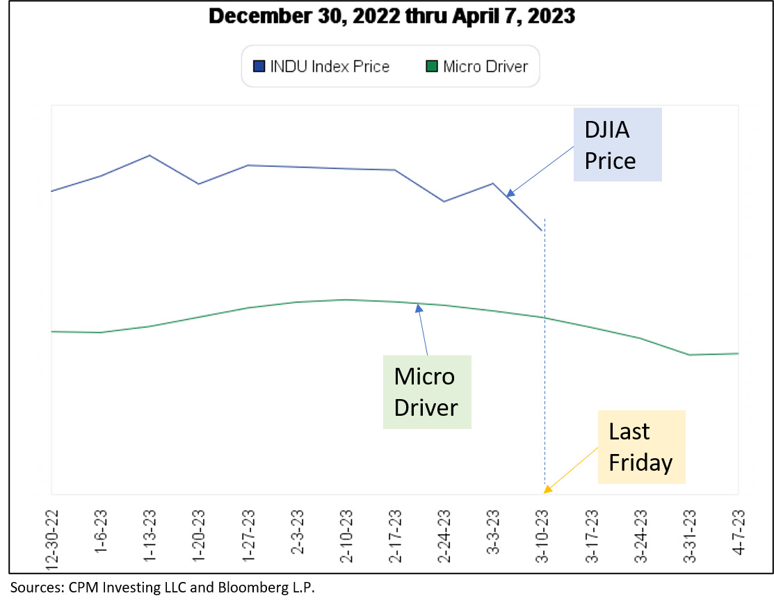
From this perspective, the current outperformance of NASDAQ may be at the extreme and it may be reversed over the near future. To invest heavily in NASDAQ now may risk investing in it just as it begins to underperform the others. The Micro MRI for the NASDAQ was at the 87th percentile last Friday - a high level. Thus, we will move into NASDAQ opportunistically. 

There have been several periods over the last 100+ years in which there have been large spreads between the DJIA and breakaway sectors such as technology and energy. Even considering these periods, the historical simulations indicate that our strategy can produce high return and low variability.  

D. Not Yet a Bull Market for the DJIA

Figure 4 below indicates the status of the Macro MRI for key indexes. This first column indicates whether the Macro MRI is now in the upleg of its cycle. The second indicates the Macro’s level (percentile) compared to its own history. Third, whether the Exceptional Macro is present. Fourth, whether the index could be described as being in a bull market as indicated by the Macro MRI being in the upleg of its cycle and the presence of the Exceptional Macro. The inception date of the index.

Figure 4


Historically, bull markets are most reliably indicated by the DJIA. Thus, that the DJIA has not made a full shift is worth noting. It is best to follow our discipline which is to pay most attention to the DJIA, which suggest caution at this time. 

The current status is somewhat troubling because the physics-based drivers we’ve recently developed indicate that the Macro MRI had an opportunity to begin its upleg last September. The NASDAQ seems to have responded to that driver, but the DJIA has not.

For the DJIA, the beginning of the Macro’s upleg was late and the Exceptional Macro made sporadic appearances, which is not at all typical. Looking back over the last 100 years, the Macro MRI has been more responsive to the driver. We suspect that the lack of major declines in stocks over the last 18 months has allowed high stock valuations to persist, and that this is a major factor in the lackluster stock returns outside of the tech sector. The DJIA seems to suggest there is unfinished business from the last year and a half.  

E. High Stock Valuations

Figure 5 below shows that the current valuations levels are still high for the DJIA. When valuations are high, stock prices tend to move lower. When valuations are low, stock prices tend to move higher. This is a version of buy low and sell high.

The important Price/Book and Price/Sales ratios for the DJIA are still high by historical standards, at the 83rd and 88th percentile, respectively. This is a high level compared to the historical refence points (A, B, and C) shown that are the low points of the DJIA price levels (after large declines), just before a bull market begins.  

Figure 5


It appears that investors in general have not been concerned by these high levels. The same is true for companies in NASDAQ. Figure 6 below shows the same table for the NASDAQ 100. 

Figure 6


The important Price/Book and Price/Sales ratios are still high by historical standards, at the 91rd percentiles for both. This is a high level compared to the historical refence points (A, B, C, and D) shown that are the low points of the NASDAQ price levels (after large declines) just as a bull market begins. 

F. Corporate Earnings Have Not Yet Declined

By some measures, corporate earnings have not yet shown the declines that might be expected after a bear market. Figure 7 below shows the DJIA (brown line, log scale) and our measure of “Economic Load” (orange) on the stock market. Economic Load is our composite of valuation statistics, change in short-term interest rates, and a comparison of stock dividend yield to bond yields.  The higher the orange line, the more downward pressure there is on stock prices and corporate earnings (double blue line).  

Figure 7


After the major peaks in the economic load in 2007 (C) during the Global Financial Crisis, the DJIA and corporate earnings declined meaningfully. The same is true after B although that decline was affected by the COVID pandemic. It appears that the current situation (A) is different. The anticipated declines have not yet occurred. Perhaps they won’t, but it is too early to conclude they won’t because the declines in stock prices and corporate earnings occurred well after the peaks of the economic load at C and B. 

G. A Period of Low Investor Excitability Has Just Ended

This lack of concern about valuations economic load could be related to the period of low investor excitability we have just passed through. At the beginning of 2022, we indicated that the next several months could be expected to have muted price cycles – an indication that investors will not get excited about either good news or bad news. This view is based on our recent research on the drivers of resilience. That same research suggests that the calm is over and that investors will now be much more excited about both good news and bad news. We may find that investors will now be more concerned about valuations and favor lower prices for stocks. If true, the reliability and the current conservative nature of the DJIA will be to our advantage. 

H. But There is Progress Toward Stronger Markets

I do think we have begun a new long-term trend toward higher stock prices. The stock market has been battling headwinds since the end of 2017, and this has been a very challenging period.  But that period appears to be over. The Macro MRI for most all stock indexes are at low levels and moving higher.  There will still be challenges but instead of headwinds fighting our progress, we are likely to have tailwinds the help us along as we work through the short-term challenges presented by the markets. 

-----------------


5/31/2023

Weekly Note - May 31, 2023

The markets continue to vacillate among three paths forward:
  • pricing for a recession (supports higher Treasury bond prices, all else equal)
  • pricing for inflation (weaken support for bonds and DJIA stocks short term, supports higher commodity prices and growth stocks)
  • pricing for stronger economic growth (supports higher stock prices)  

The MRI for the DJIA indicate that while longer-term (Macro) resilience continues to be present, it is fading. The short-term (Micro) resilience cycle is in its downleg but has far to go before reaching the bottom of that cycle; it is at the 60th percentile of levels since 1918. The Exceptional Macro, which could compensate for the Micro MRI being in its downleg, is no longer present. This mix suggests a moderately high level of vulnerability for DJIA prices. The algorithms continue to have low target weights for stocks.  

Some of the recent changes in the MRI might be related to the debt ceiling negotiations in Washington. The strength of the longer-term (Macro) resilience was not high prior to the negotiations possibly due to existing concerns about an impending recession and high stock valuations. The debates may have added to those concerns. The drivers of resilience that we recently developed suggest that stock market resilience should be stronger than it has been recently, which supports the idea that stock market investors are becoming more concerned about these issues.

If recession does indeed become the dominant issue, our bond investments can provide a good source of return in our portfolios.

Should the market start pricing for stronger economic growth and lower inflation, our current stock and bond investments can perform well. The MRI have recently suggested that this was a plausible scenario. Support for this path can be seen in the low unemployment rate and lower recent inflation readings.

Should the market start pricing for stronger growth and persistently high inflation, we will need to resume investments in a commodities ETF. I discuss the addition of a different commodities ETF in the section below. The upcoming addition of ETF COM is intended to address the long-recognized shortcomings of many of the dominant commodities ETFs.

During a period of stronger growth and persistently high inflation, portfolio performance will also be helped by the addition of a NASDAQ-linked ETF to gain greater exposure to the stocks of higher growth companies. A NASDAQ-linked ETF has not been included in our portfolios thus far because of the tendency during the early 2000s for high growth companies to experience bubble conditions that are difficult to navigate using the MRI. However, our algorithms navigated the recent decline in the NASDAQ well and NASDAQ-linked ETFs will be a good complement to our DJIA-linked ETFs. We do not envision the NASDAQ ETFs replacing the DJIA ETFs.

The portfolios currently hold a high number of ETFs to provide exposure to different asset classes but this is temporary. A lower number makes trading easier. To address this issue, I have indicated that BITO and SHY (cash-like bonds) are optional holdings. If you find it difficult to trade the current portfolio, you can simply not own these and hold that money as cash in your account.

NASDAQ-Linked ETFs

We will be adding NASDAQ-linked ETFs to the portfolios in the coming weeks but are likely to start at a very low weight. Our signals indicated that early April 2023 was a good time to buy the NASDAQ-linked ETFs. Unfortunately, we did not respond by adding NASDAQ at that time and have missed the strong returns since then. To date, this has been a mistake. While NASDAQ is a good long-term addition to the portfolios, this may not be a good time to give it a meaningful weight in the portfolio because its Micro MRI is currently very high in its cycle. Thus, it will likely have a small weight in the portfolios until a better buying opportunity occurs. Figure 1 below shows DJIA and NASDAQ performance for the recent twelve months.

Figure 1

The recent 12 months are shown along the horizontal axis. You can see that the performance of NASDAQ has been quite strong in May. The three MRI (Micro, Macro and Exceptional Macro) for NASDAQ have all been positive and providing resilience over the last few months. The move higher is likely the result of those forces plus the excitement about AI and its business potential for major tech companies.

Figure 2 below shows how our algorithms have timed exposure to NASDAQ. Figure 2 shows a 2x leveraged ETF (QLD) if bought and held over time (red line, labelled “Policy Weights”) and if bought and sold to avoid losses (gold line, which is called the traded sleeve) with the money invested in bonds when not in QLD.

Figure 2

In the early 2000s, the losses of the traded sleeve (gold) are less than simply holding the ETF (red), but were still too high for the ETF to be a good addition to our portfolios.

However, the traded sleeve (gold) avoided the worst losses since 2021 and indicates that our algorithms work effectively. Their greater effectiveness may be primarily the result of the maturing of the companies in the index - the NASDAQ of today is different than the NASDAQ of the early 2000s. The largest holdings of the NASDAQ ETFs are currently Microsoft, Apple, NVIDIA, Amazon, and Google – clearly major companies. While I do not have access to the names of the companies representing the largest holdings in 2000, the major companies of NASDAQ did not have the similar global stature and existing businesses of those dominating NASDAQ today.

A figure showing trades for the ETF QQQ (no leverage) and TQQQ (3x leverage) would show a similar pattern relative to holding the respective ETFs long term without trading.

Adding ETF COM for Commodities Exposure

An investment in commodities can provide positive returns during inflationary periods. I have been following commodities since the mid-2000s and the track record of the algorithms since that time has been good relative to the main commodities index, which is tracked by the ETF GSG. Figure 3 below shows the commodities ETF GSG without trading to avoid losses (red line, labelled “Policy Weights”). It also shows the return of using our algorithms to avoid losses (gold line, labelled “Sleeve”). I started running these signals in real life at the time indicated by vertical green line (July 2008).

Figure 3


The traded sleeve (gold) has far better performance than holding GSG long term (red). Yet, the performance of the traded sleeve (gold) is still too volatile for our purposes. The losses in 2020 and 2022 were dramatic.

A long-standing problem with most commodity ETFs (including GSG and PBDC, both of which we have used) is that they are heavily biased toward energy commodities (such as oil and gas). They currently hold about 60% of their assets in energy commodities. Energy commodities have had a large impact on inflation so this makes sense. But in general, we avoid investing in assets that are heavily influenced by the decisions of small group of people. Energy prices have been heavily influenced by OPEC decisions and government policy. This aspect of the major commodity ETFs plus the normal volatility of energy prices has always made commodities an uncomfortable addition to our portfolios.

Furthermore, there are commodities other than oil and gas that perform well during times of inflation, such as industrial metals (e.g., copper and aluminum), precious metals (gold and silver), and agricultural (wheat, cattle). Gold can be an important commodity in times of stress so we have used a gold ETF to get the needed exposure.

The ETF COM is different than SGS and PDBC. It does not hold static exposures to commodities. Instead, it tracks a rules-based index that began in October of 2010 that invests in a range of commodities. When a commodity exhibits a positive price trend for a specified period of time, the index increases the weight of that commodity. It will invest in up to 12 commodities (through futures contracts). The index has a simulated track record prior to 2010, which we have evaluated.

Figure 4 below shows three commodity ETFs, GSG (one of the largest and oldest), PDBC (which we have used most recently), and COM (which we plan on adding). The time period is May 2015 (the inception of PDBC) through May 31, 2023.

Figure 4


All three ETFs provided exposure to commodities during the sharp move higher (blue arrow) beginning in 2020 and ending in early 2022, which is a good characteristic for our portfolios. But COM (black) does not have the sharp declines seen in the other ETFs, which is an added benefit.

In our evaluation of COM, we found our long-term (Macro) MRI has done a good job of smoothing out the returns even further. Figure 5 below shows the performance of COM (red), and trading using the models we developed for it (gold line). This analysis was done recently so is not as objective as that shown for the GSG in Figure 3, but the figure below does suggest that COM has a regular cycle of resilience that we can use to smooth returns.

Figure 5


During the long period in which there were small positive returns (2011 through 2016) we would not have a meaningful target weight for ETF COM. We plan on using it tactically when positive returns are expected. Our current reading for COM is to have a target weight of zero but that positive returns may develop in the foreseeable future. Thus, adding this ETF over the next few weeks makes sense.

-----------


4/12/2023

Weekly Note - April 12, 2023

Summary

The current MRI dynamics of the DJIA and the US Treasury bond indexes suggest that both stocks and bonds will move higher from here. Over the next few weeks, we are likely to see greater resilience emanating from natural sources as indicated by the drivers mentioned below. That said, the current weakness of the Exceptional Macro for the DJIA, high stock valuations, and the upcoming period of high investor excitability beginning in early June (at the latest) are the main focus of our attention for the coming several weeks.

Note: For the next several weeks, we will be holding more ETFs than usual. Over the next month or two, we will identify redundant ETFs and remove them to make trading easier. The research on the drivers has resulted in lower trading, which has made a higher number of ETFs in the portfolios more acceptable for the time being.


The Status of the Stock and Bond Markets

Please see this page for descriptions of the language used to discuss our Market Resilience Indexes® https://focused15investing.com/language

Since the end of 2021, the stock and bond markets have faced significant challenges. These include a persistent war, inflationary pressures, central bank actions to combat inflation by raising interest rates, and concerns about a possible recession caused by higher interest rates. The Federal Funds rate increased to 4.83% from a low of 0.06% in June of 2021.

Despite these challenges, the decline in the DJIA has been minimal, declining only 1% since the beginning of January 2021 through last Friday (April 7). Plus, stock valuations have remained high for the last 18 months (see this page for current valuation levels: https://marketresilience.blogspot.com/p/djia-historical-valuation-comparison.html. Many market commentators have wondered why stock investors have not sold their stocks in a panic similar to those seen in March 2020 (Covid) and 2008 (Global Financial Crisis).

From our perspective, the answer may lie in the physics-based drivers of resilience that give rise to the market fluctuations we track with the MRI. At the end of 2021, we determined that the next 12 to 18 months would be a period of low investor excitability. Market gains and losses are muted during such periods. The declines of 2008 and 2020 occurred during periods of high investor excitability, as did most of the major stock market gains and losses of the last 100 years.

The current low level of investor excitability has, we believe, resulted in the absence of significant declines in stock prices over the last 15 months. However, we anticipate that this period of low investor excitability will come to an end by the end of May, based on objective non-market drivers of investor risk aversion. After that time, we are more likely to see investor euphoria and panic and larger price swings higher or lower.

Unfortunately, it is unclear at this time whether the dramatic moves will be higher or lower. Investors may attempt to correct the currently high stock valuations by selling stocks and driving down their prices. Or they may favor stocks due to the expectation of lower future interest rates and a positive trajectory for both stocks and bonds. Based on our analysis of current conditions, the expected shift is currently toward greater in investor risk tolerance and market resilience. 

The sections below show the current MRI conditions of key stock and bond markets, which will show the generally positive trajectory for both stocks and bonds. We update our view of conditions each week and will respond as needed.   

The DJIA Over the Last 15 Months

As a way of describing the dynamics of the last 15 months, I will first show the price of the DJIA (log scale) and its Macro, Exceptional Macro, and Micro MRI. Figure 1 below shows the period from December 1, 2020 through last Friday (April 7, 2023). The upper line is the DJIA, with a vertical line on April 7, 2023 in order to highlight the current date. The scale is not shown; the important patterns to see are the relative movements of the DJIA. 

The smooth blue line is the Macro MRI. It peaked in December of 2021 (at the 80th percentile of levels since 1918), indicated by the red arrow.  It has been in the downleg of its cycle until last week when it shifted to the upleg of its cycle (at the 27th percentile), indicated by the green arrow. If we were just making investment decisions based on the Macro MRI, we would have sold the DJIA-linked ETFs in December 2021 and we would be buying now.   

Figure 1

However, our disciplines call for also considering the presence of the Exceptional Macro MRI and the cycles of the Micro MRI. 

The small vertical arrows show the presence of the Exceptional Macro. It was present from the beginning of the period shown to July of 2021 (a), and a short period in December of 2022 and early 2023 (b). It appeared again two weeks ago. 

The Exceptional Macro appears when the Macro MRI begins to shift from the downleg of its cycle to the upleg, although there are false signals from time to time. In many cases, when Exceptional Macro is present, the stock market is highly resilient and can overwhelm any vulnerability indicated by the Micro MRI. 

In the current situation the Exceptional Macro is not as strong as it normally is after major stock price declines. This condition could be rooted in the fact that we have not had a major (e.g., a loss greater than 30%) decline in the DJIA thus far.

The purple line shows the Micro MRI for the DJIA, which tracks its shortest cycle of resilience.  One can see that the DJIA price movements parallel the Micro MRI except when the Exceptional Macro is present. As expected, the Exceptional Macro overwhelms any lack of resilience stemming from the declining Micro MRI.  From this perspective, the market has performed as expected given the MRI conditions. 

These dynamics suggest that the market will be more resilient for the next several weeks and possibly months:

  • The Macro MRI for the DJIA is currently at a low level by historical norms (at the 27th percentile of levels since 1918), and has declined dramatically from the 80th percentile at its recent peak shown by the red arrow indicating the end of 2021,
  • The Macro MRI has shifted to the upleg of its cycle as of the last week
  • The last three times the DJIA’s Macro MRI troughed at this level (12/2020, 6/2016, and 9/1988) were followed 6 months later by returns of 15%, 10%, and 12%, respectively. In addition, the DJIA continued to move higher after the six-month period in each of these cases.
  • The Exceptional Macro is present.
  • The Micro MRI is a low level (34th percentile since 1918) in its normal range and is in the upleg of its cycle. 

Consistent with these MRI dynamics, the algorithms and computer model evaluating this current status are inching closer to triggering a signal to buy our DJIA-linked ETFs. However, the strength of the Exceptional Marco is not as strong as it typically is at the end of the major stock market declines of the last 100 years. We are watching closely to see the persistence of the Exceptional Macro. It has appeared sporadically over the last several months and there is a small but meaningful chance that it ceases to be present over the next several weeks. If it ceases to be present, we will reduce our exposure to the riskiest ETFs. Yet, for reasons described below it seems that there is a good chance the resilience of the stock and bond markets will follow historical norms and increase from this point. 

As you may recall from prior notes, we have identified likely drivers of the MRI.  These drivers are based on objective variables that are exogenous to the markets and affect the collective risk aversion of investors. The key advantage of these drivers is that they can be forecast into the future giving an indication of future stock market resilience. 

Figure 2 below shows the same period as the prior figure but includes up-arrows indicating the presence of the drivers. The small green up-arrows indicate the short-term driver and the larger blue up-arrows indicate the long-term driver.  The short-term driver generally corresponds to the Micro MRI and the long-term generally corresponds to the Macro MRI. 

Figure 2 

As you can see in the Figure 2 above, the end of the long-term driver and the short-term driver in late 2021 correspond to the red arrow indicating the peak of the Macro MRI. The beginning of the long-term driver in approximately 8-5-2022 corresponded to a shift in DJIA (upper line) after which the DJIA moved more horizontally. 

Conceptually, the effects of these drivers are additive and the long-term driver is stronger. When there are both green and blue arrows, we can expect investors to be more optimistic and the markets to be more resilient. 

Figure 3 below is the same as prior figures with the addition of diagonal arrows during periods when both the short- and long-term drivers are present. During these periods the DJIA avoided major declines and tended to move higher. 

Figure 3

Again, the advantage to understanding the drivers is that we can get a sense for the resilience dynamics of the coming months. You can see that after the vertical line indicating last Friday, we will be entering a period during which the short- and long-term drivers both indicate the potential for higher stock market resilience. At this time, the MRI and the drivers are in agreement: the DJIA is poised to become more resilient.

Subjectively, it appears that simply following the drivers might have been appropriate over the last 15 months; the MRI seemed to follow the drivers. However, following the MRI is typically more successful than following the drivers.

An example of this is the last time we had a major rate increases to fight inflation. The period from early 1981 through mid-1983 is similar to the current period. The period encompasses when Federal Reserve Chairman Paul Volker increased the Federal Funds rate to 20% from 11.2% in June 1981. The period also occurred during a period of low investor excitability. Figure 4 below shows the DJIA from December 1980 through April 1983 with the same markings used in the figures above. Volker increased rates at the point marked by letter A. That event coincidentally occurred at the end of the long-term driver (blue up-arrows), and occurred just before the peak in the Macro MRI, indicated by the red arrow.

Figure 4


The magnitude of the decline in the Macro MRI between the red arrow indicating the peak and the deep green arrow indicting the trough is coincidentally the same magnitude of the decline in the Macro MRI in the recent 15-month period. The change in the Macro MRI suggests that the market response to the recent rate hikes has been as aggressive as it was to the Volker rate hikes decades earlier. 

Subjectively, it appears that from the red arrow to the end of the period shown in Figure 4, the DJIA appears to follow the MRI as opposed to the drivers; the drivers were less explanatory of the change in the DJIA price. This is confirmed by a statistical analysis we performed using the drivers and data from the Daily News Sentiment Index produced by the US Federal Reserve Bank of San Francisco. The conclusions from this analysis are:

  • During the Volker period, the Daily News Sentiment Index explained a high level (77%) of the variations on the DJIA. The MRI capture the effects of news sentiment. The drivers explained a far lower level (23%).
  • During the recent period, the drivers explained a higher level (55%) of the variation in the DJIA. The Daily News Sentiment Index explained less (45%).

While the periods were similar in that they both were affected by large hikes in interest rates to combat inflation and occurred during periods of low investor excitability, the rate change in June of 1981 came after a decade of high interest rates and was more extreme in terms of a rate change. Also, a 20% short-term interest rate is conceivably more economically traumatic and newsworthy than a 4.8% rate. Perhaps the market consensus after the initial shock of inflation and rate increases is that the current period is less traumatic and will pass more quickly.

The less traumatic nature of the recent period is supported by the performance of the DJIA in both periods. Figure 5 below shows the price level of the DJIA in the two periods when interest rates increased dramatically. From the peak in the DJIA through the lowest point in the DJIA for the most recent period (red line) is at week 39, the two paths are similar.  After that point, the declines for the 1981 period continued while there has been a rebound in the recent period.  

Figure 5

The greatest loss for the two periods is similar, at a loss of 23% for the Volker period and a loss of 21% for the current period. In addition, we are 67 weeks into the current decline and the Macro MRI is shifting to its upleg. That is a similar time frame for the Volker period, which ended after 69 weeks.

US Treasury Bonds

During most periods over the last 100 years, bonds have tended tend to move higher when stocks move lower. It is this relationship the makes a portfolio that mixes stocks and bonds attractive. However, in times of rising interest rates that are likely to induce lower economic growth (like the Volker and the current periods), bonds and stocks may drop at the same time. 

Our least aggressive bond ETF is SHY, which is linked to a 1- to 3-year US Treasury bond index. Figure 6 below shows in the upper panel the performance (on a log scale) of a 2-year US Treasury bond index, which is a useful proxy for SHY. The period shown is since January of 2000 through last Friday. In the lower panel is the Macro MRI. The vertical green lines in both panels are the Exceptional Macro MRI. 

Figure 6


You can see that over most of the time period shown, the index in the upper panel moves higher, which indicates a positive return for the index. The index moved higher even in many cases when the Macro MRI moved lower. This is because of the yield on the bonds and has meant that this index and the related ETFs are good investments in most market environments. This behavior makes SHY a good default investment when other ETFs lack resilience. 

In most periods covered in Figure 6, the appearance of the Exceptional Macro indicated the beginning of a period of higher resilience and returns. In the lower panel, the appearance of the Exceptional Macro indicated a likely beginning of the Macro MRI moving higher, as expected. Recently, the Macro MRI peaked recently at the red arrow in the lower panel. The red arrow is also shown in the upper panel.  It was clear at this time that interest rates would be rising to fight inflation and this made SHY unattractive as a default investment. It made sense during this period to use higher Box #2 Cash levels as a default investment. 

The important observation in Figure 6 above is that the Macro MRI has recently begun the upleg of its cycle and has done so at a low level (green arrow).  The Macro MRI is currently at the 1st percentile of levels since the beginning of the index in 1980 – an extremely low level. We now expect SHY to function more normally as a default investment and we have taken Box #2 Cash down to a normal level. 

A similar pattern is seen for the 10-year US Treasury bond index that is a good proxy for our more aggressive bond ETFs (UST and TYD), as seen in Figure 7 below. At the end of 2020 shown by the red arrow below, the Macro MRI was at the 100th percentile since the beginning of the index in 1983. It declined to a percentile of lower than the 1st percentile at the time shown by the deep green arrow. 

Figure 7

Based on analysis of yields for the 10-year bonds (which has a longer history), the magnitude of change in Macro levels shown above would be equally extreme over the period since 1962.  The current level of the Macro MRI would be similar to the levels in the fall of 1963, early 1970, late 1966, and late 1981. These are all time times after which bonds produced high returns.   

---- 


4/11/2023

Bitcoin

Starting April 14, 2023, we will include the Bitcoin ETF “BITO” in the Sapphire publication as a opportunistic addition. We plan to add it to the other publications over the subsequent weeks.  

The Macro MRI for Bitcoin is currently at a low level in its cycle and has recently shifted to the upleg of the cycle. Bitcoin adheres to the same principles found in our main stock and bond investments such as the DJIA and the US 10-year Treasury Bond index. To date, its price movement follows closely the cycles of optimism and pessimism tracked by its MRI.

The upper panel in the figure below displays the price of Bitcoin on a log scale from 2011 through April 7, 2023. The lower panel shows the Macro MRI for Bitcoin. The vertical green lines in both panels indicate the periods when the Exceptional Macro MRI is present. During such times, we typically see the investment increase in price more quickly and be less sensitive to the short-term periods of resilience tracked by the Micro MRI, which is not shown for clarity.

The red arrows indicate the timing of the most recent peak in the Macro MRI, and the green arrows indicate the most recent trough. The recent trough has been at the lowest point on record for Bitcoin. If the cycle moves towards its average value, the price of Bitcoin will likely increase from this point.

Bitcoin is an investment that has value simply because many investors believe it has value and there is limited supply, much like gold. Neither gold nor Bitcoin pays those who hold them dividends (like stocks) or interest (like bonds). 

However, Bitcoin's price behavior is more fully explained by its MRI than is gold's. This important attribute makes it a better fit for our portfolios than gold. 

A disadvantage of Bitcoin is its short history, which begins in 2011. Gold has been a valuable asset for thousands of years.

In addition, neither gold nor Bitcoin have valuation concerns and may respond more fully to the upward movements in the MRI without being encumbered by high valuations, which currently plague stocks. High valuations may put a lid on on stock price increases despite the markets being more resilient.  

Despite its short history, Bitcoin is sufficiently attractive to include in our portfolios because of the predictability of its price cycles. However, should it no longer follow its MRI, we will remove it from our portfolios.

3/15/2023

Weekly Note - March 15, 2023

This week's change in target weights have these effects on our accounts:
  1. Increase SHY by about 23% pts. SHY is the most cash-like bond ETF we hold
  2. Increase gold ETF GLD by about 5% pts
  3. Increase our 10-year bond ETFs (UST or TYD) by about 3% pts

The note below covers:

  1. My thoughts about the safety of accounts at Schwab

  2. Current valuation of the DJIA suggests the downward pressure on stock prices is not over

  3. A key driver of Micro MRI indicates more vulnerability to come
 

1. The Safety of Our Accounts at Schwab


I have my investment accounts at Schwab and I believe many subscribers do as well. The collapse of Silicon Valley Bank (SVB) over the last week sparked concerns about the safety of other financial institutions, including Schwab. I cannot give financial advice but my thoughts may be helpful.
  • I believe my accounts at Charles Schwab brokerage are safe.
  • It is important to differentiate between the stock of Schwab the company and the safety of investment accounts held within the Schwab’s brokerage arm.
  • The stock for the Charles Schwab Company (Ticker SCHW) has dropped in recent days, which has been widely reported in the news. As of this writing (Monday 3/15/2023) it has dropped about 30% from its recent high on January 10, 2023.
  • A decline in the price of Schwab company stock does not mean investment accounts are less secure. It does suggest that Schwab the company may have lower profits going forward because higher interest rates have affected the company’s own assets (some of which are held as bonds).
  • Investment accounts are held in the account holder’s name at the brokerage within Schwab and cannot be accessed or used by the Schwab company.
  • Investment accounts held at major brokers, including Schwab, are insured by the Securities Investor Protection Corporation (SIPC) for amounts up to $500,000 for securities (e.g., ETFs) and $250,000 in cash.
  • In addition to this insurance, Schwab has a third-party insurer as a back-up measure for the investment accounts. I was told this by phone on March 13. Schwab does not disclose the name of the insurer.
  • Schwab has a web page devoted to recent events (note 1).
    • The webpage states they have been receiving inflows from clients – including on Thursday and Friday of last week. “Our growth and momentum have continued in March, with daily net new assets of over $2 billion per trading day month-to-date, including Thursday and Friday of last week.”
    • This would be the opposite of a run on their assets.
  • The investment publication Barron’s published an opinion that the recent decline of the Schwab company stock may make the stock an attractive purchase (note 2). This would be the opposite of what has occurred at SVB and other regional banks. An attractive stock price for the Schwab company is not relevant to us because we do not buy individual stocks; we buy ETFs. It does, however, indicate that the stock of Schwab the company may be poised for a rebound after the current anxiety has passed.


2. Valuation and the Actions of the Fed Continue to Weigh on Stock Prices 


While the collapse of SVB has rattled the cages of investors around the world over the recent week, the stock market has been contending with difficult issues for many months. These include high stock valuations, high inflation, and recent interest rate increases by the Federal Reserve to fight inflation. Stock valuations remain high, inflation readings are still high, and it is not clear that the Fed is done increasing interest rates.

Focusing just on valuations, the valuations ratios of Price-to-Sales and Price-to-Book for the DJIA (based on a weighted average of all ~30 companies in the index) are both currently at the 85th percentile of levels since 2000. These high levels suggest the DJIA is still expensive and, all else equal, likely to decline.


3. A Key Driver of Micro Market Resilience Index


The decline in the DJIA we have seen over the last several weeks has been consistent with the MRI levels and what I believe are important driving forces behind changes in the MRI. See this page for a discussion of the language we use to discuss resilience: https://focused15investing.com/language

The Micro MRI, which measures the shortest cycle of resilience, has been in the downleg of its cycle for several weeks. As of last Friday (March 10, 2023), it was at the 31st percentile of levels since 1919. While low in its cycle, it can still move lower and still be moving normally. 

The Macro MRI, which measures the longest cycle of resilience is not clearly in either the upleg or downleg of its cycle; it is currently moving horizontally, which unusual. Thus, the longer-term trend of the market is not clear at this time.

Over the last few years, we have identified what we believe to be important drivers of investor optimism and pessimism. These are unrelated to the current market environment but give an early indication of how optimistic or pessimistic investors will be over the coming weeks. They therefore foreshadow how the MRI might move.

Figure 1 below shows the price of the DJIA (log scale, blue line) and the driver for the Micro MRI, labelled “Micro Driver” (green). The most recent date, March 10, 2023, is shown as a dotted vertical line. The time period covers December 30, 2022 through April 7, 2023 on the horizontal axis. The vertical scale is not shown because our focus is on the relative changes of these lines over time. The actual MRI are not shown.

Figure 1


As you can see, the DJIA has generally followed the Micro Driver over the last several weeks. If this continues, the DJIA will remain vulnerable to declines into April. Since the Macro MRI is moving horizontally (as mentioned above), it is not likely to contribute to higher levels of market resilience over the coming weeks. This means that any bad economic and financial news are more likely to negatively affect stock prices. This view is supported by the driver of the Macro (not shown), which has been moving horizontally for several months.  

Thus, our portfolios have been defensive, and are likely to remain defensive until the Micro and/or Macro MRI cycles turn to the uplegs of their cycles. Based on the trajectory of the Micro Driver in Figure 1, it looks like an upleg in the Micro MRI will be at least two weeks away. Accordingly, the next Plant season is a few weeks away.

------------------------------------------------

Notes

1.     Schwab Website

Quote from Schwab Company website https://www.aboutschwab.com/perspective-on-recent-industry-events. Extracted March 13, 2023.

·         “We believe one of the best indicators of the strength and stability of the firm is our client activity. Our February results show that clients entrusted Schwab with more than $41.7 billion in net new assets – our second-strongest February ever following our strongest January ever. Our growth and momentum have continued in March, with daily net new assets of over $2 billion per trading day month-to-date, including Thursday and Friday of last week. 

·         Following the recent events in the banking industry, we are pleased to see the U.S. Treasury Department, Federal Reserve, and FDIC step in with decisive action to support depositors during this critical time. We think the steps announced today provide an additional layer of protection for individuals and will help boost confidence in the American banking system.  

·         Collectively, more than 80% of client cash held at Schwab Bank is insured dollar-for-dollar by the FDIC. According to S&P Global Market Intelligence, that percentage is among the highest of the top 100 U.S. banks. As a comparison, the banks in the news the last few days have between 2% and 20% of their deposits insured.

·         As a further safeguard, Schwab has access to over $80 billion in borrowing capacity with the Federal Home Loan Bank (FHLB), which is an amount greater than all our uninsured deposits. That helps provide the firm significant access to liquidity, so money is there when clients need it. 

·         Investments at Schwab are held in investors’ names at the Broker Dealer. Those are separate and not comingled with assets at Schwab’s Bank.”


2.     Barron’s Article on Schwab Company Stock

Quote from Barron’s article https://www.barrons.com/articles/charles-schwab-stock-price-bank-selloff-4bb1ae5f). Extracted march 13, 2023. 

“Many banks and companies with related banking entities, such as Charles Schwab, also have a material amount of fixed income securities on their balance sheet with unrealized losses, as recently rising interest rates have decreased the value of fixed income securities,” Morningstar analyst Michael Wong wrote in a March 9 research note. He said he wasn’t concerned about Schwab’s liquidity or capital levels and doesn’t plan to change his $87 fair-value estimate. He says shares are undervalued.

Wong notes that Schwab had $36.6 billion of shareholders’ equity and a Tier 1 leverage ratio (a measure of core capital to total assets) of 7.2% at the end of 2022. That’s above the company’s internal target, and the regulatory minimum is 4%, Wong writes. 

Buying opportunity? Analysts Richard Repetto and Patrick Moley at investment bank Piper Sandler were quick to note the differences between Schwab and SVB, writing in a March 10 research report that “yesterday’s sell off is overdone and could present an attractive entry point into one of the strongest brands in financial services.”


1/11/2023

Weekly Note - January 11, 2023 - Update of Valuation Ratios and Corporate Earnings

 The note below covers:

1. Valuation Ratios for the DJIA are Still High
2. Corporate Earnings Have Not Yet Come Down

1. Valuations for the DJIA are Still High


Stepping outside the MRI framework, the valuations of the companies in the DJIA are still high compared to their valuations between January 2000 and last Friday (1/6/2022). Figure 1 below shows the current ratios and historical reference points. Please see this page for a brief description of these ratios.

Figure 1


The Price/Book (P/B) and Price/Sales (P/S) ratios are most important for this discussion. They are still high compared to the range of values since January 2000. As one can see in Figure 1, the percentile rankings of the current values are both above the 90th percentile. These figures mean stocks are expensive based on recent actual book values, sales, and earnings.  

In order for these high levels to be justified, corporate earnings growth will need to be strong going forward. In a time of slower economic growth induced by the Federal Reserve with higher interest rates, an outlook for especially strong economic growth does not seem to be the most likely scenario.  

Historically, these valuation ratios are low at market bottoms, and the ratios are shown for three recent market bottoms. DJIA prices will need to fall further to achieve those levels. In my elaboration of the industry adage “A Bull Market Climbs a Wall of Worry,” point #3 is relevant here – the current high valuation ratios suggest that stock prices will fall more than they already have.   

2. Corporate Earnings Have Not Yet Come Down


Figure 2 below shows the price of the DJIA (log scale, brown line), with the Peak-Earnings Indicator (PEI) in yellow. Last Friday is at the far right. The current major decline of the DJIA, which began in December of 2021, is indicated by “D”. The PEI has signaled that corporate earnings have been abnormally high throughout much of 2022. While earnings for the companies in the DJIA (shown by the double blue line) have declined somewhat since the mid-2022, they not yet declined as much as they have after the prior declines A, B, and C. Note that the declines in actual earnings typically occur several months AFTER the PEI has itself peaked.  

Figure 2


If historical patterns hold true, corporate earnings are likely to continue to decline further from here. If you would like to read my discussion of the PEI, I describe it here.

Based on the PEI and this analysis, the effects of a recession have not yet been seen in corporate earnings. Corporate earnings are likely buoyed by the ample Covid stimulus still in the system. That stimulus is helping to drive inflation, and the Fed is trying to dampen the effects of that stimulus. Thus, the economic battle between inflation and recession continues.


11/30/2022

Weekly Note - November 30, 2022

The note below covers:

1. Market Comment
2. Current Valuation Ratios
3. Conclusion
Note 1: Corporate Earnings Have Not Yet Come Down

1. Market Comment


The short-term cycle of resilience (measured by the Micro MRI) for the DJIA was at the 82nd percentile of levels since 1918 as of last Friday, which is a high level. The computer models and historical precedents continue to indicate that the recent move higher in the stock market is likely to be temporary and stock prices (as tracked by the DJIA) will be more vulnerable to declines when the Micro MRI moves to the downleg of its cycle. Please see this page for the language used to describe the MRI cycles: https://focused15investing.com/language

The Macro MRI, which indicates the longer-term trend of the stock market, is becoming less negative. In addition, the Exceptional Macro is very close to appearing for several stock market and bond market indexes. If these do indeed change, they would indicate a bullish view of the stock market (stock prices continuing higher) that could last several quarters or longer. As this shift takes place, we must recognize that the low point of this market decline might have already taken place at the end of September (when the Micro MRI began its upleg). At that time, there was little indication that these positive shifts might take place soon.

Nonetheless, the computer models and algorithms indicate that stock prices (as measured by the DJIA) are likely to be more vulnerable to declines over the coming weeks when the Micro MRI inevitably moves to the downleg of its cycle. Thus, our portfolios are still defensive. Qualitatively, I believe there will be a better time in the future for our portfolios to be aggressive. This view is supported by the high valuation ratios of stocks.

2. Valuations for the DJIA are Still High


Stepping outside the MRI framework, the valuations of the companies in the DJIA are still high compared to their valuations between January 2000 and last Friday (11/25/2022). Figure 1 below shows the current ratios and historical reference points. Please see this page for a brief description of these ratios.

Figure 1


The Price/Book (P/B) and Price/Sales (P/S) ratios are most important for this discussion. They are still high compared to the range of values since January 2000. As one can see in Figure 1, the percentile rankings of the current values are both at the 93rd level in this time period. These are high figures meaning stocks are not cheap based on recent actual book values, sales, and earnings.  These figures say stocks are expensive.

In order for these high levels to be justified, corporate earnings growth will need to be strong going forward. In a time of slower economic growth induced by the Federal Reserve with higher interest rates, an outlook for especially strong economic growth does not seem to be the most likely scenario.  

Historically, these valuation ratios are low at market bottoms - closer to their average valuation ratios indicated above (their 50th percentile rankings). DJIA prices will need to fall further to achieve those levels. In my elaboration of the industry adage “A Bull Market Climbs a Wall of Worry,” point #3 is relevant here – the current high valuation ratios suggest that stock prices will fall more than they already have. While not shown, the P/B and P/S ratios for the S&P 500 stock index are also high rating at the 85th and 92nd percentiles, respectively.  

3. Conclusion

The markets have been transitioning over the last several weeks and I expect them to continue to do so for the next few weeks. The markets are undergoing a shift from investor concerns being focused on inflation and high interest rates to a concern about recession and high valuations. However, instead of the market moving straight from a) inflation fear, to b) recession/valuation fear, the market seems to be going through an intermediate step: a) inflation fear, to b) everything will be OK (soft landing), to c) recession/valuation fears. A soft landing means that the Fed slows economic growth to curb inflation but does not push the economy into recession. Historically, soft landings have been difficult to achieve.  

Currently high valuation ratios support the potential dominance of c) recession/valuation fears.  Yet, the MRI are starting to signal an “OK-soft landing” for now. We had a similar situation in the early 2000s, and there was a further decline after a “OK-soft-landing” period of a few months, which the MRI identified. This view is supported by the Peak-Earnings Indicator analysis described in note 1 below. As the transition becomes clearer, we will move either way – becoming more or less aggressive. 


Note 1: Corporate Earnings Have Not Yet Come Down


Figure 2 below shows the price of the DJIA (log scale, brown line), with the Peak-Earnings Indicator (PEI) in yellow. Last Friday is at the far right. The current decline of the DJIA, which began in December of 2021, is indicated by “D”. The PEI signaled that corporate earnings are abnormally high throughout much of 2022, but earnings for the companies in the DJIA (shown by the double blue line) have not yet declined as far as they have after the prior declines A, B, and C.

Figure 2


If historical patterns hold true, corporate earnings are likely to continue to decline further from here. You can also see that the declines in earnings take place several months after the PEI has peaked. If you would like to read my discussion of the PEI, I describe it here.

Based on the PEI and this analysis, the effects of a recession have not yet been seen in corporate earnings. Corporate earnings are likely buoyed by the ample Covid stimulus still in the system. That stimulus is helping to drive inflation, and the Fed is trying to dampen the effects of that stimulus. Thus, the economic battle between inflation and recession continues and we appear to be lull between the two extremes.


10/26/2022

Weekly Note - October 26, 2022

The note below covers:

  1. Market Comment
  2. New Page – Repeated from Last Week’s Note
  3. Performance

1. Market Comment


As expected, the stock market has moved higher since the end of September. The move higher is likely a counter-trend rally, which is when prices move higher temporarily and then fall to a lower level than when the rally began.

As you may recall, the timing of this move higher is not a surprise; it is consistent with the projected movements of the Micro MRI. Since the beginning of 2022, the Micro MRI has generally followed its projected path. If the DJIA continues to follow the projected path, the current counter-trend rally will end in early November. Stock prices are then likely to be less resilient through the end of this year.

In addition to the projections calling for further price declines in a few weeks, the computer models and algorithms based on the MRI also are very cautious about the mid-term outlook for stocks. The following points describe the MRI conditions for the DJIA as of 10/21/2022. Please see this link for a discussion of our terminology: https://focused15investing.com/language

  • The Macro MRI has been in the downleg of its cycle since mid-December 2021, when it peaked at about the 80th percentile. The downleg continues and shows no sign of ending. A shift to the upleg of the Macro MRI cycle will be a strong indicator of the end of the current bear market.
  • The Macro MRI has declined to a low level. It is at the 32nd percentile of levels since 1918. The decline of the Macro from its recent peak at the 80th percentile to the current 32nd percentile has been quite steep. While I do expect it to decline further, we are coming closer to the inevitable end of the decline.
  • The Micro MRI is at the 26th percentile and in the upleg of its cycle. As mentioned above, the most likely path indicated by the projections is for it to move higher through early November and then begin another downleg that will be in place since through the end of the year.

Valuations for the DJIA are Still High


Stepping outside the MRI framework, the valuations of the companies in the DJIA are still high compared to their valuations between January 2000 and last Friday. Figure 1 below shows the current ratios and historical reference points. Please see this page for a brief description of these ratios.

Figure 1


The Price/Book (P/B) and Price/Sales (P/S) ratios are most important for this discussion. They are still high compared to the range of values since January 2000. The percentile rankings of the current values are 85th and 87th, respectively. In a time of slower economic growth and higher interest rates, I expect these valuation ratios to drop to levels close to or below their average valuation ratios indicated above (their 50th percentile rankings). DJIA prices will need to fall further to achieve those levels. In my elaboration of the industry adage “A Bull Market Climbs a Wall of Worry,” point #3 is relevant here – the current high valuation ratios suggest that stock prices will fall more than they already have.

This relatively low P/E ratio is noteworthy. When P/B and P/S ratios are high and the P/E ratio is relatively low, we can infer that the market, in its collective wisdom, is indicating that the current level of corporate earnings is abnormally high and is likely to decline. 

Figure 2 below shows the price of the DJIA (log scale, brown line), with the Peak-Earnings Indicator (PEI) in yellow. Last Friday is at the far right. The current decline, which began in December of 2021, is indicated by “D”. As you can see the PEI is still high compared to the PEI before the Global Financial Crisis (A) and the Covid Crash of 2020 (C).

Figure 2


The double blue line in Figure 2 above indicates actual earnings of the DJIA companies. At the far right of the line, we can see that earnings level has declined from its peaks at the end of 2021. But we can also see that the decline in earnings has been less than the declines that occurred after the high PEI readings at points A and C, despite the indicator being at a similarly high level. 

The recent decline in earnings thus far is even less than decline taking place after B, even though the PEI is currently quite a bit higher now (D) compared to B. If historical patterns hold true, corporate earnings are likely to continue to decline further from here. If you would like to read my discussion of the PEI, I describe it here.

Thus, with the Macro MRI indicating a lack of resilience, high P/B and P/S valuation ratios, and the PEI still signaling abnormally high earnings and lower future earnings, the most likely path for stocks as tracked by the DJIA is for further stock price declines than we have seen thus far in 2022. Other stock indexes have similar MRI conditions, with the exception of the tech-heavy NASDAQ, which is a little further along the downleg of its Macro cycle. It is perhaps closer to the inevitable inflection point indicating the end of its bear market.

Bonds Likely to Become More Attractive


As the country moves into an economic recession, the Fed will be more inclined to slow interest rate increases and perhaps even induce lower rates. These moves may make our bond ETFs more resilient. I suspect that decreasing our Box #2 Cash levels and increasing the bond allocations will be one of next major moves. However, as of today, the timing is not right for this change.

2. New Page – Repeated from Last Week’s Note


On page 2 of the weekly report, I show the target weights for all model portfolios. There is no new information on page 2. This page simply pulls together information stated on other pages, which still exist. My goal is to simplify your task of locating the target weights you need to use.

If you have selected the portfolio indicated as “Main” as your long-term portfolio, the orange box indicates the portfolio that you should be using at this time. The portfolio in the orange box is one step less aggressive than the Main portfolio, as specified in the note, “Box #3 Portfolio Shift Relative to Your Long-term Portfolio: -1.”

If you are using for your long-term portfolio one other than the Main portfolio, use the next less aggressive portfolio to implement the Box #3 Portfolio Shift: -1.

3. Performance (not audited)


Below are estimates of the returns that one would get from December 31, 2021 through last Friday by following the instructions for the “main” portfolios for each of the publications. Please see endnote for a brief comment on the main portfolios. Contact me with questions.

The year-to-date returns as of 10/21/2022 are:

   Diamond:    -8.6%
   Sapphire:    -10.7%

These returns compare favorably to the following alternatives:

   DJIA:         -13.4%
   S&P500:     -20.3%
   NASDAQ:    -30.1%
   IEF:            -18.0% ETF for the US 7-10-year Treasury bond index, with no leverage

   VBINX:     -19.5% Vanguard Fund with 60% of assets in stocks and 40% in bonds
   VASGX:    -21.5% Vanguard Fund with 80% of assets in stocks and 20% in bonds

Endnote: Main Portfolios

The main portfolio in the Diamond publication is sg235, and the main portfolio in the Sapphire publication is sg325. If you use either of these as your long-term portfolio and have followed the instructions since the first of the year by switching to the target weights of a less aggressive portfolio (by following the specification for Box #3, i.e., “-1”) and holding Box #2 Cash as instructed, your account’s performance should be close to the figures above.

Some deviation between your account and the numbers above can be expected. The performance figures above assume trading is done at the close of trading (4 pm, Eastern) on Fridays. Most people trade earlier in the day. In addition, we sometimes trade before Friday.

If you use as your long-term portfolio one that is more aggressive or less aggressive than the “Main” portfolio, your actual performance will be different.

The figures above are based on the actual ETFs in the model portfolio. The figures in the weekly publication are based on the index that the ETFs track.

8/23/2022

Weekly Note - August 24, 2022

We are still in a Wait season. The next potential Plant season is likely to be in late September.

The Comments section below (not required reading) covers:
1. Current Market Conditions
2. Market Resilience Index (MRI) Conditions
3. Recent Performance

Links included in the text below:

Current Stock Valuations: https://marketresilience.blogspot.com/p/djia-historical-valuation-comparison.html

Historical Inflationary Periods: https://marketresilience.blogspot.com/p/inflationary-periods.html

----------------------------------------------------------------------------------------------------------------------

1. Current Market Conditions (Updated 8/23/2022)


Based on the MRI of a wide range of asset classes (e.g., stocks, bonds, commodities), longer-term investor concerns are shifting away from high inflation toward a possible economic contraction - concern about inflation is still high but is fading. 

At this time, I see DJIA’s recent move higher as the last portion of a counter-trend rally that began in mid-June. The MRI support this view and suggest that stock prices will soon weaken. Many stock indexes have Micro MRI that are very high in their cycles and are shifting to the downlegs of their cycles. I list these and other indexes with their MRI statistics in section 2 below.

Recent business articles have statements similar to this Bloomberg headline of 8/16/2022: “JPMorgan Says the Stock Rally Has Legs. Morgan Stanley Disagrees.” Current MRI dynamics and valuation metrics (mentioned below) support the Morgan Stanley opinion described below. An excerpt from the Bloomberg article:

Top Wall Street strategists are divided on whether the US stock market is poised to extend its longest winning streak of the year -- or slip back after another false dawn.

Morgan Stanley strategists said in a note Monday that the sharp rally since June is just a pause in the bear market, predicting that share prices will slide in the second half of the year as profits weaken, interest rates keep rising and the economy slows. But rivals at JPMorgan Chase & Co. said the rally -- which has pushed up the tech-heavy Nasdaq 100 index by over 20% -- could run through the end of the year.

The schism reflects the highly uncertain outlook for the US stock market in the face of strong cross-currents. On the one hand, inflation is showing signs of pulling back from its peak and businesses have been expanding payrolls at a strong pace, both of which auger well for equities. Yet at the same time, Fed officials have signaled that they will continue to raise interest rates aggressively until consumer price increases are reined in, which risks driving the economy into a recession.

My analysis of valuation ratios for the DJIA supports the more pessimistic view held by Morgan Stanley. The valuation measures of Price/Sales and Price/Book are high by historical standards, and the market is also signaling that we may be in a period of peak earnings; earnings are likely to decline in the coming months. High valuations and potentially declining corporate earnings do not bode well for the stock market, and this is especially true when interest rates are rising. Valuation is not a formal part of our process because of data limitations. Instead, I use it for market context. I have updated an analysis done earlier this year here: https://marketresilience.blogspot.com/p/djia-historical-valuation-comparison.html

While concerns for high inflation and interest rate hikes are receding (for the time being), it is too soon to assume inflation has been tamed. There is a broad range of experiences with inflation over the last 100 years. The most recent period of high inflation was during the 1960s and 1970s, when high inflation persisted for about 18 years. This is probably an extreme case in terms of length. The inflationary period after World War 1 and Spanish Flu pandemic ended abruptly. Other periods of inflation fall in between these.

For historical context, I have added a post, “A Historical Perspective on Past Inflationary Periods,” which shows periods of inflation over the last 100+ years and how the DJIA has performed. It also shows how the MRI-based algorithms we use in the model portfolios performed over different periods. https://marketresilience.blogspot.com/p/inflationary-periods.html

Note about Drivers of Resilience: The MRI drivers I have discussed recently are beginning to indicate a turning point in the Macro MRI, potentially causing it to be less negative. Historically, following the actual Macro MRI has been more successful than following its drivers. However, the drivers give us a view into what may happen in the more distant future. Also, we continue to be in a period of "low investor excitability." During such periods, rapid price changes, either higher or lower, are less likely. 

2. Market Resilience Index (MRI) Conditions


See this link for a description of the language used to discuss resilience: https://focused15investing.com/language.

The DJIA is transitioning to a more vulnerable condition. Last Friday's level of DJIA's Micro MRI moved lower from the prior week; it appears to have begun the downleg of its cycle. Neither the Macro nor Exceptional Macro MRI for the DJIA are providing resilience. These conditions describe a counter-trend rally that is likely to end soon, which means that stock prices are likely to resume the longer-term trend downward established earlier in the year. 

Other US stock indexes are in similar conditions, which reinforces the view that we have indeed been in a broad-based counter-trend rally. All have Micro MRIs at the upper ends of their ranges that are shifting to the downlegs of their cycles. None have longer-term measures of resilience (Macro Exceptional Macro) in the uplegs of their cycles, which makes them vulnerable to declines when their Micro MRIs inevitably make a shift to their downlegs.

Section Updated as of 8/19/2022  
  • DJIA: percentile 82, 83 the prior week. Levels since 1918
  • S&P 500: 92, 93 the prior week. Levels since 1931
  • NASDAQ: 78, 78 the prior week. Levels since 1972
  • Russell 2000: 88, 90 the prior week. Levels since 1985 (small company stocks)
The same is true for these indexes or assets (don’t worry if these terms are not familiar; some people may find these useful):
  • DJ Transports: 81, 81 the prior week. Levels since 1916
  • NASDAQ vs DJIA: 79, 81 the prior week. Levels since 1995
  • Russell 2K vs DJIA: 92, 95 the prior week. Levels since 1995
  • R1K Growth vs Value:  91, 95 the prior week. Levels since 1985 
  • MSCI US Sectors: Cyclical vs Defensive: 92, 94 the prior week. Levels since 1995

Indexes with Micro MRIs moving opposite to those mentioned above:
  • VIX: 6, 2  the prior week. Levels since 1998
  • Credit Spreads: 12, 10 the prior week. Levels since 2002 (Macro MRI is positive)
All the indexes above have Micro MRI at extreme levels, which are likely to revert toward their means in the next few weeks.

3. Performance (not audited)


The US stock market has declined from December 31, 2021 through last Friday. I have calculated the returns that one would get by following instructions since the beginning of the year for the “main” portfolios for each of the publications. Please see endnote for a brief comment on the main portfolios. Contact me with questions.

The year-to-date returns as of 8/19/2022 are:

Diamond: -3.3%
Sapphire: -5.6%

These returns compare favorably to the following alternatives:

DJIA: -6.0%
S&P500: -10.4%
NASDAQ: -18.4%
IEF: -10.1% ETF for the US 7-10-year Treasury bond index, with no leverage

VBINX: -10.9% Vanguard Fund with 60% of assets in stocks and 40% in bonds
VASGX: -12.5% Vanguard Fund with 80% of assets in stocks and 20% in bonds

Endnote: Main Portfolios

The main portfolio in the Diamond publication is sg235. The main portfolio in the Sapphire publication is sg325.

If you use either of these as your long-term portfolio and have followed the instructions since the first of the year by switching to the target weights of a less aggressive portfolio (by following the specification for Box #3, i.e., “-1”) and holding Box #2 Cash as instructed, your account’s performance should be close to the figure above.

Some deviation between your account and the numbers above can be expected. The performance figures above assume trading is done at the close of trading on Fridays. Most people trade earlier in the day. In addition, we sometimes trade before Friday. If you use as your long-term portfolio one that is more or less aggressive than the main portfolio, your actual performance will be different.

The figures above are based on the actual ETFs in the model portfolio. The figures in the weekly publication are based on the index that the ETFs track.